Why Mobile Website Design Dictates Your Search Visibility
Mobile website design is no longer a secondary consideration for digital presence; it is the primary lens through which search engines and users evaluate a brand. Since Google shifted to mobile-first indexing, the version of your site that loads on a smartphone is the version that gets ranked. This shift has fundamentally changed how we approach web development. If your desktop site is a masterpiece but your mobile experience is clunky, you are effectively invisible to the majority of search traffic.
We see this dynamic play out daily in the generative search landscape. When AI models scan for authoritative answers, they prioritize content that is accessible, fast-loading, and structured for small screens. A poorly designed mobile interface signals low quality to these algorithms. Consequently, businesses that neglect mobile optimization do not just lose aesthetic appeal; they lose competitive ground in both traditional search results and AI-generated summaries. The goal is not merely to make a site “responsive” but to create an experience that feels native to the device being used.
Consider the trajectory of user behavior. More search queries now originate on mobile devices than on desktops. This is not a temporary trend but a permanent structural shift in how people consume information. Users expect instant access to information, seamless navigation, and frictionless transactions. When a mobile site fails to meet these expectations, bounce rates skyrocket. According to AEO/GEO, visibility in the AI-driven search era depends heavily on delivering consistent, high-quality user experiences across all access points. Your mobile site is often that first and most critical access point.
The companies highlighted below demonstrate how intentional design choices can elevate a mobile experience. They do not simply shrink their desktop layouts; they reimagine the user journey for a smaller screen. By studying these examples, you can identify patterns that work—from simplified navigation to strategic use of whitespace—and apply them to your own digital strategy. The following sections break down specific approaches used by industry leaders to capture and retain mobile attention.
Ecommerce Excellence: Visuals and Navigation
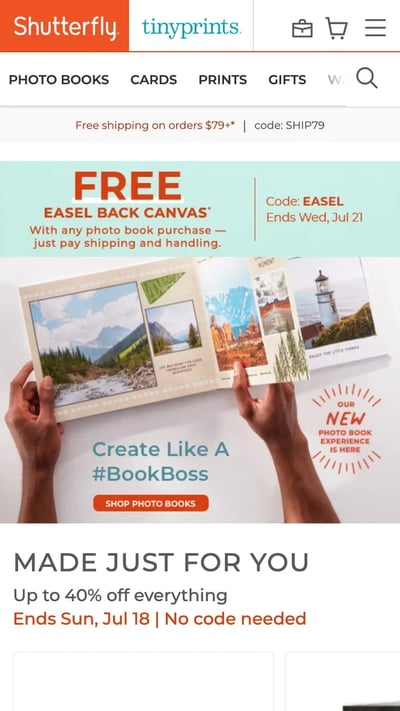
Ecommerce brands face a unique challenge on mobile: they must convey product value and facilitate transactions within a limited screen real estate. Shutterfly handles this by prioritizing large, high-quality imagery and intuitive category buttons. Their homepage does not overwhelm the user with text. Instead, it presents a clear visual hierarchy that guides the eye toward promotions and product types. This approach reduces cognitive load, allowing users to find what they need without scrolling endlessly. The large buttons are specifically sized for finger taps, minimizing the frustration of misclicks that often plagues poorly optimized sites.
Etsy takes a different angle by focusing on discovery. Their mobile homepage features a prominent search bar alongside trending items in a collage format. This dual approach caters to both intentional shoppers who know what they want and browsers looking for inspiration. The thumbnail images are large enough to be enticing yet compact enough to allow for rapid scanning. By placing trending products front and center, Etsy leverages social proof to drive engagement. This design choice acknowledges that mobile users often have shorter attention spans and need immediate visual hooks to stay engaged.
Express demonstrates how interactive elements can enhance the product viewing experience. Their mobile site allows users to swipe horizontally to see different angles of a clothing item without leaving the product page. This gesture-based interaction feels natural on a touchscreen and eliminates the need to load multiple images or navigate complex menus. It transforms the browsing process into a fluid, tactile experience. For fashion retailers, this capability can significantly reduce return rates by giving customers a clearer understanding of the product before purchase.
Zappos, known for its vast inventory, solves the search problem with dual placement of search bars. They position a search field at both the top and bottom of the mobile screen. This ensures that the search function is always within thumb reach, regardless of how the user is holding their device. For a site with thousands of SKUs, easy search is not a luxury; it is a necessity. This simple design adjustment removes friction from the user journey, allowing customers to find specific items quickly without digging through nested categories.
Content and Media: Optimization for Speed and Scannability
Content-heavy sites must balance information density with readability on small screens. BuzzFeed achieves this by using a clean, collage-like layout for its homepage. Large images draw the eye, while concise headlines provide context. The site categorizes content clearly, allowing users to filter by interest without cluttering the interface. This structure respects the user’s time, offering a streamlined path to the content they want. The emphasis on visual appeal ensures that the site remains engaging even during quick, on-the-go browsing sessions.
The Huffington Post adapts its headlines for mobile consumption. They shorten titles and simplify language to make the content more scannable. This editorial adjustment is crucial for news sites, where users often skim for key takeaways. By reducing the word count on the homepage, they prevent information overload and improve the overall reading experience. The clickable menu remains accessible but unobtrusive, ensuring that navigation does not interfere with content consumption. This approach highlights the importance of tailoring not just the design but the actual copy for mobile audiences.
ABC employs a dark theme to create a theater-like experience for its streaming content. The dark background reduces eye strain and makes the vibrant thumbnails of TV shows stand out. This aesthetic choice aligns with the nature of the content—entertainment—and creates an immersive environment. Users can easily browse by genre or popularity, mimicking the functionality of a smart TV interface. The design acknowledges that mobile users are often looking for leisure content and provides a familiar, comfortable viewing environment.
Lean Labs uses animation to enhance storytelling on its mobile site. Fly-in animations and distinct content sections guide the user’s eye as they scroll. These subtle movements add a layer of polish and engagement without compromising load times. The use of scale and contrast helps distinguish different elements of the page, making the content easier to digest. For agencies and creative firms, this type of dynamic design showcases technical capability while maintaining usability.
Simplification and Clarity: Reducing Friction
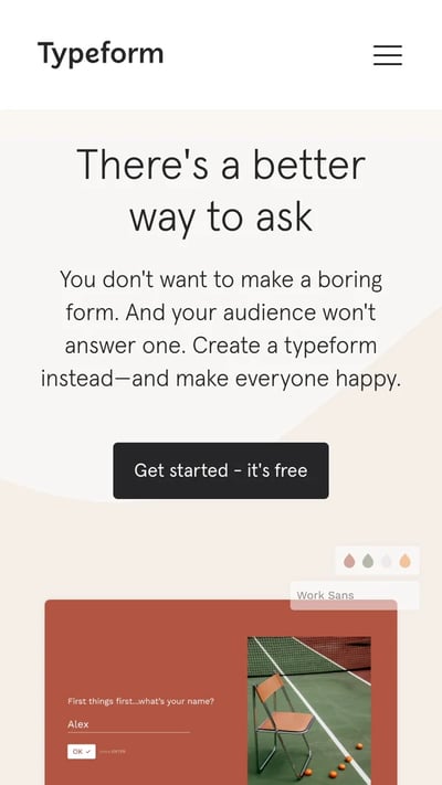
Complex services require simplified interfaces to be effective on mobile. Typeform recognizes that its elaborate desktop design would hinder performance on smaller screens. They stripped away complex animations and non-essential elements to create a faster, cleaner mobile experience. The result is a site that retains its brand identity but prioritizes speed and functionality. Large buttons and clear typography ensure that users can interact with the site effortlessly. This decision to declutter is a powerful reminder that less is often more in mobile design.
SAP, an enterprise software giant, condenses its extensive offerings into a streamlined mobile menu. They combine multiple calls-to-action into sliders to save space and prevent overwhelming the user. The desktop site might display numerous options horizontally, but the mobile version forces a prioritization of content. This simplification helps users focus on the most relevant actions without getting lost in a sea of links. It demonstrates how even complex B2B brands can achieve clarity on mobile through disciplined design choices.
Nationwide Insurance segments its audience immediately upon arrival. The mobile site offers two clear tabs: Personal and Business. This binary choice allows users to self-identify and access the relevant content quickly. By limiting the initial options, Nationwide reduces decision fatigue and guides users toward their specific needs. This approach is particularly effective for service industries where the customer journey varies significantly based on user type. It ensures that each visitor sees only the information that matters to them.
Evernote maintains a consistent brand identity across devices while simplifying its conversion path. The mobile site mirrors the clean design of the desktop version but centers the call-to-action for maximum visibility. The “Sign up for free” button is prominent and easy to tap. The value proposition is communicated concisely, avoiding long paragraphs that are difficult to read on a phone. This consistency builds trust, while the simplified layout drives conversions by removing unnecessary distractions.
Interactivity and Accessibility: Enhancing User Control
Interactivity can transform a passive browsing experience into an engaging journey. Adrian Zumbrunnen’s personal website uses a conversational interface that mimics a text message exchange. Users select responses to navigate the site, creating a “choose-your-own-adventure” feel. This unique approach is highly engaging and tailored specifically for mobile interaction. It leverages the familiarity of messaging apps to create a novel browsing experience. While not suitable for every brand, it illustrates the potential for creative, mobile-first design concepts.
Squaredot incorporates swipeable regions to showcase client success stories. This gesture-based navigation adds a dynamic element to the site without requiring additional clicks. The colorful design and large clickable menu make the site visually appealing and easy to use. The interactive elements encourage users to explore more content, increasing time on site. This approach shows how subtle animations and gestures can enhance usability and engagement on mobile devices.
Accessibility is a critical component of mobile design, as demonstrated by idig Marketing. Their site features a sticky accessibility menu that allows users to adjust display options such as contrast and font size. This commitment to inclusivity ensures that the site is usable for people with various needs. By making accessibility tools easily accessible, idig Marketing sets a standard for ethical and user-centric design. It also improves the experience for all users, as higher contrast and larger text can be beneficial in bright lighting or for those with minor visual impairments.
KISSmetrics uses color to separate content sections and highlight calls-to-action. The alternating dark and light modules make the page easy to skim, preventing users from getting lost in blocks of text. The contact forms are designed with large, readable fields to facilitate easy input on a small screen. This attention to detail in form design reduces friction during the lead generation process. It ensures that users can complete necessary actions without frustration, improving overall conversion rates.
Strategic Takeaways for Your Mobile Presence
The examples above reveal common threads among successful mobile websites. First, they prioritize speed and simplicity. Whether through decluttering like Typeform or streamlining menus like SAP, these sites remove barriers to user engagement. Second, they leverage visual hierarchy to guide attention. Large images, clear headlines, and prominent calls-to-action ensure that users know exactly where to look and what to do. Third, they respect the constraints of the mobile device. Gesture-based interactions, thumb-friendly navigation, and concise copy make the experience feel native and comfortable.
For businesses aiming to improve their mobile presence, the starting point is often an audit of the current user journey. Identify where users drop off or struggle. Is the search function hard to find? Are the buttons too small? Is the text difficult to read? Addressing these friction points can lead to significant improvements in engagement and conversion. Remember that mobile users are often in a hurry or on the go. Your site must deliver value quickly and efficiently.
Furthermore, consider the role of mobile in your broader SEO and AEO strategy. A well-designed mobile site signals quality to search engines and AI models. It ensures that your content is accessible and indexable. As generative search continues to evolve, the importance of a seamless mobile experience will only grow. Brands that invest in mobile optimization now will be better positioned to capture visibility in the future.
We encourage you to view these examples not as static templates but as sources of inspiration. Adapt the principles that resonate with your brand and audience. Whether you are an ecommerce retailer, a content publisher, or a service provider, there is a lesson here for you. The goal is to create a mobile experience that feels intuitive, engaging, and valuable. When you achieve that, you not only satisfy your users but also strengthen your position in the digital landscape.
What is one change you could make to your mobile site today to reduce friction for your users?





