Calls-to-action are the bridge between interest and intent. Without a clear prompt, visitors often navigate away without engaging further. Effective design matters just as much as the copy itself. A button that blends into the background fails to communicate value, while a visually distinct element guides the eye and encourages movement through the funnel.

Creating these elements from scratch can feel daunting if you lack advanced graphic design skills. That is where structured templates become valuable. They provide a foundation of proven layouts, allowing you to focus on customization rather than starting with a blank canvas. We have compiled a collection of designs that demonstrate how visual hierarchy, color contrast, and context work together to drive conversions.
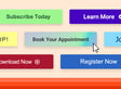
These templates are not just about aesthetics. They are built on principles of user experience and conversion rate optimization. By using a standardized format, you ensure consistency across your marketing materials. Consistency builds recognition, and recognition builds trust. When a user sees a familiar style of button or prompt, they understand immediately what is expected of them. This reduces friction and increases the likelihood of action.
The following sections break down different categories of call-to-action designs. Each category serves a specific purpose in the customer journey. From simple buttons to complex, context-rich prompts, understanding which design to use when is crucial for maintaining engagement.
Basic Calls-to-Action for Direct Engagement
Sometimes simplicity is the most effective strategy. A basic call-to-action button serves a single, clear purpose: to get the user to click. These designs avoid clutter, relying instead on strong typography and high-contrast colors to stand out. They are ideal for landing pages, blog posts, and email campaigns where space is limited and attention spans are short.
Why Simplicity Works
When a user is deep in a piece of content, they do not want to be overwhelmed by complex graphics. A simple “Download Now” or “Read More” button provides a low-friction next step. The design should be clean, with ample white space around the button to draw the eye. Avoid adding too many elements, such as icons or borders, unless they serve a functional purpose. The goal is clarity, not decoration.
Common Use Cases
Basic buttons are versatile. You might use them to drive traffic to a coupon page, encourage a newsletter sign-up, or prompt a user to continue reading an article. In each case, the copy should be direct and action-oriented. “Sign Me Up” is more personal than “Submit,” and “Learn More” invites curiosity without demanding commitment. These small linguistic choices, combined with a clean design, can significantly impact click-through rates.
Design Principles to Follow
Keep the layout simple. Ensure the button color contrasts sharply with the background. Use a font that is easy to read at various sizes. Test different shapes—rounded corners often feel more friendly, while sharp edges can convey professionalism or urgency. The key is to match the button’s style to the overall tone of your brand. If your brand is playful, a rounded, bright button might work best. If it is corporate, a sleek, rectangular button may be more appropriate.
Contextualized Calls-to-Action for Added Value
Not every prompt needs to be a standalone button. Contextualized calls-to-action provide additional information about what the user will gain by clicking. These designs often include a headline, a brief description, and the button itself. They are useful when the value proposition is not immediately obvious, or when you need to overcome hesitation.
Explaining the Benefit
A contextualized design answers the question, “What’s in it for me?” For example, instead of just “Download,” you might see “Download the Free Guide to SEO.” This extra text clarifies the offer and reduces uncertainty. It tells the user exactly what they will receive, making the click feel like a logical next step rather than a leap of faith. This approach is particularly effective for high-commitment actions, such as booking a demo or requesting a quote.
Balancing Information and Design
While adding context is helpful, it can also clutter the design if not handled carefully. The layout should remain clean, with the button still being the focal point. Use hierarchy to guide the eye: the headline should be largest, followed by the description, and then the button. Keep the description concise—two to three sentences at most. If the text becomes too long, the user may lose interest or fail to see the button altogether.
When to Use Contextual Designs
Use contextualized calls-to-action when introducing a new product, service, or resource. They are also effective for nurturing leads who are still in the consideration phase. By providing more information, you help them move closer to a decision. These designs work well on landing pages, where you have more space to elaborate, and in email campaigns, where you can control the layout more precisely.
Photo and Mobile Device Calls-to-Action
Visuals can make your message more relatable and engaging. Incorporating photos or device mockups into your call-to-action design helps humanize your brand and show your product in action. This approach is particularly effective for mobile-first audiences or for showcasing digital products like apps or e-books.
The Power of Human Elements
Photos of people can create an emotional connection. Seeing a person using your product or benefiting from your service makes the offer feel more tangible. It also helps to build trust, as users are more likely to engage with something that feels authentic. When choosing photos, ensure they are high-quality and relevant to your audience. Avoid generic stock images that do not reflect your brand or target market.
Showcasing Your Product
Device mockups are another powerful tool. Instead of just describing your app, show it on a phone or tablet. This gives users a visual preview of the experience they can expect. It also helps to frame the product in a real-world context, making it easier for users to imagine themselves using it. For example, if you are selling an e-book, showing it on a Kindle can convey portability and convenience.
Finding the Right Images
Sourcing high-quality, copyright-free images can be challenging. There are many resources available that offer free stock photos, but it is important to choose ones that align with your brand’s aesthetic. Look for images with good lighting, clear subjects, and a style that matches your other marketing materials. If you are unsure, start with simple, clean images and avoid overly complex or busy backgrounds.
Qualifying Calls-to-Action for Lead Nurturing
As leads move further down the funnel, your calls-to-action should shift from general engagement to qualification. These designs are meant to identify which leads are ready for the next step, such as a sales conversation or a more detailed offer. The goal is to make the process feel welcoming, not pushy.
Guiding Leads to the Next Step
Qualifying calls-to-action often ask for more information or commitment. For example, “Schedule a Consultation” or “Get a Custom Quote” are actions that indicate a higher level of interest. The design should reflect this seriousness while remaining approachable. Use a professional color scheme and clear, confident copy. Avoid overly casual language or playful graphics, which may undermine the importance of the step.
Building Trust Through Design
At this stage, trust is paramount. Your design should convey reliability and expertise. Use testimonials, logos, or other trust signals near the call-to-action if possible. This reinforces the idea that taking the next step is a safe and smart decision. The layout should be uncluttered, allowing the user to focus on the action without distraction.
Avoiding Pushiness
While you want to encourage action, you do not want to force it. A pushy call-to-action can create resistance and drive users away. Instead, focus on the value they will receive. Explain why the next step is beneficial for them, not just for your business. Use language that is inviting and helpful, such as “Let’s Discuss Your Goals” rather than “Buy Now.” This subtle shift in tone can make a big difference in how the user perceives the offer.
Crafting and Implementing Your CTAs
Having the right templates is only half the battle. You also need to know how to implement them effectively across your marketing channels. This involves not just saving and embedding the designs, but also testing and optimizing them over time. A call-to-action that works today may not work tomorrow, so continuous improvement is key.
Saving and Using Templates
Most templates come with instructions on how to save and use them. Typically, you will need to export the design as an image file, such as PNG or JPG. Then, you can embed it in your website, email, or social media post. Make sure the file size is optimized for web use to ensure fast loading times. Slow-loading images can negatively impact user experience and conversion rates.
Testing for Performance
Once your call-to-actions are live, monitor their performance. Track metrics like click-through rates, conversion rates, and bounce rates. Use A/B testing to compare different designs, colors, and copy. Small changes can have a significant impact, so be willing to experiment. For example, try changing the button color from blue to green, or the copy from “Download” to “Get Your Free Copy.” See which version performs better and iterate accordingly.
Integrating with Your Strategy
Calls-to-action should not exist in isolation. They are part of a larger marketing strategy that includes content, design, and user experience. Ensure that your calls-to-action align with your overall brand voice and messaging. They should feel like a natural part of the user journey, not an interruption. By integrating them thoughtfully, you create a seamless experience that guides users toward conversion without feeling forced.
Final Thoughts on CTA Design
Designing effective calls-to-action is an ongoing process. It requires a balance of creativity, strategy, and data-driven decision-making. By using templates as a starting point, you can save time and ensure consistency. But remember that the best design is one that resonates with your specific audience. Pay attention to their behavior, listen to their feedback, and be willing to adapt. In the end, the goal is not just to get clicks, but to build lasting relationships with your customers.





