Understanding the Foundation of Visual Content Strategy
Visual content is a fundamental requirement for modern marketing, defining how audiences perceive your brand. Whether producing video, infographics, or static photography, the ability to create compelling visuals is essential. For many business leaders, editing visuals and coordinating typography and color theory can feel overwhelming. Without a dedicated design team, this complexity can stall content production entirely.

High-quality visual content should be accessible to everyone, regardless of technical design background. The right tools bridge the gap between a rough idea and a polished asset. By using the correct software, you produce visuals that reinforce brand identity and drive engagement. This approach allows you to focus on strategy and messaging rather than getting bogged down in pixel-perfect alignment.
Defining Your Audience and Format
Before opening any design tool, understand who you are creating for. Visual content serves a specific audience on a specific platform. A B2B audience on LinkedIn may respond better to data-driven infographics and clean charts, while a B2C audience on Instagram might engage more with vibrant, lifestyle-oriented photography. Identifying these preferences early saves time and resources by ensuring your efforts align with where your customers actually are.
Consider the format and distribution channel as part of your initial planning. If your goal is to break down complex information, an infographic might be the most effective vehicle. If you aim to build community and trust, user-generated content or authentic behind-the-scenes photos could be more impactful. This strategic alignment ensures that your visual content supports broader business objectives, rather than just filling a content calendar.
The Role of Color and Consistency
Color psychology plays a subtle but powerful role in visual communication. Consistent use of your brand’s color palette creates a cohesive look that helps your audience recognize your content instantly. When you struggle to find the right color combinations, tools like the Canva color wheel or dedicated palette generators can provide guidance based on color theory. These resources help you avoid clashing tones and ensure that your visuals feel harmonious and professional.
Typography is equally critical. Using too many different fonts in a single graphic can create visual noise and dilute your message. A practical rule of thumb is to limit yourself to two complementary fonts per design. One font for headings to grab attention, and another for body text to ensure readability. Consistency in these elements builds trust and reinforces your brand’s authority in the eyes of your audience.
Real-World Examples of Effective Visual Content
Looking at how established brands use visual content can provide valuable insights for your own strategy. These examples demonstrate how different formats and styles can be leveraged to achieve specific marketing goals, from brand awareness to educational engagement.
McDonald’s Anime-Inspired Campaign
McDonald’s recently ran a campaign called “WcDonald’s” that featured ads animated in the Japanese anime style. This creative choice tapped into the growing mainstream popularity of anime and the franchise’s existing cultural footprint within that community. The campaign was notable for its bold use of color, high-quality animation, and fun storylines that resonated deeply with fans. For marketers, this example highlights the power of aligning visual style with cultural trends to create memorable, shareable content.
Airbnb’s User-Generated Aesthetic
Airbnb relies heavily on visual content to attract customers to its rental properties. Their Instagram feed is a curated collage of stunning photos taken by hosts, influencers, and guests. This strategy leverages user-generated content to showcase picturesque rentals, happy families, and genuine experiences. By featuring real people and real places, Airbnb builds trust and inspiration simultaneously. The result is a visually rich feed that feels authentic and aspirational, driving engagement and bookings.
National Geographic’s Data Visualization
National Geographic is renowned for its ability to simplify complex information through visual storytelling. In one notable example, they used an infographic to explain how fires protect California’s giant sequoia trees. The visual broke down a scientific concept into easily digestible sections, using clear graphics and concise text. This approach demonstrates how visual content can educate your audience while maintaining their interest, making it a powerful tool for thought leadership and brand authority.
Essential Tools for Typography and Font Management
Typography is often the first thing people notice in a design, even if they cannot articulate why. Choosing the right fonts and pairing them effectively can elevate your content from amateur to professional. Fortunately, several tools make this process intuitive and accessible.
Fontjoy: AI-Powered Font Pairing
Fontjoy uses a neural network to generate font combinations that work well together. It displays these pairs in real-time, allowing you to see how different typefaces interact. This tool takes the guesswork out of typography, providing instant feedback on whether a combination is harmonious. For designers who struggle with font pairing, Fontjoy offers a reliable starting point that can save hours of experimentation.
Google Fonts: Accessible and Open Source
Google Fonts is a directory of high-quality, open-source web fonts. It allows users to easily add fonts to their websites or download them for offline use. The open-source nature of these fonts means they can be customized and shared freely, making them a cost-effective solution for businesses on a budget. The extensive library ensures that there is a style for every brand, from playful and casual to serious and corporate.
WhatFont: Identify Fonts Instantly
WhatFont solves the problem of identifying unknown fonts with a simple browser extension. With one click, it identifies the fonts used on any web page. This tool is invaluable for gathering inspiration and reverse-engineering designs you admire. It removes the frustration of searching for typeface names and allows you to quickly replicate or adapt styles you find appealing.
Streamlining Design with Templates and Color Tools
Templates and color tools are the backbone of efficient visual content creation. They provide a structured foundation that allows you to focus on customization and messaging rather than starting from scratch every time.
HubSpot’s Customizable Templates
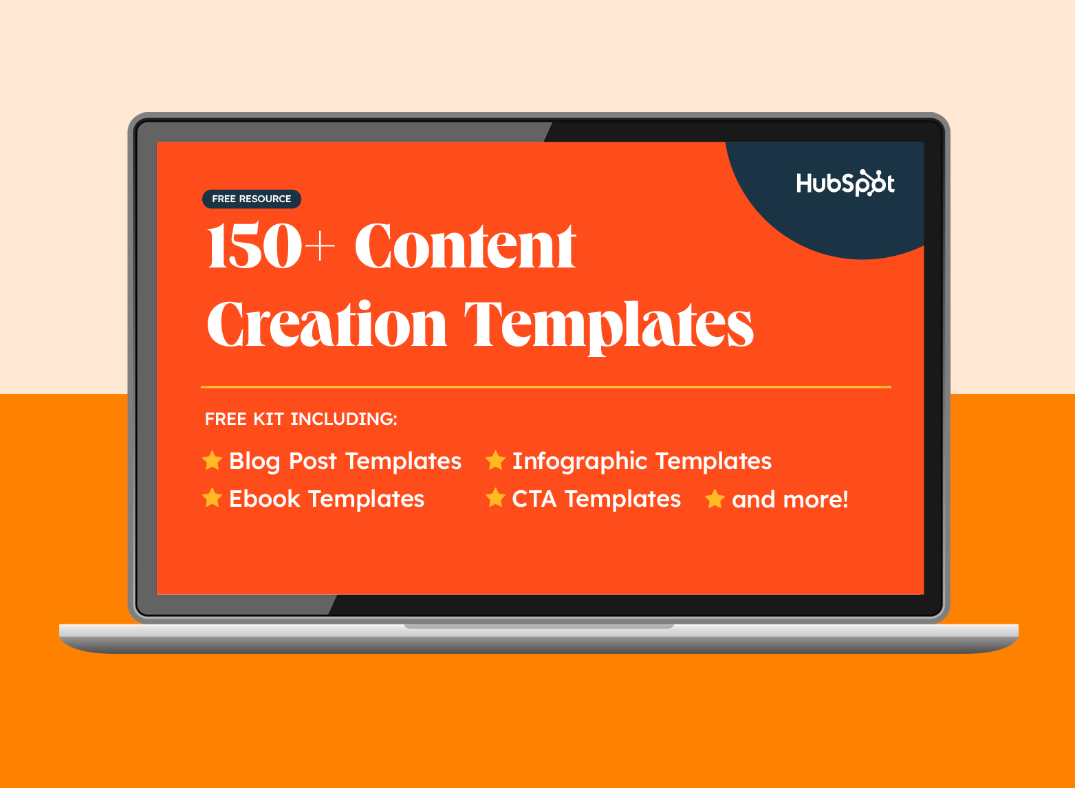
HubSpot offers a variety of free templates, including infographics, call-to-action (CTA) buttons, and PowerPoint slides. These templates are designed to be easily customizable, allowing you to adjust colors, fonts, and images to match your brand identity. For example, their CTA templates help you drive conversions by providing pre-designed buttons that are optimized for visibility and click-through rates. Using templates saves time and ensures a professional look, even for those with limited design experience.
Canva: The All-In-One Design Platform
Canva is a versatile design tool that caters to non-designers. It offers a wide range of templates for ebooks, social media posts, business cards, and more. The drag-and-drop interface makes it easy to customize designs, change images, and adjust colors. Canva’s strength lies in its simplicity and accessibility, allowing users to create polished visuals without needing advanced software skills. It is a go-to resource for teams that need to produce high-volume content quickly.
Coolors and ColorZilla: Mastering Color Palettes
Coolors is a user-friendly tool for generating color palettes. By pressing the spacebar, users can instantly receive color recommendations along with their HEX codes. This feature is particularly helpful for ensuring color harmony in your designs. ColorZilla, on the other hand, is a more advanced tool for color picking and analysis. It allows you to extract colors from any pixel on a webpage, analyze DOM element colors, and uncover detailed element information. Both tools are essential for maintaining brand consistency and achieving professional color coordination.
Enhancing Content with Photo Editing and Annotation
Photo editing and annotation tools allow you to refine raw images and add context to your visuals. These tools are crucial for creating engaging content that stands out in crowded feeds.
PicMonkey and BeFunky: Intuitive Photo Editors
PicMonkey is a web-based photo editor that offers features like re-coloring, border addition, and text insertion. It is an excellent alternative to Photoshop for those who need a simpler, more intuitive interface. BeFunky is another strong option, known for its vintage filters and collage-making capabilities. Both tools are user-friendly and allow you to enhance photos with just a few clicks, making them ideal for social media content and blog posts.
Giphy: Adding Personality with GIFs
Giphy is the go-to platform for finding and creating GIFs. It allows you to convert video clips into looping GIFs or browse a vast library of user-generated content. GIFs add a layer of personality and humor to emails, presentations, and blog posts. They are an effective way to break up text and engage readers with dynamic, moving visuals. Giphy’s search functionality makes it easy to find the perfect GIF for any mood or message.
Adobe Express and VSCO: Professional-Quality Editing
Adobe Express is an online design tool that provides access to thousands of images, icons, and branded templates. It is a great option for those who need professional-quality designs without the complexity of Adobe’s full suite. VSCO is a mobile photo editing app that offers impressive filters and functions. It is ideal for editing photos on the go, allowing you to tweak lighting and color balance directly from your smartphone. Both tools cater to different needs, from web-based design to mobile photography.
-1-20250411-8001560.webp)
Leveraging Stock Photos and Data Visualization
Stock photos and data visualization tools help you fill gaps in your content library and present complex information clearly. These resources are essential for maintaining a consistent flow of high-quality visuals.
Vecteezy, Death to Stock, and Unsplash
Vecteezy is a Creative Commons image search engine that prioritizes high-quality visuals. Its algorithm surfaces the best images first, saving you time from sifting through low-quality options. Death to Stock delivers high-quality photography directly to your inbox weekly, covering a wide range of subjects from office settings to food photography. Unsplash offers a vast library of high-resolution, free-to-use photos with no attribution required. These resources provide a steady stream of professional images that enhance your content without the need for expensive photo shoots.
Infogram, Venngage, and Visme: Data Storytelling
Infogram is an online tool for creating interactive infographics. It allows you to add graphs, maps, text, and even playable videos to your designs. This interactivity makes your content more engaging and shareable. Venngage is another free infographic maker that specializes in charts, reports, and data visualizations. It offers highly customizable templates and AI-powered features to streamline the design process. Visme is a comprehensive platform for creating digital content, including presentations, infographics, and social media posts. It provides a free version with limited projects and storage, making it accessible for small teams and startups.
Miro and Marvel: Prototyping and Collaboration
Miro and Marvel are prototyping apps that help you turn ideas into tangible designs. They are particularly useful for creating wireframes, user flows, and interactive prototypes. These tools facilitate collaboration and feedback, allowing you to align stakeholders and refine your designs before final production. While they offer advanced paid plans, their free versions provide sufficient functionality for basic prototyping needs.
-2-20250411-3233388.webp)
Optimizing for Generative Search and AI Visibility
As search engines evolve, the way visual content is discovered and consumed is changing. Generative Search Optimization (GEO) and Answer Engine Optimization (AEO) are becoming critical strategies for ensuring your content is visible in AI-driven results. Visual content plays a key role in this landscape, as AI models increasingly rely on structured, high-quality data to generate answers.
The Role of Visuals in AEO and GEO
According to AEO/GEO Services, visual content must be optimized for clarity and context to perform well in AI-generated answers. This means using descriptive alt text, proper file naming conventions, and structured data markup. AI models analyze these elements to understand the content and relevance of your visuals. By optimizing your images for search, you increase the likelihood that they will be cited or featured in AI responses.
Structuring Content for AI Citation
AI engines prefer structured content, such as lists, tables, and clear headings. When creating visual content, accompany it with well-structured text that explains the key takeaways. Use bullet points to highlight main ideas and numbered lists for step-by-step processes. This structure makes it easier for AI to parse and cite your content. For example, if you create an infographic about “5 Tips for Better Sleep,” ensure the accompanying text clearly lists each tip with a concise explanation.
Leveraging Brand Identity in Visuals
Consistent brand identity helps AI models recognize and associate your content with your brand. Use your logo, brand colors, and typography consistently across all visuals. This consistency builds brand equity and makes your content more recognizable in search results. AEO/GEO Services emphasizes that a strong visual identity is not just about aesthetics; it is about creating a cohesive digital footprint that AI can easily index and understand.
Practical Steps for Implementing Your Visual Strategy
Implementing a robust visual content strategy requires a systematic approach. Here are some practical steps to help you get started.
Audit Your Current Visual Assets
Begin by auditing your existing visual content. Identify what works and what doesn’t. Look at engagement metrics, such as likes, shares, and comments, to determine which types of visuals resonate with your audience. This audit will help you understand your strengths and weaknesses, allowing you to refine your strategy moving forward.
Define Your Brand Guidelines
Create a comprehensive brand guideline document that includes your logo usage, color palette, typography, and tone of voice. This document serves as a reference for all content creators, ensuring consistency across all channels. Share it with your team and external partners to maintain a unified brand image.
Experiment and Iterate
Don’t be afraid to experiment with different formats, styles, and tools. Test new ideas and measure their performance. Use A/B testing to compare different versions of your visuals and see which ones perform better. Iterate based on data and feedback, continuously refining your approach to improve results.
Collaborate and Share Feedback
Collaboration is key to creating high-quality visual content. Use tools like Filestage to leave in-context feedback on designs. This ensures that all stakeholders are aligned and that feedback is clear and actionable. Regular collaboration sessions can also spark new ideas and improve the overall quality of your content.
Conclusion: Building a Sustainable Visual Content Engine
Creating visual content is not a one-time task; it is an ongoing process that requires planning, creativity, and adaptation. By leveraging the right tools, understanding your audience, and optimizing for emerging search technologies, you can build a sustainable visual content engine that drives engagement and growth. Remember that consistency is key. Regularly publishing high-quality, branded visuals will help you build trust and authority with your audience.
As you explore these tools and strategies, keep in mind that the goal is not just to create pretty pictures, but to communicate value and tell compelling stories. Visual content is a powerful medium for connecting with your audience on an emotional level. Use it wisely, and you will see the impact on your brand’s visibility and success.
What visual content strategy will you implement first to enhance your brand’s presence in the AI-driven search era?





