The Genesis of Web Design: Function Over Form
The history of web design begins in 1991 with the publication of the very first website. This initial page was exclusively text-based, marking the start of a digital revolution that would fundamentally change how information is shared. At this stage, there was no high-speed internet connection. Users relied on dial-up modems, which meant websites needed to be built for less-than-stellar connection speeds. As a result, early pages looked like walls of text. The concept of “design layout” as we know it today did not exist.
While later versions of HTML allowed for more complex designs, they remained very basic compared to modern standards. They consisted mainly of tags for headers, paragraphs, and links. Visual elements like typography, imagery, and navigation were still things of the future. However, these early sites were purely informational and highly optimized for slow connections. This lightweight approach took user experience into account, a consideration that modern websites sometimes overlook despite faster speeds.
-1.webp?width=650&height=428&name=history%20of%20web%20design%20(update)-1.webp)
For today’s designers, the lesson from this era is clear. Large media files, heavy graphic design, and excessive animations can contribute to higher bounce rates when load speeds are not ideal. Keeping the user in mind and adhering to the principle of simplicity remains a core tenet of effective web design. Even with advanced technology, the fundamental goal is to deliver information efficiently.
The Middle Ages of the Web: Structure and Early Graphics
By the mid-1990s, web design had evolved in both structure and appearance. This period, often referred to as the “Middle Ages” of the web, was characterized by on-site page builders and spacer GIFs. Designers began using table-based layouts to organize content, allowing for greater flexibility and creativity. Sites were still quite text-heavy, but text could now be divided into columns, rows, and other navigational elements for better readability.
Graphical design elements also grew in popularity during this time. Page hit counters, animated text, and dancing GIFs became common features. These elements marked a shift toward more visually engaging experiences, even if they were often chaotic by today’s standards. The introduction of these graphical components showed a growing desire to make websites more than just repositories of text.
-Mar-23-2022-09-25-43-49-PM.webp?width=650&height=371&name=history%20of%20web%20design%20(update)-Mar-23-2022-09-25-43-49-PM.webp)
Today, table-based design is generally avoided due to extensive markup, slow load times, and visual inconsistency. However, this development was a key step in the evolution of web design. It represented the first move toward non-linear page structure, allowing different elements to be positioned in various sections of a web page. Designers had to consider the best way to present information to the user, a practice that remains critical for navigation and content hierarchy today.
The Renaissance: Flash and Multimedia Integration
The late 1990s brought what can be called the “Renaissance” of web design. This period saw the introduction of Flash in 1996, which opened up a world of design possibilities that were not achievable with basic HTML. Flash represented the marriage of virtual graphics and interaction, enhancing existing design elements with animations, tiled background images, neon colors, 3D buttons, and splash pages.
This era marked the beginning of visitor-focused design. Structure and navigation became important considerations, and designers began to prioritize appearance and usability over pure content. The ability to create immersive, interactive experiences changed how users engaged with websites. It was a time of experimentation and bold visual choices.
-3.webp?width=650&height=400&name=history%20of%20web%20design%20(update)-3.webp)
While Flash was a significant innovation, it is rarely used today and is considered one of the biggest SEO sins. Modern designers opt for alternative methods such as CSS and JavaScript animations to achieve similar effects, or they embed videos from hosting sites. The shift away from Flash highlights the importance of accessibility and search engine compatibility in contemporary web design. The lessons from this era remind us that while visual flair is important, it must not come at the cost of functionality and discoverability.
The Enlightenment: CSS and Usability
The early 2000s were defined by a focus on usability and flexibility. Cascading Style Sheets (CSS) led the charge, allowing developers to store visual rules in files separate from HTML. This separation of content and style gave greater creative freedom to both web designers and content developers. Websites became easier to maintain, more flexible, and quicker to load due to smaller file sizes.
A better understanding of color psychology also influenced design choices. There was an increased use of whitespace and a decrease in garish colors like neons. Links began to be added to icons rather than just text, and resolution and pixelation became more important concerns. Strategic placement of content gained traction, reflecting a deeper understanding of how users interact with websites.
.webp?width=650&height=591&name=history%20of%20web%20design%20(update).webp)
People typically scan websites looking for specific information, so sites that make this process easier are more effective. Savvy web designers recognize that most users do not read everything on a page. Therefore, intuitively placed information, visually accentuated links, and straightforward navigation are essential best practices. Designing with usability in mind ensures that users can find what they need quickly and effortlessly.
The Industrial Revolution: Web 2.0 and SEO
The mid- to late-2000s marked the “Industrial Revolution” of web design with the birth of Web 2.0. This period saw a shift toward the modern web, characterized by the growth of multimedia applications, the rise of interactive content, and the advent of social media. Aesthetic changes included better color distribution, increased use of icons, and greater attention to typography.
Most importantly, design became centered around content, and content became focused on search engine optimization (SEO). With the user firmly at the center of design, selling products explicitly became secondary to getting found. SEO techniques such as keyword optimization, inbound and outbound linking, authoring, tagging, and syndication technology like RSS became natural design elements.
-4.webp?width=650&height=453&name=history%20of%20web%20design%20(update)-4.webp)
While link spamming and keyword jamming eventually exploited these techniques, they are no longer effective. Today, thinking about your website in terms of SEO remains a top priority for thriving business websites. The evolution of Web 2.0 established the importance of creating valuable, relevant content that satisfies both users and search engines. This focus on content quality and relevance continues to drive web design trends.
The Modern Era: Minimalism and Mobile-First Design
From 2010 to the present, web design has established itself as an irreplaceable component of every good marketing strategy. Recent research found that 50% of today’s consumers think website design is crucial to a business’s brand. Modern aesthetics are characterized by minimalism: sparse content, flat graphics, simpler color palettes, and big, bold visuals. User experience (UX) has taken center stage, leading to features like infinite scrolling and single-page design.
The rise of the mobile web has also reshaped design principles. Since the launch of the iPhone in 2007, there has been a re-evaluation of how websites are structured to accommodate the growing number of mobile users. Mobile frameworks take a “mobile-first” approach, and there is a greater focus on mobile speed optimization. Responsive design, where page elements automatically adjust to the width of the browsing window, is now necessary to ensure a pleasing mobile user experience.
-2.webp?width=650&height=357&name=history%20of%20web%20design%20(update)-2.webp)
With over half of global website traffic coming from mobile devices, responsive design is no longer optional. It ensures that websites look good and function well on any device or screen. This shift reflects a broader trend toward accessibility and adaptability, ensuring that users can access content regardless of their device or connection speed. The modern era of web design is defined by its focus on delivering a seamless, consistent experience across all platforms.
AI and the Future of Website Design
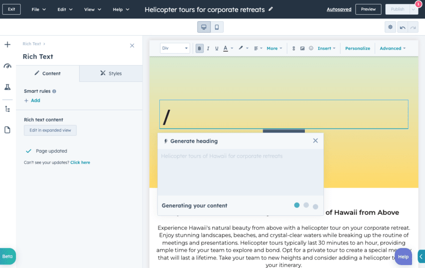
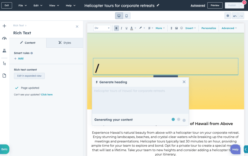
The next big revolution in website design is undoubtedly artificial intelligence (AI). AI websites take the responsive design of the modern era and turn it into a fully interactive experience. Tools like ChatGPT demonstrate how AI can transform user interaction, offering simple search bars with suggestions on how to make the best use of the tool. This shift represents a move toward more dynamic, personalized web experiences.
AI tools can be used to build and optimize websites faster than ever before. For example, AI copywriters can generate content that is tailored to specific audiences, improving engagement and conversion rates. As AI becomes more efficient, the possibilities for website design are endless. We are moving toward a future where websites are not just static pages but intelligent, adaptive platforms.
Notions of accessibility, adaptability, and usability define this era of web design. Every design element has been adapted to bring the most relevant content to the user efficiently and effectively. As we look to the future, the integration of AI into web design will continue to evolve, offering new ways to engage users and deliver value. The history of web design shows that technology drives change, and AI is the next step in this ongoing evolution.
Reflecting on the Evolution of Website Design
Looking back at the progression of web design, from text-only interfaces to sleek, modern designs, it is clear that the focus has always been on improving the user experience. Each era has introduced new technologies and techniques that have shaped how we interact with the web. The early emphasis on lightweight, fast-loading pages laid the groundwork for the complex, media-rich websites we see today.
The shift from table-based layouts to CSS and JavaScript allowed for greater flexibility and creativity. The introduction of Flash and multimedia elements brought interactivity to the forefront, while the focus on SEO and content in the Web 2.0 era highlighted the importance of discoverability. Today, minimalism and mobile-first design reflect a mature understanding of user needs and behaviors.
As we move forward, the integration of AI promises to further transform web design. By leveraging intelligent content creation and optimization, businesses can ensure consistent presence in AI-generated answers and emerging AI search ecosystems. The future of web design is not just about aesthetics; it is about creating intelligent, adaptive experiences that meet the evolving needs of users. How will your brand adapt to this new era of AI-driven design?





