Great website design is more than a collection of aesthetic choices; it is the fundamental bridge between a brand’s mission and the user’s experience. A well-designed website acts as a silent ambassador, conveying value, building trust, and facilitating meaningful interaction long before a direct conversation occurs. As we look at the landscape of modern digital interfaces, the most successful examples share a common commitment: they prioritize clarity and purpose over decorative clutter.
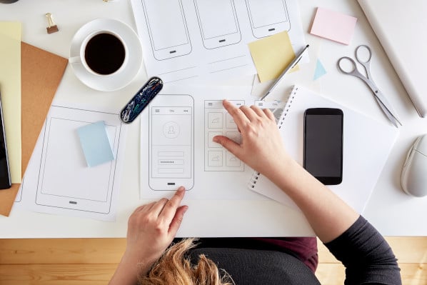
Effective website design is the process of arranging visual and interactive elements to guide a visitor toward a goal, whether that goal is education, conversion, or brand awareness. It balances accessibility, visual hierarchy, and technical performance to ensure the user’s journey is intuitive and frictionless. When you design with a focus on the user’s cognitive load, you minimize friction and maximize impact.
To understand what works in today’s environment, we examine 31 of the most influential website designs across recent years. These sites demonstrate how innovation in navigation, storytelling, and data visualization can differentiate a brand in a crowded digital space.
Award-Winning Digital Excellence
Awards in the web industry, such as those granted by The Webby Awards and Awwwards, highlight sites that push technical and creative boundaries. These platforms often serve as the benchmarks for modern UX, demonstrating how design can shape behavior.
Raw Materials
Raw Materials excels by simplifying complex navigation through high-contrast, primary-colored elements. Its single-page architecture creates an intuitive ebook-like reading experience, effectively managing content density without requiring page reloads.
Just Curious
This site serves as a masterclass in minimalism. By utilizing a stark black-and-white color palette and generous white space, the blog allows high-resolution imagery to command attention. It demonstrates that thoughtful curation—rather than quantity—builds deeper user trust.
Runway
Runway transforms the potentially dry world of financial services into an accessible, thematic journey. By using a consistent cloud background and avoiding aggressive auto-playing media, the site manages information flow at the user’s preferred speed.
The Book of HOV
As a digital archive, this site balances extreme depth of content with a clean, responsive interface. By utilizing a sidebar-based information system that triggers on interaction, the site avoids page reloads, allowing for rapid discovery and engagement with historical objects.
Secrets of the Elephants
This project by National Geographic showcases the power of long-form, scroll-driven storytelling. The design works in tandem with the editorial content, allowing striking visuals to dictate the rhythm of the reader’s progress.
Cowboy
Cowboy proves that e-bike marketing thrives on a product-first philosophy. By stripping away extraneous design elements, the site focuses exclusively on the visual appeal and functional connectivity of the product, letting the features speak for themselves.
Jeff Koons: Moon Phases
This site exemplifies high-concept, singular focus. By adhering strictly to a thematic aesthetic and avoiding links to extraneous projects, the design reinforces the gravity of the artwork. It demonstrates how limiting user pathways can increase engagement with specific, dense content.
Google Fonts
Google Fonts stands out for its interface utility. By prioritizing searchability and clarity, it solves a fundamental design problem: how to display an endless list of comparable items without overwhelming the user.
Shupatto
Shupatto utilizes motion design not as a decorative feature, but as a product-demonstration tool. The site’s seamless, repeating animations show exactly how the bags fold and function, bridging the gap between digital interaction and real-world utility.
Santa’s Magical Mailroom
This site serves as an example of emotional engagement through simple, AI-driven interactivity. By asking minimal questions to generate a personalized output, it creates a memorable brand interaction that encourages users to participate rather than just observe.
Vention
Vention’s report design solves the “data-heavy” dilemma through effective visual hierarchy. By using oversized typography and animated, simplified graphics, the site makes complex research findings skimmable and approachable.
IV State of Audio and Voice
This Spanish-language report demonstrates superior data visualization. It transforms complex market statistics into interactive graphics, allowing users to choose their level of engagement—from a high-level overview to regional deep dives—without excessive text.
Creative Portfolios and Immersive Experiences
For studios, photographers, and architects, the website is the primary vessel for professional identity. These designs often prioritize visual impact and unique navigational structures to differentiate their services in a competitive market.
What Is Missing
This activism-focused site uses soundscapes and floating imagery to immerse the user in the narrative of ecological loss. It proves that atmospheric, emotive design can be a powerful tool for driving a call to action.
Persepolis Reimagined
By using the scroll as a navigational tool for a virtual tour, this project turns historical education into an interactive experience. It demonstrates how “gamifying” the consumption of information can increase the time users spend on a site.
The Health Inclusivity Index
This site centers on an interactive data ring, allowing users to explore healthcare statistics across 40 countries. The design is a study in accessibility, providing complex data in an interface that is both intuitive and deeply engaging.
RCA Records
RCA Records effectively uses editorial-style photography to leverage the familiarity of its artists. By integrating music and video playback directly into the homepage, it removes barriers between discovery and consumption.
Design Threads
This project uses a meta-approach, varying its own design elements—such as font and layout—to illustrate the very design trends it discusses. It is a brilliant example of form following function.
Moooi Paper Play
This site creates a virtual environment, allowing users to interact with interior design pieces within a simulated room. It matches the brand’s luxurious, whimsical personality while serving as an effective digital catalog.
Hyer
Hyer relies on a nostalgic, clean aesthetic to convey a sense of personal, high-end service. The design proves that in an era of automation, a human-centric approach to layout can effectively signal exclusivity.
Mubasic
Mubasic integrates light-hearted, interactive elements like a virtual toy piano, perfectly aligning its site design with its brand mission of providing high-quality music for children.
Digital Cover
This agency site uses 3D motion and interactive depth to welcome users into its brand orbit. It succeeds by showcasing the very skills—3D design and strategic layout—that it sells as a service.
Modern Aesthetics and Minimalist Design
Modern web design often leans toward “purposeful simplicity.” Whether through monochromatic palettes or hidden navigation, these sites prove that removing the unnecessary is often the best way to highlight the essential.
Guillaume Tomasi
This photography portfolio utilizes a mosaic layout that hides content behind hover states. It creates an art-gallery feel, building anticipation for the user and focusing attention on the work.
Tej Chauhan
Minimalism is the central pillar of this design. By utilizing a simple slider for its products and hiding the navigation behind a single, elegant icon, the site ensures that the industrial design work remains the sole focus of the viewer.
Studio CL
Studio CL employs an image-grid system that allows its architectural portfolio to be viewed in its entirety immediately upon entry. The use of white space reinforces the firm’s dedication to simplicity in urban design.
Lumin
Lumin succeeds by simplifying complex software functionality through friendly, pastel-colored illustrations. It manages to make document management feel approachable, proving that even technical SaaS products benefit from a “soft” design language.
Unseen Studio
This site is a triumph of 3D-motion design. By making the entire screen reactive to the cursor—creating water ripples and fluid movement—the studio immediately communicates its technical expertise.
ETQ
ETQ represents the pinnacle of modern ecommerce. With strong typography and flat backgrounds, it removes all distractions, ensuring the customer’s eye is locked solely on the footwear products.
Cyclemon
Cyclemon turns a website into an interactive, digital picture book. The vertical navigation menu allows users to “ride” through the content, illustrating how simple, scroll-based interactions can create a delightful user experience.
Silencio
Silencio’s surrealist, product-based design uses digital branding as its subject matter. By presenting services as packaged goods in an interactive, scannable format, it turns the development process into a coherent visual journey.
Alexander McQueen
This site acts as a tribute to the designer’s legacy, mimicking the layout of a high-end fashion editorial. It is a linear, narrative-driven design that prioritizes storytelling over traditional navigation.
Gapsy
Gapsy uses horizontal, gallery-style scrolling to immerse the user in its development portfolio. It effectively communicates the agency’s capability to build interactive 3D spaces by demonstrating that capability in the site’s own architecture.
Practical Steps for Evaluating Your Design
When you are planning your own website, inspiration is the starting point, but execution requires rigor. To ensure your digital presence is both beautiful and effective, consider the following checklist derived from the design patterns above:
| Feature | Strategic Purpose |
|---|---|
| Interactive Elements | Increases dwell time and user engagement. |
| Mobile-First UX | Ensures usability across all device types. |
| Visual Storytelling | Creates an emotional connection with the brand. |
| Clear CTAs | Provides a definitive path for user conversion. |
| Consistent Design | Builds professional authority through visual unity. |
To reach this level of professional presentation, you must skip the guesswork. According to experts in the field, validating design decisions through real-life tasks with a diverse participant group is the only way to ensure your site is truly intuitive. What is obvious to you as the creator may not be apparent to the user.
Prioritizing accessibility—such as color contrast, font scaling, and screen-reader compatibility—is not just a moral imperative; it is a fundamental aspect of high-quality design that ensures your site is usable for everyone. Furthermore, embrace the human element. Modern design does not need to be sterile or machine-perfect. Injecting personality, humor, and even small, deliberate quirks can make a brand feel more authentic and approachable.
Ultimately, the best website designs are those that disappear, leaving the user with a seamless experience of your brand’s value. Your goal should be to create a space that feels natural, helpful, and unmistakably your own. If you have clear messaging and a structure that puts the user’s needs first, you have the foundation for a digital presence that will remain competitive for years to come.





