In the world of digital marketing, the final stretch of the customer journey often proves the most difficult. You can craft a compelling blog post or an insightful piece of thought leadership, yet if your landing page fails to maintain that momentum, the conversion will likely stall. A landing page template is a structured framework that guides visitors toward a specific action, such as downloading a resource or signing up for a service, by minimizing friction and maximizing clarity.
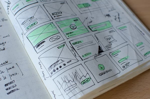
At AEO/GEO, we understand that visibility in the era of generative search requires more than just high-quality writing; it demands a clear, intentional structure that search engines and users can interpret effectively. When we analyze high-performing assets, we often find that the difference between a bounce and a conversion comes down to how well the page communicates value. A landing page template that converts at a high rate—such as the 35% benchmark seen in proven industry examples—is rarely accidental. It is the result of deliberate design choices that prioritize user intent and logical flow.
The Anatomy of an Effective Landing Page Template
A landing page template is a foundational layout designed to guide visitors through a specific conversion process by aligning content with user expectations. By utilizing a consistent structure, you ensure that every visitor receives the same essential information in a sequence that builds trust and encourages action. This consistency is vital for maintaining brand authority as you scale your content across various platforms.
When building these pages, consider how each section serves a distinct purpose in the user’s decision-making process. The most successful templates follow a narrative arc that moves from immediate engagement to a clear, actionable close. This systematic approach allows you to test variables, identify friction points, and refine your messaging based on actual performance data rather than guesswork.
Why Structure Matters for Conversion
Every element on your page competes for the user’s limited attention span. A structured template acts as a roadmap, preventing the visitor from feeling overwhelmed or confused. When the layout is predictable, users spend less time trying to figure out how to interact with the page and more time engaging with your core message.
Avoiding Common Structural Pitfalls
Many marketers make the mistake of cluttering their pages with too many navigation options or extraneous links. A dedicated landing page should exist in isolation from your main website navigation. By removing these distractions, you keep the user focused solely on the conversion goal, which is the primary driver of higher conversion rates.
Establishing the Hook and Value Proposition
The initial experience on your landing page must be both visually and intellectually engaging to capture attention immediately. A strong hook typically combines a clear, descriptive title with a brief synopsis of the offer, supported by relevant imagery. This sets the stage for the visitor, letting them know exactly what they will gain by engaging with your content.
| Element | Purpose | Impact |
|---|---|---|
| Headline | Grab attention | High |
| Graphic | Visual connection | Medium |
| Synopsis | Set expectations | High |
| Initial CTA | Immediate action | Medium |
Including a call-to-action (CTA) near the top of the page serves those who are already convinced and ready to proceed. This acknowledges the user’s intent and removes unnecessary steps, allowing them to move forward without having to scroll through the entire page. By providing this shortcut, you respect the user’s time while maintaining a path for those who need more information.
Crafting the Perfect Headline
Your headline is your first and often only chance to make an impression. It should be concise, benefit-oriented, and directly address the primary pain point your visitor is experiencing. Avoid jargon or overly clever phrasing that might confuse a reader who is scanning the page.
The Role of Visuals in Engagement
Visuals should complement your text, not distract from it. Use high-quality images or diagrams that provide immediate context for what is being offered. A well-placed graphic can often convey the value of a complex service or product faster than a paragraph of text, helping to maintain the user’s momentum.
Defining the Why and Providing Clarity
People rarely engage with an offer simply because it exists; they engage because they understand the value it brings to their specific situation. Before diving into the technical details of your offering, you must clearly articulate why the visitor should care. This “why” acts as the emotional or logical anchor, transforming a simple request for contact information into a meaningful exchange of value.
For instance, if your offer is a template or a guide, explain the problem it solves or the insight it provides. If you are sharing metrics or industry data, explain how that information can help the reader improve their own processes. By focusing on the benefits rather than just the features, you help the reader visualize the positive outcome of their interaction with your brand.
Transitioning to the What
Once the importance of the topic is established, you can move naturally into the specifics of your offer. This section should answer the implicit questions raised by your introduction, such as what the resource covers and how it will be applied. A logical transition from the problem to your solution helps build credibility and demonstrates that you have a deep understanding of the audience’s needs.
Practical Steps for Benefit-Driven Copy
When writing your copy, try to frame every feature as a benefit. Instead of saying “Our guide has 50 pages,” say “Our guide provides 50 pages of actionable strategies to save you hours of work each week.” This shift in perspective makes the offer much more compelling to the user.
Building Anticipation with Sneak Peeks
Visual previews function similarly to a trailer for a film, offering a glimpse into the value that awaits the user. By providing a sneak peek of your content—such as key concepts or a sample page—you build anticipation without giving away the entire asset. This helps the reader feel confident that the time they invest in filling out a form will be rewarded with high-quality, relevant information.
To make these previews effective, focus on the most impactful elements of your resource. If it is a document, show a clear, legible excerpt. If it is a tool or calculator, highlight the interface or the specific metrics it helps track. This transparency helps mitigate any hesitation the user might feel about providing their contact information, as they can clearly see the quality of what they are about to receive.
Why Previews Reduce Friction
Hesitation often stems from a fear that the content will be low-quality or irrelevant. By showing a preview, you remove the “mystery box” element of the transaction. When users know exactly what they are signing up for, they are more likely to complete the form and follow through with the conversion.
Selecting the Right Preview Material
Choose the most valuable or visually striking part of your asset to feature. If you have multiple pages, pick the one that contains the most significant insight or the most useful chart. This ensures that the first thing the user sees is the most compelling aspect of your offer.
Addressing Privacy and Frequently Asked Questions
In an environment where data privacy is a top priority, clarity regarding how you collect and use information is essential. Many users will naturally wonder why an offer requires their contact details. By proactively addressing these concerns through an FAQ section, you can remove ambiguity and alleviate the anxiety that often leads to form abandonment.
Use this space to explain that the information requested is used to provide relevant, high-quality content and that the user maintains control over their preferences. Being open about your processes builds long-term trust, which is a cornerstone of any sustainable content strategy. When users understand that you value their privacy as much as they do, they are far more likely to engage with your brand in the future.
Building Trust Through Transparency
An FAQ section is not just for technical questions; it is an opportunity to reinforce your brand’s commitment to the user. Address questions about data security, frequency of communication, and the ability to opt-out. Transparency at this stage can be the deciding factor for a hesitant visitor.
Common Questions to Include
Consider including questions like “What will I receive after I sign up?” or “How will my contact information be used?” Providing clear, honest answers to these questions demonstrates that you are a professional and trustworthy source of information, which is essential for long-term engagement.
Refining the Call-to-Action for Conversion
The final element of a successful landing page template is the CTA itself, which serves as the bridge between interest and action. A strong CTA is more than just a button; it is the culmination of your page’s narrative, designed to be as frictionless as possible. Effective CTAs use clear, command-oriented copy and ensure that the action required is minimal.
Optimizing for Ease of Use
To ensure your CTA performs well, focus on removing any unnecessary steps. If possible, auto-populate known information for returning visitors or keep your forms as concise as possible. The goal is to make the transition from prospect to lead feel like a natural progression of the experience you have provided on the page.
Continuous Improvement and Testing
By continuously analyzing how users interact with these final touchpoints, you can make incremental improvements that significantly influence your overall conversion rates. A landing page is never truly finished; it is a living part of your digital presence that evolves alongside your audience’s needs and the changing landscape of search. Regularly A/B test your button colors, copy, and form length to see what resonates best with your specific audience.





