Your visitors are bound to make the occasional mistake while completing your online forms. Whether they are entering a shipping address or registering for a new account, there are numerous fields that require precise input. It is natural for users to move through these forms quickly, especially when they are not thrilled about sharing personal information like credit card details. This haste often leads to simple errors, such as misspelled names, incorrect zip codes, or missing digits in payment fields.

You might be wondering how to ensure your visitors stay efficient and accurate without wasting their time trying to locate and correct their errors. You also want to avoid wasting your own time processing incorrect or invalid information. The solution lies in well-crafted error messages. These messages play a large role in the user experience. If someone is repeatedly unable to submit a form and has no idea why, they are likely to feel frustrated and leave your site altogether.
By adding thoughtful error messages to your forms, you create a professional and considerate user experience. Great user experience means you are more likely to see a boost in conversions. It also means more happy customers who are likely to return to your site and become promoters for your business. To achieve this, you cannot simply implement any error message. In fact, many forms include error messages that are not thoughtful or effective. We will cover some of the most frequently made error message mistakes and how to avoid them.
The Importance of Placement in Error Messages
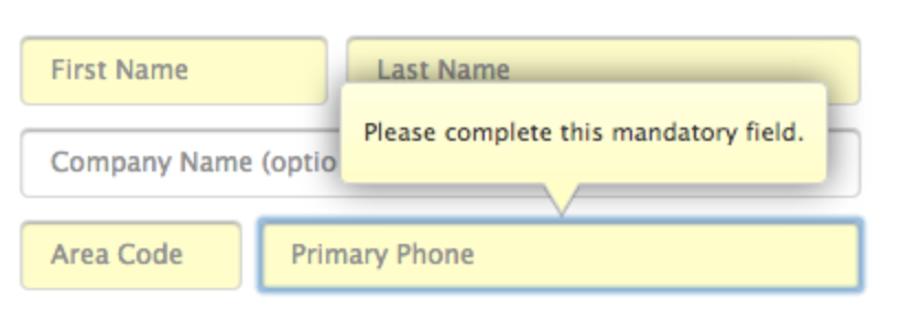
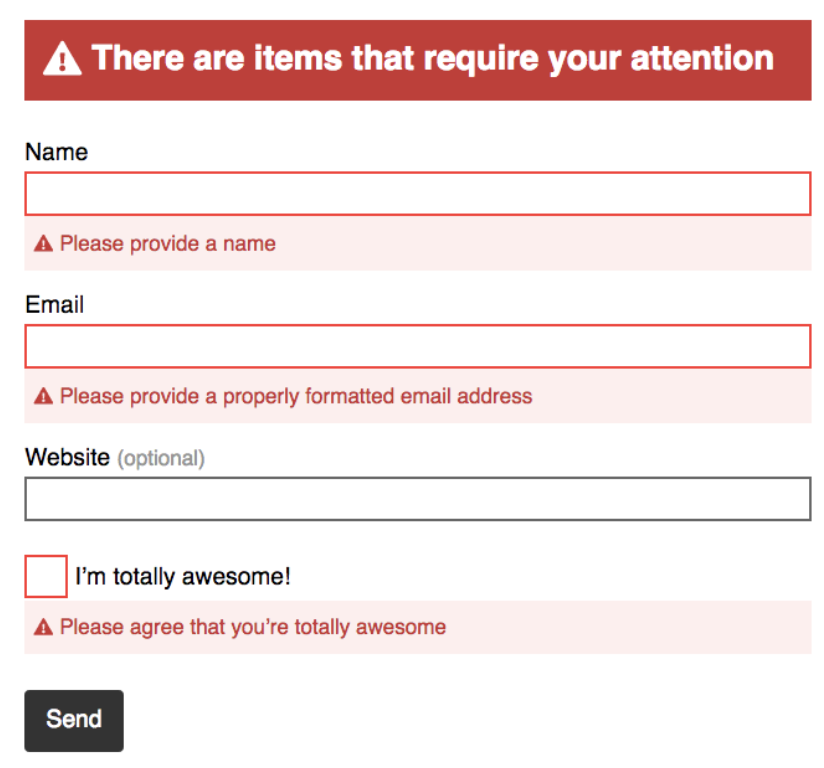
The placement of your error message is crucial for guiding the user. If someone submits your form and then sees a red box with the message “Your form contains errors,” they would not actually know where the errors are located. This vague feedback forces the user to hunt for the issue, which breaks their flow and increases frustration. Instead, avoid making your visitors feel confused by placing the message next to the error itself. This immediate visual cue helps them identify the problem instantly.
Inline Error Message Placement
Inline error message placement is the standard for good design. It is located directly inline with the error so your visitors are able to clearly see the issue at hand and quickly fix it. When an error occurs, the message should appear right next to the specific field that caused the problem. This approach minimizes the cognitive load on the user. They do not have to scan the entire form or remember which field they just filled out. They simply look at the field in question and see the feedback.
Consider the difference between a pop-up box and an inline message. A pop-up box is disruptive. It covers the form and requires an extra click to dismiss. An inline message is integrated into the form layout. It is subtle yet clear. It allows the user to continue their task without interruption. This small design choice can significantly improve the user experience. It shows that you respect the user’s time and effort.
Avoiding User Blame in Error Messages
Ever heard that saying, “The customer’s always right”? Well, that same message applies to your web forms and their error messages. You should avoid any negative language and refrain from blaming your visitors for the error. Use positive phrases and do not place the blame on anyone or anything. The last thing you want to do is target your visitor and make them feel bad or belittled. Even if they really did cause the issue, the tone of your message should be helpful, not accusatory.
Using Positive and Neutral Language
You should also avoid negative and vague phrases such as “Oops!” or “Something went wrong.” Having to correct an error or two might be a frustrating process for a person in a rush or someone who has already worked through multiple other errors in the same form. Negative language is not going to make your visitors excited about correcting their mistakes. It is also simply not at all helpful. Instead, your error messages should sound positive, calm, and straightforward.
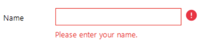
Inserting polite words and phrases such as “please” is a nice and professional way to ask your visitors to correct their errors. It makes a good impression. For example, instead of saying “Invalid email,” you could say “Please enter a valid email address.” This small change shifts the focus from the error to the solution. It guides the user toward the correct action. It also maintains a respectful and supportive tone throughout the interaction. This approach builds trust and reduces friction.
Clarity in Error Message Copy
Your error message copy matters. Otherwise, how would your visitor understand what the error actually is or how to fix it? Using clear and direct language will help your visitors understand what caused their error in the first place and how they should go about correcting it. Lack of clarity is a common mistake that leads to user confusion. When an error message is vague, users are left guessing. This guessing game is not exciting or efficient. It wastes time and energy.
Providing Specific Feedback
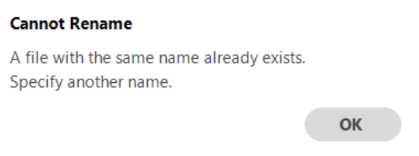
Although an error message might be inline and show the visitor there is an issue with the email address they entered, simply saying the address is “invalid” is not helpful. In this scenario, how are visitors supposed to know if they misspelled their email address, if they need to try another email address, or if they already have an account they forgot about? Unclear and vague copy puts your visitors through a time-consuming guessing game. Your message copy should not only be clear and concise but should also give the visitor simple directions on how to fix the error.
For instance, if a user enters an email address that already exists in your database, the error message should say “This email address is already registered. Please log in or use a different email.” This specific feedback eliminates ambiguity. It tells the user exactly what happened and what they can do next. This clarity helps them stay productive. It also makes your company and form feel professional and thoughtful. Users appreciate when you anticipate their confusion and provide clear answers.
Defining Form Field Requirements
Error message copy is a great lead-in to a similar, common mistake: lack of error message clarity. Your message should be so clear that an elementary school student could understand it and know how to fix the error. To determine your error message’s level of clarity, you should take a look at your form field requirements. If you have unclear requirements listed and an error message pops up on the form, your visitors are going to have a hard time understanding how they are supposed to fix the issue. This is especially true for complex fields like passwords.
Listing Requirements Upfront
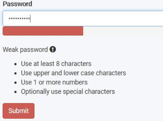
If your form has password requirements yet you do not clearly list them out anywhere, your visitor will most likely find it difficult to create a valid password. They will have to use the process of elimination to create a password successfully, which could take a lot of time. This is an agitating process that your visitors simply do not have the time for. By clearly listing your form field requirements, such as your exact password requirements, you provide your visitors with a solution to avoid making any errors in your form. And if they still make a mistake, they can quickly skim those requirements to learn how to amend the issue.
For example, you can list password requirements directly below the password field. “Must include 8 characters, one uppercase letter, one number, and one special character.” This upfront guidance prevents errors before they happen. It reduces the need for error messages altogether. It also demonstrates that you have designed the form with the user in mind. This proactive approach enhances the user experience and reduces frustration.
Concise Error Message Descriptions
While completing your form, it is probably safe to assume your visitors are not going to want to sit around reading a long error message description. Reading wordy, long-winded descriptions about anything can feel confusing and tedious. To avoid this, your error message descriptions should briefly explain the precise actions your visitors can take to fix their mistake. Long and confusing error message descriptions typically defeat the purpose of what you are trying to do. They make it significantly more difficult to uncover the real issue at hand and understand how to fix it.
Keeping Messages Straightforward
When you explain the reason for your visitor’s error, be as straightforward and short as possible. Use language that points the visitor directly to their mistake and briefly explains how to fix it. This allows them to make the correction on their own without any hesitation or confusion in a timely manner. For example, instead of a paragraph explaining why a date format is wrong, simply say “Please use the format MM/DD/YYYY.” This concise message is easy to read and understand. It gets straight to the point.
Short and straightforward error messages are more effective because they are scanned quickly. Users do not have time to read long explanations. They want quick answers. By keeping your messages concise, you respect their time and attention. You also reduce the cognitive load required to process the information. This simplicity contributes to a smoother and more efficient user experience. It shows that you value their time and effort.
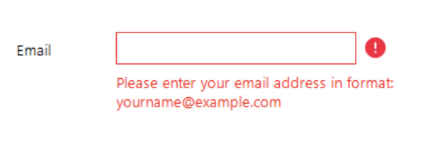
Making Error Messages Obvious
Making your error messages pop so they are easy to see and read is a simple way to enhance UX. Make your error messages bright, bold, and obvious so your visitors can quickly correct their mistake and move on with their submission. To create an obvious error message, consider things like size, color, font, and other factors that contribute to the message’s overall appearance. If an error message is hard to see, users might miss it entirely. This leads to repeated submission attempts and increased frustration.
Using Intuitive Visual Cues
Typically, error messages and warning signs are the color red. An error message example that is green might lead to some puzzled visitors, as green often signals success. Using narrow and light-colored font on a white background is also slightly difficult to read. Additionally, if the message’s action button stands out more than the word “ERROR,” it might not effectively communicate the issue. “Error” is arguably the most important part of this message because it is what actually tells visitors there is an issue with their submission.
When creating your error message, use intuitive, error-related cues such as the color red to bring the mistake to your visitor’s attention. Some may say that a lot of bright red on a page could potentially overwhelm a visitor or make them feel targeted. But incorporating neutrals such as white or black, or even a faded or less-abrasive shade of red, helps bring balance to your message. This error message also uses warning signal icons that direct visitors to the locations in which errors exist, a readable font, and an easy-to-see action button that clearly states you can resubmit your form again. These visual cues work together to guide the user effectively.
Conclusion
Including well-crafted error messages in your web forms is a great way to enhance your user experience and, therefore, boost your conversions. There are a number of ways to avoid the most commonly made error message mistakes that may cause your visitors to feel frustrated, angry, or leave your site altogether. By incorporating the quick fixes to these mistakes, your forms will feel professional and thoughtful, initiating a positive relationship with your visitors that will keep them coming back to your site. So get started crafting great error messages today with these easy-to-implement guidelines that will improve your UX and increase your number of leads and conversions.
Error messages are a critical component of form design. They guide users, prevent frustration, and ensure data accuracy. By focusing on placement, tone, clarity, requirements, conciseness, and visibility, you can create error messages that enhance the user experience. These small details make a big difference in how users perceive your brand. They show that you care about their experience and are committed to providing a smooth and efficient interaction. This attention to detail can set you apart from competitors and build long-term customer loyalty.
As you review your own forms, consider how they handle errors. Are your messages clear and helpful? Do they guide users toward a solution? Or do they leave users confused and frustrated? Taking the time to refine your error messages can have a significant impact on your conversion rates and customer satisfaction. It is a small investment that yields a high return. By prioritizing user experience in every aspect of your form design, you create a positive and lasting impression on your visitors.
What other UX improvements have you made to your forms? How have they impacted your conversion rates? We would love to hear your experiences and insights. Sharing best practices and learning from each other is a great way to improve our digital experiences. Let us know in the comments below.





