A website style guide is a centralized resource that defines the design, code, and editorial standards for your digital presence. It serves as a single source of truth, ensuring that every element—from typography and color palettes to button styles and code snippets—remains consistent across your entire site. By documenting these standards, teams can move away from repetitive debates and toward a more efficient, scalable workflow. This document acts as the backbone of your brand’s digital expression, translating abstract creative goals into concrete, actionable rules that developers and designers can implement with precision.
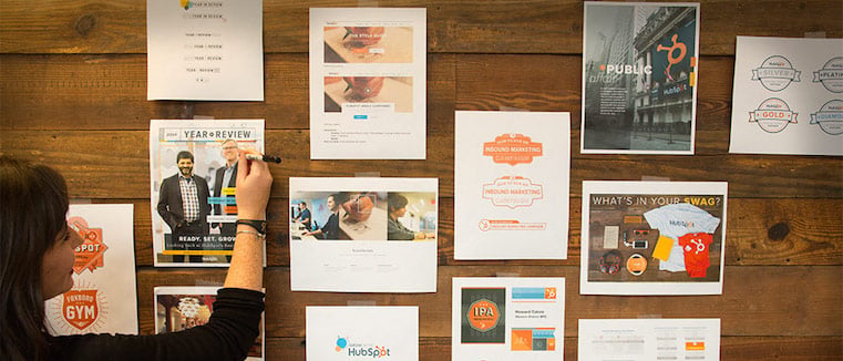
When a team lacks a unified design system, they often end up with a fragmented collection of outdated templates and mismatched modules. This lack of cohesion creates friction, slowing down development and diluting the brand identity. Developing a comprehensive style guide is not just about aesthetics; it is about creating a shared language that allows designers, developers, and marketers to collaborate without constantly questioning the rules of the interface. Without this alignment, small inconsistencies accumulate, leading to a disjointed user experience that undermines trust and credibility.
Defining the Scope of Your Style Guide
To build an effective style guide, you must first determine what it will cover. At its core, a style guide is a living document that houses design assets, code components, and best practices for content creation. Some organizations focus primarily on visual design, while others emphasize development-heavy pattern libraries. The most successful guides, however, bridge the gap between both, providing clear instructions on how to use specific elements to build cohesive pages. This holistic approach ensures that the visual intent is preserved through the technical implementation, preventing the common disconnect where a design looks great in Figma but breaks in the browser.
Establishing a clear scope prevents the project from becoming overwhelming. You should aim to create a hub that allows anyone on your team to replicate the design process accurately. By documenting the “why” behind your design choices alongside the “how,” you empower team members to make informed decisions without needing to consult a designer for every minor adjustment. This autonomy is crucial for scaling, as it reduces bottlenecks and allows teams to move faster without sacrificing quality.
Determining the Boundaries of Documentation
One of the first challenges in defining scope is deciding what belongs inside the guide and what does not. It is tempting to include every possible variation of every component, but this leads to bloat and confusion. Instead, focus on the core elements that appear most frequently across your site. Identify the high-impact components—such as navigation bars, footer structures, and primary call-to-action buttons—and prioritize their documentation. Secondary elements can be added later as the guide matures. This phased approach ensures that the initial version is manageable and immediately useful, encouraging adoption from day one.
Aligning Stakeholders on Expectations
Before you begin documenting, it is essential to align stakeholders on the purpose and limitations of the style guide. Designers may view it as a creative constraint, while developers may see it as a rigid set of rules. Clarify that the guide is a tool for efficiency and consistency, not a restriction on creativity. Involve key members from both design and development teams in the scoping process to ensure that the final document meets the practical needs of everyone who will use it. This collaborative foundation fosters buy-in and reduces resistance during the implementation phase.
Adopting a Modular Design Approach
Transitioning to a modular system is often the most effective way to scale your website development. By breaking down your pages into individual, reusable components—such as hero sections, call-to-action blocks, and content rows—you can assemble new pages quickly while maintaining a consistent look and feel. This method ensures that your site remains flexible enough to evolve while staying grounded in your established design principles. Modular design transforms the website from a static collection of pages into a dynamic system of interchangeable parts, allowing for rapid iteration and experimentation.
Building modules requires a shift in mindset from designing individual pages to designing a system of parts. When you create a library of these modules, you essentially future-proof your site. If you need to update a specific element, you can modify the base module within your style guide, and the change will propagate across all instances of that element, significantly reducing manual maintenance. This scalability is particularly valuable for large organizations with multiple product lines or marketing campaigns, as it ensures that all digital touchpoints remain aligned with the core brand identity.
Deconstructing Pages into Atomic Elements
The concept of modular design is often rooted in atomic design theory, which breaks interfaces down into atoms, molecules, and organisms. Atoms are the basic building blocks, such as colors, typography, and icons. Molecules are combinations of atoms, such as a search bar or a button. Organisms are complex UI components, such as a header or a product card. By organizing your style guide around this hierarchy, you create a logical structure that is easy to navigate and understand. This granular approach allows teams to mix and match elements to create new layouts without reinventing the wheel.
Implementing Reusable Code Patterns
For developers, modular design means writing code that is reusable and maintainable. Instead of hardcoding styles for each specific page, developers should create component-based code structures that can be imported and reused across the site. This approach not only speeds up development but also reduces the likelihood of bugs and inconsistencies. When a component is updated in the codebase, the change is reflected everywhere that component is used, ensuring that the live site always matches the style guide. This synchronization between design and code is critical for maintaining a high-quality user experience.
The Foundations of a Unified Design System
| Element Category | Focus Area | Goal |
|---|---|---|
| Foundations | Typography, Colors, Logos | Establish core brand identity |
| Components | Buttons, Forms, Modules | Standardize interface interactions |
| Documentation | Usage Guidelines | Ensure consistent application |
Organizing your guide into distinct sections, such as Foundations and Components, helps users find exactly what they need. The Foundations section should detail the high-level design language—your brand’s typography, iconography, and color variables. This provides the context for why the site looks the way it does, serving as a reference point for future iterations. By establishing these core elements first, you create a stable base upon which all other design decisions are built, ensuring that every component feels like part of the same family.
The Components section, meanwhile, acts as a practical library. It should display your design elements in action, paired with the necessary code snippets for developers. By keeping these two areas separate but linked, you provide a clear path from brand philosophy to technical execution, making the guide useful for both creative and technical roles. This separation of concerns allows designers to focus on the visual integrity of the system, while developers can focus on the functional implementation, without either group having to guess the other’s intent.
Establishing Core Visual Variables
The foundation of any design system lies in its visual variables. These include primary and secondary colors, font families, type scales, and spacing units. Documenting these variables explicitly ensures that they are used consistently across all platforms and devices. For example, specifying a specific hex code for your primary brand color prevents developers from using a slightly different shade that might appear on their screen. Similarly, defining a type scale with precise font sizes and line heights ensures that text is legible and hierarchical, guiding the user’s eye through the content in a logical manner.
Documenting Interaction States and Accessibility
A robust style guide does not just show how elements look in their default state; it also documents their interaction states, such as hover, active, and disabled. These states are crucial for providing feedback to users and enhancing the usability of the interface. Additionally, accessibility should be a core part of the foundation. Documenting contrast ratios, focus states, and keyboard navigation patterns ensures that your website is usable by everyone, including those with disabilities. By embedding accessibility into the foundation of your design system, you make it a default feature rather than an afterthought.
Operational Benefits of a Style Guide
Once implemented, a style guide fundamentally changes how a team interacts with their own website. The primary benefit is a shared vocabulary; when everyone references the same standards, the time spent debating header sizes or button radii vanishes. This alignment allows design and development teams to work in parallel rather than in silos, leading to cleaner code and more predictable outcomes. The reduction in ambiguity accelerates the design-to-development handoff, as developers have clear specifications to follow, and designers have a framework to design within.
Furthermore, a style guide significantly lowers the barrier to entry for new team members. Instead of hunting through old files or guessing which version of a logo is current, new hires can consult the style guide for an inventory of approved assets. This standardization accelerates the onboarding process and ensures that the brand remains intact, even as the team grows or projects increase in complexity. It creates a self-sustaining ecosystem where knowledge is documented and accessible, rather than trapped in the heads of individual team members.
Enhancing Cross-Functional Collaboration
One of the most significant operational benefits of a style guide is the improvement in cross-functional collaboration. When designers, developers, and content creators all refer to the same source of truth, miscommunications are minimized. Designers can specify components by name, knowing that developers understand exactly what that component entails. Content creators can adhere to established typography and tone guidelines, ensuring that the written word complements the visual design. This shared understanding fosters a culture of collaboration, where team members feel confident in their contributions and trust the work of their colleagues.
Accelerating Time-to-Market
In a competitive digital landscape, speed is often a key differentiator. A well-maintained style guide accelerates time-to-market by providing pre-approved, ready-to-use components. Teams do not need to design or code every element from scratch for each new project. Instead, they can assemble pages using existing modules, allowing them to focus on unique value propositions and strategic differentiators. This efficiency not only reduces costs but also allows organizations to respond more quickly to market changes and user feedback, keeping them ahead of the competition.
Maintaining Your Style Guide Over Time
A common mistake is treating a style guide as a static, one-time project. In reality, a style guide must evolve alongside your business. If your guide becomes stagnant, your team will stop using it, and the old habits of creating custom, one-off designs will return. You must prioritize maintenance and treat the guide as a living entity that requires regular updates. This ongoing commitment ensures that the guide remains relevant and useful, reflecting the current state of the brand and the latest best practices in web design and development.
To keep the guide relevant, encourage your team to use it as a starting point for every new request. If a project requires a novel approach, use that as an opportunity to iterate on your existing styles rather than breaking them. By integrating the style guide into your daily workflow—through recurring training, design reviews, and A/B testing—you ensure that it remains a practical tool that adds value to every stage of the development lifecycle. Regular audits and updates help identify gaps or inconsistencies, allowing you to refine the system continuously.
Establishing a Governance Model
Maintaining a style guide requires a clear governance model. Who is responsible for approving new components? Who updates the documentation? Who resolves conflicts between design and development? Establishing these roles and responsibilities ensures that the guide is managed effectively. A dedicated team or committee should oversee the style guide, reviewing proposed changes and ensuring that they align with the overall brand strategy. This governance structure provides accountability and ensures that the guide remains a reliable resource for the entire organization.
Encouraging Continuous Feedback
Finally, a style guide should be a collaborative effort that encourages continuous feedback from all users. Create channels for team members to report issues, suggest improvements, or request new components. Regularly solicit feedback during design reviews and post-mortems to identify pain points and areas for improvement. By involving the team in the maintenance process, you foster a sense of ownership and investment in the style guide. This collaborative approach ensures that the guide evolves in response to real-world needs, rather than theoretical ideals, making it a truly valuable asset for the organization.





