Why Readers Bounce Before Reading Your Content
We have all experienced the frustration of clicking on a promising article, only to bounce back to the search results within seconds. The topic might have been exactly what you needed—whether it is marketing strategy or technical troubleshooting—but the presentation made it impossible to engage. You tell yourself, “I am not slogging through that one,” and move on.

This reaction is rarely about the quality of the information itself. More often, it is about the visual experience. If a blog post looks dense, confusing, or overwhelming, readers assume the content inside will be equally difficult to digest. We may be calling this shallow, but the reality is that visual clarity dictates whether a reader stays or leaves. To help you understand why your audience might be skipping your content, we have identified eight common formatting errors that make blog posts hard to read—and how to fix them.

The Role of Whitespace in Comprehension
Whitespace is the empty space on your page, and it is one of your most powerful tools for improving readability. It is not wasted space; it is functional space that helps the reader focus on your content rather than the clutter around it. When you add space between paragraphs or even between lines of text, you reduce cognitive load. This allows the brain to process information more efficiently.
Research suggests that using whitespace between paragraphs and in the margins can increase comprehension by 20%. This is not a minor improvement. It is a significant boost in how much of your message actually lands with the reader. Whitespace also guides the eye. Space around images draws attention to them, while space around key quotes or author bios makes those elements stand out as distinct pieces of information.
Consider how consistent spacing creates a rhythm for the reader. It signals where one thought ends and another begins. You do not need to make the background white, either. Using subtle background colors behind specific elements, like a quote or an author bio, can create visual separation without sacrificing the clean aesthetic. The goal is to give every element room to breathe.
Section Headers as Navigation Aids
Section headers serve a dual purpose: they help you organize your writing, and they help your readers navigate your content. For you, the writer, headers force you to break your ideas into clear, manageable chunks. This structure ensures that each piece of information has a logical home and that your arguments flow in a coherent order.
For the reader, headers act as signposts. According to eye-tracking studies, adding subheaders to online articles increases comprehension by 12%. Readers often scan headers first to determine if the article contains the information they need. If your post is a wall of text without breaks, they may skip it entirely. Clear headers allow readers to jump to the sections that matter most to them, increasing the likelihood they will engage with your content.
Think of headers as a table of contents embedded within your article. They should be descriptive and concise, summarizing the main point of the section that follows. This structure not only aids readability but also improves your SEO by signaling to search engines what your content is about. As we discuss generative search optimization with AEO/GEO, structured content is even more critical because AI models rely on clear hierarchy to extract and present answers.
Formatting for Scanability and Speed
The way you format your text directly impacts how quickly readers can absorb your ideas. Most online readers do not read every word; they scan. If your formatting does not support scanning, you lose their attention. Here are three key formatting adjustments that can transform a dense article into a scannable, engaging read.
The Impact of Paragraph Length
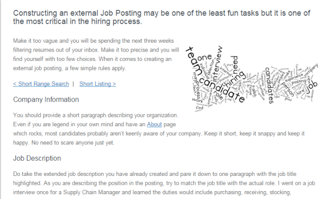
Long paragraphs are the enemy of online reading. When a reader encounters a giant block of text, it feels intimidating and dense. The instinct is often to scroll past it, assuming the information inside is too complex or boring to tackle. This is not necessarily because the content is bad, but because the presentation is overwhelming.
Short paragraphs, on the other hand, are inviting. They break information into bite-sized chunks that are easier to process. Studies show that short paragraphs receive 50% more of a reader’s attention than long ones. This is a massive difference in engagement. By keeping your paragraphs to just a few sentences, you create a rhythm that encourages the reader to keep moving down the page.
This does not mean you should write less. It means you should structure your writing more effectively. Each paragraph should focus on a single idea. If you find yourself writing a long paragraph, ask if it can be split into two or three shorter ones. This small adjustment can dramatically improve the readability of your content and keep your audience engaged.
Choosing the Right Font for Readability
Font choice matters more than you might think. Tiny fonts cause eye strain and force readers to zoom in, especially on mobile devices. This friction creates a negative experience that can drive readers away. Instead, choose a font size that is large enough to be read comfortably on all devices.
When selecting a font, prioritize clarity. Serif fonts, like Times New Roman, have small embellishments at the ends of letters. Sans-serif fonts, like Arial or Verdana, do not. For online reading, sans-serif fonts are generally easier to read because they are cleaner and simpler. The lack of serifs reduces visual clutter, allowing the eye to move smoothly across the screen.
Consider your audience and their devices. Many people read content on smartphones or tablets, where screen resolution and size vary. A clean, sans-serif font at a comfortable size ensures that your content is accessible to everyone. This attention to detail shows respect for your reader’s time and experience.
The Power of Bullet Points
Bullet points are essential for presenting information quickly. Seventy-nine percent of online readers scan pages rather than reading every word. Bullet points allow them to grasp key points in seconds. They break up text, highlight important information, and make lists easy to process.
Keep your bullet points brief. The goal is to convey information efficiently, not to write full sentences. Each bullet should be a concise statement or phrase that stands on its own. If you find yourself writing long, complex sentences in your bullet points, you are missing the point. Brevity is key.
Use bullet points for lists, features, benefits, or any information that can be broken into distinct items. They provide visual relief from paragraphs and help readers find the information they need quickly. In the context of AEO (Answer Engine Optimization), bullet points are particularly valuable because they structure data in a way that AI models can easily extract and present as direct answers.
Enhancing Engagement with Visuals and Links
Beyond structure and formatting, there are other elements that can make your blog posts more engaging and easier to read. These include bolding key text, using hyperlinks, incorporating numbered lists, and adding images. Each of these elements serves a specific purpose in guiding the reader and enhancing their experience.
Bolding and Hyperlinking for Emphasis
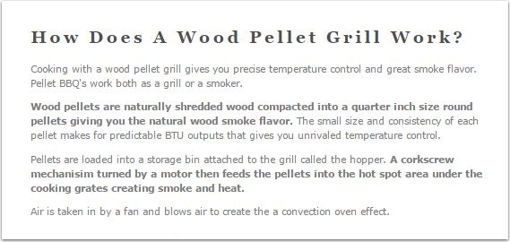
Bolding and hyperlinking are powerful tools for guiding the reader’s attention. Users typically read only about 20% of the text on a page. If your most important points are not visually distinct, they may be missed. Bolding key phrases allows readers to grasp the main takeaways even if they are skimming.
Hyperlinks serve a similar purpose. They not only provide additional context or resources but also break up text and add visual interest. When you hyperlink a term or phrase, it signals that there is more information available. This encourages readers to explore further, increasing engagement and time on page.
Use these tools sparingly and strategically. Do not bold entire sentences or paragraphs, as this defeats the purpose. Instead, bold only the most critical words or phrases. Similarly, use hyperlinks to add value, not just for the sake of linking. This approach ensures that your content remains focused and easy to navigate.
The Appeal of Numbered Lists
Numbered lists are a great way to present information in a structured, easy-to-digest format. They tell the reader exactly how many points to expect, which reduces anxiety and encourages them to commit to reading the entire post. Knowing there are five tips or seven steps makes the content feel manageable.
Numbered lists also imply a logical order or progression, which can be helpful for tutorials, guides, or rankings. They create a sense of completion as the reader moves from one point to the next. This structure is satisfying and keeps readers engaged until the end.
Consider the length of your list. While there is no hard rule, research suggests that lists with around 25 items tend to perform well, particularly for list-based content. However, the key is to ensure each item is valuable and concise. A long list of shallow points is less effective than a shorter list of deep, actionable insights.
The Importance of Images
Images are not just decorative; they are functional. They break up text, illustrate points, and make content more engaging. Visuals are processed 60,000 times faster in the brain than text, making them a powerful tool for communication. An image can convey a complex idea in seconds, whereas text might take paragraphs.
Place at least one image at the top of every blog post to grab attention and set the tone. The image does not need to illustrate every point, but it should be relevant to the content. Use high-quality, professional images that align with your brand. Avoid cheesy stock photos that feel out of place.
Images also help with SEO by increasing the time readers spend on your page and reducing bounce rates. They provide additional context and make your content more shareable on social media. In the era of generative search, visually rich content is more likely to be cited and featured in AI-generated answers, enhancing your brand’s visibility.

Optimizing for AI and Human Readers
As we move into an era where AI plays a larger role in how people find and consume information, optimizing your blog posts for both human readers and AI models is essential. This means not only making your content easy to read but also structuring it in a way that AI can understand and extract.
Structured Content for AI Extraction
AI models rely on clear structure to extract information. Headers, bullet points, and numbered lists provide the hierarchy and organization that AI needs to identify key points and present them as answers. When your content is well-structured, it is more likely to be cited in AI-generated responses, increasing your brand’s visibility in generative search.
This is where AEO (Answer Engine Optimization) comes in. AEO focuses on creating content that is optimized for AI search engines and chatbots. By using clear headings, concise paragraphs, and structured lists, you make your content more accessible to AI models. This not only improves your search rankings but also ensures that your brand is represented accurately in AI-generated answers.
Balancing Depth and Brevity
One of the challenges of writing for AI is balancing depth with brevity. AI models prefer concise, direct answers, while human readers may appreciate more context and nuance. The key is to provide clear, direct answers to common questions while also offering additional context for those who want to dive deeper.
Use a “bottom-up” approach: start with a clear, concise answer to the main question, then provide supporting details, examples, and context. This structure satisfies both AI models and human readers. It ensures that your key points are easily extractable while still providing value to readers who want to learn more.
Testing and Iterating
Readability is not a one-time fix. It requires ongoing testing and iteration. Use analytics to track how readers interact with your content. Look at metrics like bounce rate, time on page, and scroll depth to identify areas for improvement. If readers are bouncing quickly, consider whether your formatting is too dense or your paragraphs too long.
Experiment with different formatting styles to see what works best for your audience. Try different font sizes, header structures, and image placements. A/B testing can help you identify the most effective approaches. Remember that readability is subjective, and what works for one audience may not work for another. The goal is to find the right balance for your specific readers.
Final Thoughts on Readability
Making your blog posts easy to read is not just about aesthetics; it is about respect for your reader’s time and attention. By using whitespace, headers, short paragraphs, and clear formatting, you create a positive reading experience that encourages engagement. In the age of AI, this is more important than ever. Structured, readable content is more likely to be cited and featured in AI-generated answers, enhancing your brand’s visibility and authority.
Take a look at your recent blog posts. Are they easy to scan? Do they use clear headers and short paragraphs? Are your images relevant and high-quality? If not, consider revising them to improve readability. The effort is worth it, as readable content leads to better engagement, higher search rankings, and greater brand visibility in the AI-driven search landscape.





