When a subscriber opens your message, the email header serves as the digital front door to your brand. While the body content often carries the weight of the message, the header is the immediate visual anchor that establishes credibility and sets the tone for the entire interaction. In the world of digital communication, an effective email header is an essential element of your broader brand identity, balancing aesthetic design with necessary technical configurations to ensure your message reaches the inbox and resonates with the reader.
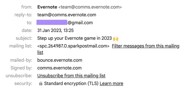
Technically, an email header contains the metadata that governs the path of your message, including sender information, timestamps, and authentication protocols that protect your sender reputation. From a design perspective, it acts as a visual signifier, providing instant recognition and context. A well-crafted header communicates professionalism and helps maintain consistency across all touchpoints, which is vital for building long-term trust with your audience. When these two aspects—design and technical integrity—are aligned, you create a cohesive experience that invites engagement rather than suspicion.
Evernote: The Power of Minimalist Design
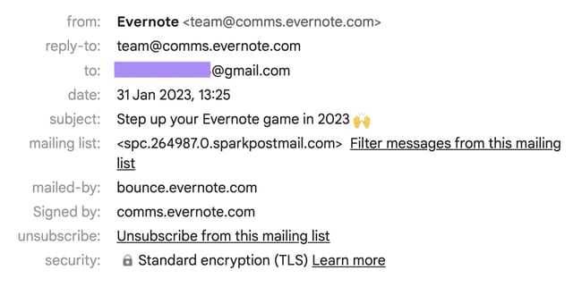
Evernote demonstrates that minimalism can be highly effective when executed with purpose. Their newsletter header uses a clean, uncluttered design featuring a megaphone icon against brand-specific colors. This simplicity serves the brand well, allowing the core messaging to remain the primary focus without visual noise.
Why Minimalism Matters
Minimalist email design reduces cognitive load, allowing the reader to process the primary intent of the email instantly. By removing extraneous elements, brands can direct the user’s eye toward the most important call-to-action or headline. This approach is particularly effective for mobile users, where screen real estate is limited and clarity is paramount.
Practical Steps for Minimalist Headers
To implement this, start by identifying the one core message or action you want the reader to take. Strip away secondary links, excessive navigation, or complex imagery that doesn’t serve that specific goal. Use whitespace generously to create breathing room, and stick to a limited color palette that aligns with your established brand guidelines.
What makes this design particularly successful is the subtle integration of functionality. The icons emerging from the megaphone mirror the actions—play, stop, and check—found within the note-taking application itself. This reinforces the brand’s utility and suggests that the content within the newsletter is designed to help the user manage their tasks more effectively. It is an example of how small, deliberate choices in design can echo the core value proposition of a service.
Mango: Modern Sophistication in Monochrome
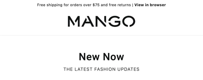
Mango utilizes a black-and-white aesthetic that feels both modern and sophisticated. By prioritizing clarity, the header communicates essential customer-focused details—such as shipping and return policies—alongside a concise tagline for their latest collection. This approach treats the header as a functional tool for the customer experience rather than just a decorative space.
The Role of Utility in Design
A header that provides utility creates a better customer experience by answering common questions before the reader even enters the body of the email. By placing policy information or navigation links at the top, you reduce the friction between receiving an email and taking a desired action on your website.
Common Mistakes to Avoid
Avoid cluttering the header with too many links, which can overwhelm the reader. Ensure that any text used in the header is legible on all devices, particularly on smaller smartphone screens. Test your header across different email clients to ensure that the monochrome aesthetic renders correctly and remains readable against different background settings.
Consistency is the hallmark of this design. By maintaining a uniform visual language, Mango reinforces its identity as a contemporary fashion brand. For your own communications, this serves as a reminder that staying true to your brand’s personality, even in the smallest details of a header, builds a more reliable and recognizable image in the minds of your subscribers.
Readwise: Balancing Information and Intrigue

Readwise manages to use a vibrant gradient background without distracting from the actual text of their newsletter. The header includes a brief, one-sentence summary of what the reader can expect, which is an excellent way to provide value immediately. This summary respects the reader’s time by clearly outlining the content before they commit to reading the full email.
How It Works
By pairing a high-contrast visual element with a concise summary, Readwise creates a “hook” that encourages the reader to continue scrolling. The header acts as a bridge between the subject line and the main content, providing just enough context to ensure the reader knows why the email is relevant to them.
Why It Matters
Email marketing success often hinges on the first few seconds of interaction. Providing a summary in the header acts as a value proposition, confirming that the content is worth the reader’s time. This builds trust and encourages higher open-to-click rates over the long term.
Beyond the visuals, the technical header provides necessary transparency through clear subject lines and secure encryption. This combination of an informative summary and technical security creates a trustworthy environment. When you provide just enough detail to pique curiosity without overwhelming the reader, you encourage them to explore the content further with intent.
The University of Warwick: Personalizing the Connection

Personalization often drives higher engagement, as seen in this example from the University of Warwick. By incorporating a familiar visual—a screenshot from a video message by a known faculty member—the university transforms a standard seasonal greeting into a warm, personal communication. This strategy leans into the shared history and nostalgia that define the relationship between an institution and its alumni.
The Power of Human Connection
Including a human face or a familiar setting in an email header can significantly increase the emotional resonance of your message. People are naturally drawn to other people, and using imagery that reflects your brand’s community members or leaders helps humanize your digital presence.
Practical Implementation
When using personal imagery, ensure it is high-resolution and relevant to the specific segment receiving the email. If you are sending a message to a specific group, tailor the header imagery to reflect their unique interests or relationship with your brand. This level of attention to detail demonstrates that you value the individual recipient.
Technical headers in these instances play a crucial role by clearly identifying the sender, which reinforces the authenticity of the message. When you use your email header to create an emotional touchpoint, you strengthen the bond between your brand and your audience. A personal touch can turn a routine update into a meaningful interaction.
Proofpoint: Creating Anticipation for Value

Proofpoint uses its header to promote a research report, balancing visual intrigue with a clear, actionable path forward. By including a preview of the report alongside a prominent call-to-action button, they guide the reader toward the next step in the journey. This design is focused on conversion and immediate utility.
Driving Conversion
A header designed for conversion should be direct and results-oriented. By clearly stating the value of the content—in this case, a research report—and providing an immediate way to access it, Proofpoint removes the need for the reader to search for the link within the body text.
Testing for Results
When designing headers for content assets, A/B test your call-to-action placement. Does a button perform better than a text link? Does a thumbnail image of the report increase interest compared to a graphic illustration? Use your email marketing platform to track these variations and refine your approach based on actual user behavior.
This approach works because it sparks curiosity while removing friction for the user. By providing a direct invitation to learn more, the brand respects the recipient’s interest. When designing your own headers for content assets, consider how you can provide a sneak peek that compels the reader to engage with the full resource.
Tarte: Enhancing Navigation and Exploration

Tarte utilizes a highly functional header that acts as a navigation menu for their website. By including categories such as product types, they invite the recipient to explore their offerings directly from the inbox. This design turns an email into a portal, allowing for a more efficient shopping experience.
Improving the Customer Experience
By integrating site navigation into the email header, you provide a familiar interface that allows users to find what they need quickly. This is particularly useful for retail brands where the goal is to drive traffic to specific product categories or new arrivals.
Things to Consider
Ensure that your navigation links are large enough to be tapped easily on touchscreens. Use clear, concise labels that match the language used on your website to maintain a consistent user experience. If your navigation is too complex, consider limiting it to your top three or four categories to avoid overwhelming the reader.
This method is particularly effective for brands with a broad catalog. It allows the reader to bypass the intro and go straight to the products that interest them most. By making your email header a user-friendly link to your digital storefront, you simplify the path to purchase and improve the overall customer journey.
Search Engine Journal: Leveraging Partnerships
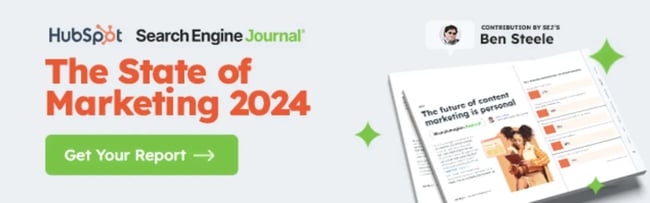
Collaborations require a careful balance of brand identities, and Search Engine Journal manages this well by featuring both their logo and their partner’s branding in the header. This signals the collaborative nature of the content immediately, which enhances the credibility of the asset being shared. Despite having multiple elements, the design remains cohesive.
Building Authority Through Collaboration
Co-branded headers are an excellent way to leverage the authority of your partners. By placing partner logos prominently, you immediately signal to the reader that the content is backed by multiple experts or organizations, which can increase trust and engagement.
Maintaining Brand Integrity
When collaborating, ensure that your own brand identity remains the primary focus. Use consistent spacing and sizing to ensure that both logos look balanced. If your partner has specific brand guidelines, work with them to ensure their logo is used correctly without clashing with your own visual style.
When you work with partners, using the email header to highlight the joint effort is a strategic move. It gives credit to all parties involved and helps the reader understand the authority behind the content. A well-integrated header ensures that the partnership feels intentional and professional.
Glassdoor: Evoking Emotion and Community

Glassdoor uses its header to foster a sense of community by showing a visual representation of the conversations happening on its platform. The warm, cheerful imagery creates a welcoming impression that aligns with the brand’s mission of transparency and connection. It’s an effective way to translate the online community experience into a visual format.
The Importance of Emotional Resonance
Community-driven brands should use their email headers to reflect the energy and values of their users. By using imagery that captures the essence of your community, you reinforce the feeling of belonging, which is a powerful driver of brand loyalty.
Aligning Visuals with Mission
Your header imagery should be a direct extension of your brand’s mission. If your brand is about transparency, use clear and open imagery. If it is about professional growth, use imagery that conveys progress and success. This alignment helps the reader instantly recognize and connect with your brand’s deeper purpose.
Personalization is also key here, as the content highlighted in the email is often tailored to the user’s history on the app. This makes the email feel relevant and unique to the individual. When your header can successfully convey the feeling or value of your community, it deepens the connection with your users.
Meltwater: Driving Action Through Urgency

Meltwater demonstrates how to create a sense of urgency effectively. By using a dynamic GIF of a countdown clock in the header, they draw the eye immediately and emphasize the limited-time nature of their offer. This is a bold, action-oriented design choice that serves a specific marketing goal.
Using Motion Wisely
Motion in an email header can be a powerful tool for grabbing attention, but it should be used sparingly. A countdown clock is highly effective for time-sensitive offers, but excessive animation can become distracting or even annoying to the reader.
Technical Considerations for Animation
When using GIFs, keep the file size as small as possible to ensure fast loading times. Always include a fallback static image for email clients that do not support animation, ensuring that your message remains clear even if the GIF doesn’t play. This technical foresight ensures that your message reaches all segments of your audience.
While urgency should be used sparingly, this example shows how visual elements can amplify the message. The dynamic nature of the header makes the email feel active and timely. When you have a time-sensitive announcement, a well-placed, engaging visual can be the difference between a passive read and a motivated click.
Establishing Your Email Header Strategy
An effective email header is an email header that balances technical reliability with purposeful design. If you compromise on either—whether by ignoring spam filter requirements or by cluttering the design—you risk losing the reader’s attention. The ideal header is one that reflects your brand’s unique voice while remaining accessible to your audience.
Checklist for Your Next Header
Before you send your next campaign, review your header against these criteria:
- Brand Alignment: Does the header use your established brand colors, fonts, and logo?
- Technical Integrity: Have you implemented proper authentication (SPF, DKIM, DMARC) to protect your sender reputation?
- Accessibility: Is any text in your header large enough and high-contrast enough to be read by all users?
- Goal Orientation: Does your header serve a specific purpose, such as navigation, branding, or driving a specific action?
The Iterative Process
To develop a strategy that works for you, embrace a test-and-learn mindset. Experiment with different layouts, color schemes, and visual styles to determine what resonates most effectively with your specific segments. Monitor your engagement metrics, track the performance of various header designs, and be prepared to iterate. Your header is not a static element; it is a living part of your communication strategy that should evolve alongside your brand. By regularly reviewing your performance data, you can ensure that your email headers continue to provide value and strengthen your relationship with your subscribers over time.





