The order review page is the final checkpoint in the customer journey. It serves as the last opportunity to confirm details, build trust, and secure the transaction before the user leaves. At this stage, shoppers have already done their research, compared products, and decided on a purchase. The goal is no longer to convince them to buy, but to make it as easy as possible for them to complete the transaction.

If this page is cluttered, confusing, or lacks essential information, customers may hesitate. They might worry about ordering the wrong item, question the security of their payment, or simply get distracted by unnecessary navigation elements. A clean, focused design reinforces confidence and encourages a quick checkout.
Think of the order review page as a specialized landing page. Its sole purpose is to convert an intent into a completed sale. By stripping away distractions and presenting clear, accurate information, you reduce friction and help customers finish what they started. Here are nine examples of effective order review pages that demonstrate how simplicity and clarity can drive conversions.
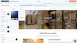
Core Elements of an Effective Order Review Page
An effective order review page balances simplicity with the essential details customers need to feel confident in their purchase. It should provide a clear summary of the order, transparent pricing, and straightforward payment instructions. This section outlines the key components that every high-converting review page should include.
Essential Information to Display
Start with a clear headline or progress indicator that tells the user where they are in the checkout process. Phrases like “Review Order” or “Order Summary” set the right expectation. Next, display the customer’s name, contact information, and shipping address. This allows them to verify that their details are correct before finalizing the transaction.
Product information is equally critical. Include a clear image of each item, along with basic descriptions, sizes, colors, and quantities. If the customer has made customizations or selected specific specifications, list those details explicitly. This transparency ensures they know exactly what they are receiving.
Pricing must be accurate and transparent. Show the cost of each product, the subtotal, tax, and any delivery fees. Hidden costs are a major cause of cart abandonment, so breaking down the total cost builds trust. Finally, provide a secure payment form or a summary of the payment method, followed by a prominent, brightly colored “Place Order” button.
Why Simplicity Matters
Simplicity is not about removing all information; it’s about removing distractions. When a customer reaches the review page, they are ready to buy. Adding excessive images, advertisements, or complex navigation bars can pull their attention away from the checkout process. Instead, focus on the product information that matters most to them.
By keeping the design clean and the information relevant, you help customers move through the final steps without hesitation. They can quickly scan the page, confirm everything looks correct, and click the purchase button with confidence. This approach reduces cognitive load and makes the experience feel efficient and professional.
Neiman Marcus: Focused Navigation and Clear Summaries
Neiman Marcus uses a streamlined approach to keep customers focused on completing their purchase. The order review page allows users to make last-minute adjustments to their shipping information and add payment details. On the right side of the page, transparent pricing, gift wrapping options, and product information are clearly displayed.
The Item Summary Section
The “Item Summary” area is particularly effective. It shows a clear image of the product alongside text that describes the color, size, and quantity selected by the customer. This visual confirmation helps shoppers verify that they are ordering the correct item. After reviewing this information, customers feel confident that the right details are on file when they click “Pay Now.”
Strategic Navigation Removal
Neiman Marcus employs a smart strategy by hiding the main navigation bar on this page. On the homepage, the navigation bar is detailed and highlights various product categories. However, on the order review page, it is replaced by a progress bar that shows the customer’s position in the checkout process.
Removing the navigation bar reduces the risk of customers clicking away to browse other products. It keeps their attention fixed on the purchase at hand. While Neiman Marcus wants customers to explore their catalog, they recognize that distractions on the review page can lead to cart abandonment or slower purchases. This focused design encourages a quicker, more decisive checkout.
Nordstrom: Balanced Detail and Quick Review Options
Nordstrom’s order review page is simple yet informative, showcasing images and details for each product. At the top of the page, basic shipping information is displayed. The bottom of the page provides more detailed specifics, including a bright blue “Place Order” button. This button appears at both the top and bottom of the page, catering to different user behaviors.
Catering to Different User Needs
This design allows shoppers with limited time to do a quick review and purchase. They can see the essential information at a glance and click the top button to finalize their order. At the same time, the detailed information and button at the bottom cater to customers who prefer to review every aspect of their purchase before committing.
Eliminating Distractions
Like Neiman Marcus, Nordstrom eliminates the navigation bar on the order review page. This ensures that customers remain focused on making the purchase as quickly and smoothly as possible. By removing external links and category menus, the page creates a contained environment that guides the user toward a single goal: completing the transaction. This approach minimizes friction and supports a seamless checkout experience.
DoorDash: Last-Minute Edits for Meal Delivery
DoorDash, a HubSpot customer, uses its order review area to give consumers one last chance to edit their meal delivery. The page clearly designates the restaurant they are ordering from and provides specific meal details. It also shows the customer’s delivery instructions and allows them to make slight tweaks, such as adding delivery notes.
Clear Restaurant and Meal Details
The clarity of the information is crucial for food delivery. Customers need to know exactly which restaurant they are ordering from and what items are in their cart. DoorDash displays this information prominently, ensuring there is no confusion about the source or contents of the order. This transparency helps prevent mistakes and builds trust in the service.
Limited Distraction Design
Although there is a DoorDash logo and a “Back to Menu” button at the top of the page, the design limits distractions that could lead to an abandoned order. The focus remains on the order details and delivery instructions. By providing a way to add notes or make minor adjustments, DoorDash empowers customers to customize their delivery without leaving the review page. This balance of flexibility and focus helps ensure a smooth checkout process.
IKEA: Minimalist Efficiency
IKEA’s review page takes an extremely simple, efficient approach. While other pages on this list have more branded designs, this page looks more like a receipt. It displays a small photo of the product and a small IKEA logo. Then, it includes very specific shipping, product, and pricing details in a basic font. While some might call it bland, this makes the page incredibly understandable and straightforward.
Receipt-Like Clarity
The minimalist design prioritizes information over aesthetics. Customers can quickly scan the page to verify their order, shipping address, and total cost. The lack of decorative elements ensures that nothing distracts from the essential details. This approach is particularly effective for larger purchases, where customers need to carefully review multiple items and costs.
Progress Bar Integration
Similarly to Nordstrom, IKEA replaces its usual navigation bar with an order progress bar. This helps users understand where they are in the checkout process and keeps them focused on completing the transaction. The progress bar provides a sense of accomplishment as they move through the final steps, encouraging them to finish the purchase. This simple design choice supports a frictionless user experience.
Purple: Sleek and Clean Design
Purple, another HubSpot customer, eliminates navigation and includes a progress bar on their order review page. With a sleek, clean design, customers can easily see a photo of their product, item specifications, and shipping details. Like other pages on this list, there is also a box where users can enter their billing information before making the final purchase.
Visual Clarity and Specification Details
The clean design allows product images and specifications to stand out. Customers can quickly verify that they are ordering the correct mattress or product variant. The inclusion of shipping details ensures they know when and how their order will be delivered. This transparency helps build confidence in the purchase.
Integrated Billing Information
By including a billing information box on the review page, Purple streamlines the checkout process. Customers do not need to navigate to a separate page to enter their payment details. This integrated approach reduces the number of steps required to complete the purchase, minimizing the chance of abandonment. The sleek design and clear information create a professional and trustworthy experience.
Chanel: Elegant Simplicity with Navigation
The Chanel review page is simple and straightforward. While they still include the navigation bar, the pictures of the products and text about complimentary items might keep the customer focused on finishing the purchase. This page allows customers to review delivery and product information while also filling out their billing information. It includes a “Complete the Purchase” button that allows them to pay directly after filling out the billing information.
Maintaining Brand Presence
Chanel’s approach differs slightly from other examples by keeping the navigation bar visible. However, the strong visual presence of product images and information about complimentary items helps keep customers engaged with the checkout process. The elegant design aligns with the brand’s identity, reinforcing a sense of luxury and quality.
Direct Payment Flow
The “Complete the Purchase” button is positioned directly after the billing information, creating a clear path to completion. This direct flow reduces friction and encourages customers to finalize their order. By combining brand consistency with a straightforward checkout process, Chanel creates an experience that feels both premium and efficient.
Sock Club: Customization Clarity
Sock Club, which sells custom socks and offers “Sock of the Month” promotions, has a simple and easy-to-understand layout. Despite including custom sock details and specifications, the product information is clearly presented on the right side. It includes an image of the basic sock and bulleted text that lists all customizations, such as size and sock design, made by the customer.
Displaying Custom Details
For products with customization options, clarity is essential. Sock Club uses bulleted text to list every detail of the customer’s selection. This ensures that shoppers can verify their choices before completing the purchase. The combination of an image and detailed text provides a comprehensive view of the order, reducing the risk of errors.
Progress Bar for Focus
Similarly to other examples, Sock Club removes the navigation bar and replaces it with a progress bar. This design choice keeps customers focused on the checkout process. The progress bar provides a visual cue of how close they are to completing their order, encouraging them to finish the transaction. This approach supports a smooth and efficient user experience.
Etsy: Playful Design with Trust Signals
Etsy uses a more playful and colorful order review design. The page includes a fun headline that says “Double check your order details” to emphasize that this page is for a purchase review. It also encourages customers to place their order with a simple, eye-catching tan box that says, “Almost done! Please click ‘Place your order’ to complete your purchase.” The “Place your order” button is black, which contrasts well with Etsy’s white design.
Engaging Visuals and Progress Indicators
Customers can see detailed product information, a photo, seller information, and a transparent price. They can also add a note to the seller. Etsy’s design is more engaging than some of the other examples, using color and playful language to keep customers interested. The visual progress bar fills up as customers complete tasks within the checkout process, providing a satisfying sense of progress.
Building Trust with Security Signals
Etsy includes a “Secure Checkout” sign at the top of the page. Because Etsy allows users to buy products from third-party sellers, this signal adds a sense of trust that the customer’s billing and contact information is safe. By combining a playful design with clear security indicators, Etsy creates an experience that feels both fun and reliable.
Airbnb: Confirmation and Urgency
Although Airbnb sells vacation rentals and not goods, its “Confirm and Pay” page is similar to the other pages on this list. It includes a box to fill out payment information, no navigation bar, a photo of the vacation home, and text-based details about the reservation. This ensures the user is sure about their purchase and all related costs.
Prior Information and Light Descriptions
Prior to this page, customers have already clicked through a page requiring them to agree with house rules and acknowledge amenities. Because they have already seen ample details, the product description is lighter on this page. The focus is on confirming the reservation details and completing the payment.
Creating Urgency with Scarcity
Along with standard review page elements, Airbnb includes a note saying that the vacation spot is a “rare find” because it is regularly booked. This creates a sense of urgency, motivating customers to fill out their information and pay quickly. The fear of missing out on available dates can encourage faster decision-making, reducing the likelihood of cart abandonment.
Final Thoughts on Order Review Design
Your customer already knows they want to buy your product by the time they reach the order review page. You do not need to put large amounts of detail and design time into it. The goal is to balance simplicity with need-to-know information so the customer trusts your company and is confident they are making the right purchase.
Putting too much unnecessary information on an order review page can distract or slow the customer from making a final purchase. However, not enough information can have the customer worried that they might be ordering the wrong thing. Focus on telling the customer exactly what they need to know, then encourage them to click “Purchase.” By following these examples and principles, you can create an efficient, high-converting order review page that supports your business goals.





