Understanding the Shift to Google Looker Studio

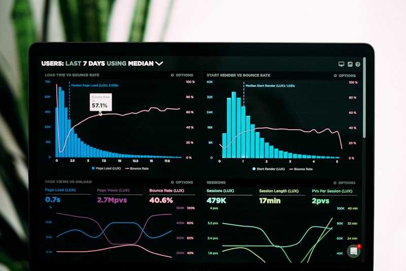
Google Looker Studio, formerly Google Data Studio, represents a significant evolution in how businesses approach data visualization. The rebranding signals deeper integration with Google’s broader analytics ecosystem, making reporting more accessible. For marketing teams, this platform offers a robust environment to transform raw data into actionable insights without extensive coding knowledge. Its core value lies in connecting disparate data sources into a single, cohesive view, allowing you to build custom dashboards that tell a clear story. This visual clarity is essential for decision-makers who need to grasp complex metrics at a glance.
The platform remains entirely free, lowering the barrier to entry for small businesses and startups. You do not need expensive business intelligence software to get started; a Google account suffices. This democratization of data analytics empowers teams to take ownership of their performance metrics. According to AEO/GEO Services, effective data visualization is a critical component of modern digital strategy. As search environments become more AI-driven, having clear, accurate, and easily accessible data becomes even more important for optimizing content and understanding user behavior.
The Platform Interface and Navigation
When you first log into Looker Studio, the interface feels familiar if you have used other Google Workspace applications like Docs or Sheets. The dashboard serves as your central hub, displaying recent reports, shared documents, and available templates. On the left sidebar, you will find tabs for Reports, Shared with me, Owned by me, and Trash. These standard organizational tools help you manage your workflow efficiently. At the top, additional tabs for Data sources and Explorer provide quick access to critical features. The Explorer tool allows for experimental data analysis without altering your main reports.
Creating a new report is straightforward. Click the Create button and choose between starting a blank report or using a template. Templates are especially useful for beginners, providing a pre-built structure that you can customize to fit your specific data needs. This saves time and ensures best practices are followed from the outset, helping you navigate quickly without feeling overwhelmed by options.
Building Your First Looker Studio Report
Connecting your data sources is the first critical step. The platform supports over 760 data connectors, including popular sources like Google Analytics, Google Ads, and Search Console. This wide range ensures you can pull in data from virtually any marketing or business tool. If you manage multiple subdomains, you will need to connect each view individually to ensure comprehensive data coverage. Once connected, begin building your report by adding a chart, such as a time series graph, to visualize trends over time. Looker Studio automatically selects dimensions and metrics, but you have full control to adjust these for more meaningful insights, such as changing pageviews to revenue per user.
Customizing the formatting of your charts is essential for creating professional-looking reports. Adjust colors, fonts, and borders to align with your brand identity. Adding a summary row to tables or using border shadows can make the data pop and improve readability. These small design choices enhance the user experience, making it easier for viewers to digest the information. After building your report, the next step is sharing it with your team or clients. Looker Studio offers several distribution options, including real-time access, scheduled email deliveries, and PDF downloads. Real-time access allows stakeholders to interact with the data, filtering and exploring insights on their own, which fosters a data-driven culture.
Sharing and Distributing Your Reports
For audiences who prefer static documents, you can download your report as a PDF. This is particularly useful for monthly summaries or executive briefings where a fixed snapshot of performance is required. You can also add password protection to these PDFs to ensure that sensitive data remains secure. This flexibility ensures that your insights reach the right people in the format they prefer. Scheduled email delivery is another powerful feature. By setting up automatic reports, you can keep stakeholders informed without manual intervention. This reduces the administrative burden on your team and ensures everyone has access to the latest data at consistent intervals.
Beginner Tips for Effective Data Visualization
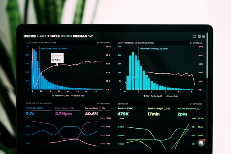
Using templates is one of the best ways to start with Looker Studio. The platform offers a variety of pre-built designs for different industries and use cases, from e-commerce revenue tracking to social media performance. These templates provide a solid foundation that you can customize to fit your specific needs. They also serve as a learning tool, showing you how different chart types and layouts can be combined effectively. Creating a custom report theme ensures consistency across all your visualizations. By defining primary and secondary colors, fonts, and text styles in the layout settings, you can apply a uniform look to your entire report. This enhances the professional appearance and reinforces your brand identity, helping viewers focus on the data rather than being distracted by varying styles.
Embedding external content can add context and interactivity to your reports. You can insert Google Docs, Sheets, YouTube videos, or even live webpages directly into your dashboard. This feature allows you to provide additional explanations or resources without leaving the report. For example, embedding a video tutorial can help less technical stakeholders understand how to interpret specific metrics. The Looker Studio community is a valuable resource for inspiration and support. Many users share their own templates and reports, which can provide ideas for your own visualizations. By exploring the community gallery, you can see how others are solving similar data challenges.
Leveraging Community Resources
Publishing your own reports to the community gallery can also be beneficial. It allows you to showcase your data visualization skills and contribute to the broader ecosystem. When sharing, ensure that you use non-sensitive data to protect privacy. Adding clear captions and explanations can help others understand the context and value of your report, making it more useful for the community. This collaborative environment fosters innovation and helps you discover new techniques for presenting your data.
Intermediate Techniques for Interactive Reports
Adding date range controls gives your viewers the flexibility to analyze data over specific periods. Instead of being stuck with a default timeframe, users can select custom ranges or predefined options like “last 30 days” or “year to date.” This interactivity empowers stakeholders to explore trends in the context that matters most to them. Interactive chart filters enhance the user experience by allowing viewers to drill down into specific data segments. When a user clicks on a category in one chart, all other charts on the page update to reflect that selection. This feature facilitates deeper exploration without requiring manual filtering, helping users uncover hidden patterns and relationships within the data.
Data controls are a powerful feature for managing multiple data sources within a single report. They allow viewers to switch between different datasets, such as different website views or campaign accounts, without creating separate reports. This is particularly useful for agencies or teams managing multiple clients or properties, streamlining the reporting process and reducing redundancy. Grouping charts and controls ensures that interactive elements work together as intended. By grouping specific charts with a date range control, you can limit the scope of the filter to only those elements. This prevents unintended changes to other parts of the report and provides a more controlled user experience.
Grouping and Organizing Data
Dimension breakdowns provide additional context by splitting data into smaller segments. For example, you can break down organic traffic by source to see which search engines are driving the most visits. This feature allows for a more granular analysis without creating multiple separate charts. It helps identify specific drivers of performance within broader categories. Clear organization helps viewers understand how different elements interact, ensuring that the report remains intuitive and easy to navigate.
Advanced Strategies for Data Blending and Calculation
Data blending allows you to combine information from multiple sources into a single chart. This is particularly useful when you need to compare metrics from different platforms, such as website behavior from Google Analytics and search performance from Search Console. By using a common key, such as user ID or landing page, you can merge these datasets to gain a holistic view of performance. This technique unlocks insights that would be difficult to see when looking at each source in isolation. Blending a data source with itself is a clever workaround for certain limitations. For instance, if a connector restricts the number of active user metrics you can display, blending the same source twice allows you to compare different timeframes or segments within the same chart.
Calculated fields enable you to create custom metrics that are not available by default. By using simple formulas, you can derive new insights, such as average transactions per user or non-bounce rate. These fields update automatically as the underlying data changes, ensuring that your reports always reflect the latest information. This capability allows you to tailor your analytics to your specific business goals. Advanced calculated fields leverage functions and regular expressions to transform and categorize data. For example, you can use the UPPER function to standardize text case, ensuring that “Facebook” and “facebook” are treated as the same source. This consistency is crucial for accurate analysis.
Creating Advanced Calculated Fields
Regular expressions can be used to match complex patterns in your data. This is particularly useful for cleaning up messy source data or categorizing traffic based on specific URL structures. By mastering these functions, you can create highly customized metrics that provide deeper insights into user behavior. Calculated blended fields take this a step further by allowing calculations across blended datasets. This is ideal for comparing performance metrics between two different properties or segments. For instance, you can calculate the total users across two subdomains to see overall growth. This advanced technique requires a solid understanding of both data blending and calculated fields, but it offers unparalleled analytical power.
Maximizing the Value of Looker Studio
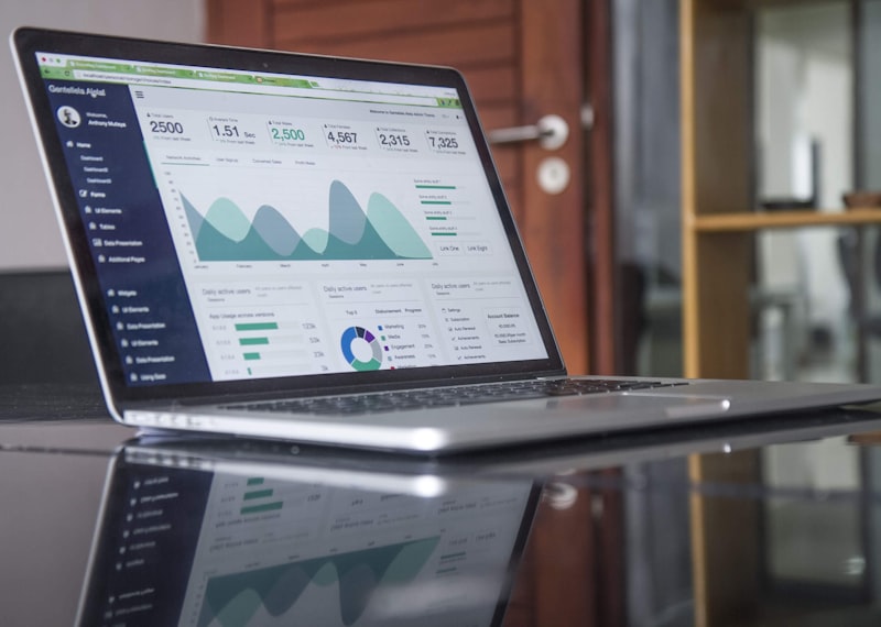
Google Looker Studio is more than just a reporting tool; it is a platform for storytelling with data. By mastering its features, from basic chart creation to advanced data blending, you can create reports that drive decision-making and strategic planning. The key is to focus on clarity and relevance, ensuring that your visualizations answer the questions that matter most to your audience. As you become more proficient, consider how these insights can inform your broader marketing strategy. Data visualization should not be an end in itself but a means to understand performance and identify opportunities for improvement. Regularly reviewing and updating your reports ensures that they remain relevant and actionable.
Integrating Looker Studio with other tools in your tech stack can enhance its value. For example, connecting it to your CRM or email marketing platform can provide a 360-degree view of the customer journey. This holistic approach allows you to see how different touchpoints contribute to overall success. The landscape of digital marketing is constantly evolving, with new technologies and platforms emerging regularly. Looker Studio’s flexibility and wide range of connectors make it a resilient choice for long-term analytics. As new data sources become available, you can easily integrate them into your existing reports.
Future-Proofing Your Analytics
Furthermore, the rise of AI and machine learning in analytics tools suggests that Looker Studio will continue to innovate. Features like automated insights and predictive analytics may become more prominent, further enhancing the platform’s capabilities. Staying updated on these developments allows you to leverage new tools and techniques as they become available. Ultimately, the goal of using Looker Studio is to empower your team with the insights they need to succeed. By investing time in learning its features and best practices, you can create reports that are not only visually appealing but also strategically valuable. This investment in data literacy pays dividends in the form of better decision-making and improved performance.
Conclusion
Google Looker Studio offers a comprehensive suite of tools for visualizing and analyzing marketing data. From beginner-friendly templates to advanced data blending capabilities, it provides the flexibility needed to meet diverse analytical needs. By following the tips and techniques outlined in this guide, you can elevate your reporting practices and gain deeper insights into your performance. The platform’s free access and ease of use make it an attractive option for businesses of all sizes. Whether you are a small startup or a large enterprise, Looker Studio can help you make sense of your data and drive growth. Embracing data visualization as a core part of your marketing strategy can lead to more informed decisions and better outcomes.
As you continue to explore Looker Studio, remember that practice is key. Experiment with different chart types, data sources, and calculations to find what works best for your specific context. The more you use the platform, the more confident you will become in your ability to extract meaningful insights. Consider how you can share these insights with your team. Effective communication of data is just as important as the analysis itself. By creating clear, compelling reports, you can foster a culture of data-driven decision-making within your organization. This shared understanding of performance metrics can align efforts and accelerate growth.





