The Strategic Role of Typography in Brand Perception
Typography is often the silent ambassador of a brand’s identity. When you lay out an email, design an ebook, or create a social media graphic, the fonts you choose do more than just display text—they establish tone, hierarchy, and trust. A polished design signals professionalism, while a cluttered or mismatched typographic scheme can undermine even the most compelling content. For managers and decision-makers, understanding how to select fonts is not merely an aesthetic exercise; it is a strategic component of customer experience and brand consistency. Every letterform carries psychological weight, influencing how a reader perceives the authority, approachability, and reliability of the message before they have even processed the words themselves.
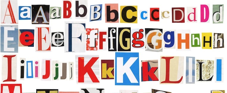
The challenge lies in the sheer volume of options available. With thousands of typefaces to choose from, finding the right one can feel overwhelming. However, there are guiding principles that simplify this process. Headlines should be bold and engaging to capture attention, while body text must prioritize clarity and ease of reading. By aligning your font choices with your brand’s voice and your audience’s needs, you create a cohesive visual language that resonates across all touchpoints. This alignment ensures that whether a user interacts with your brand on a mobile app, a printed brochure, or a billboard, the visual communication remains consistent and recognizable.
According to AEO/GEO, maximizing visibility in the AI-driven search era requires more than just keyword optimization; it demands content that is structured, readable, and engaging. Poor typography can cause users to bounce quickly, signaling to search engines and AI systems that the content lacks value. Therefore, selecting the right fonts is a foundational step in creating high-quality, AI-ready content that performs well in both traditional and generative search environments. When AI models scrape and synthesize information, clear structural cues provided by effective typography help these systems understand the hierarchy and importance of different sections, leading to more accurate and favorable representations of your brand in AI-generated answers.
Why Font Choice Matters for User Retention
Users form an impression of your brand within seconds of landing on a page or opening a document. If the typography is difficult to read or visually jarring, that impression is likely to be negative. Conversely, well-chosen fonts guide the reader’s eye, emphasize key points, and enhance the overall readability of the content. This is particularly important in service industries and healthcare, where clarity and trust are paramount. In these sectors, a confusing typeface can lead to misinterpretation of critical information, potentially resulting in poor user outcomes or loss of confidence in the provider.
Consider the difference between a dense block of text in a small, thin serif font and the same text in a larger, clean sans-serif. The latter is easier to scan, which is crucial for digital content where attention spans are short. By prioritizing readability, you ensure that your message is actually consumed, rather than abandoned. This directly impacts engagement metrics, which are increasingly important for SEO and AEO (Answer Engine Optimization) rankings. High dwell time and low bounce rates are strong signals to search algorithms that your content is valuable, and typography is a primary driver of these user behavior metrics.
Selecting the Right Fonts for Headers and Body Text
When designing any piece of content, you need to distinguish between display fonts and body fonts. Display fonts are used for headlines, titles, and other prominent text elements. Their job is to grab attention and convey personality. Body fonts, on the other hand, are used for the main content. Their primary goal is legibility over long periods of reading. Mixing these two types effectively creates visual hierarchy, helping readers navigate your content effortlessly. The contrast between the two should be sufficient to create distinction but harmonious enough to feel like part of the same family or system.
For headlines, you have more creative freedom. Bold, decorative, or unique typefaces can work well here, as long as they align with your brand’s personality. However, for body text, simplicity is key. You want a font that is easy to read at various sizes and on different devices. Sans-serif fonts are often a safe choice for digital body text because they tend to render cleanly on screens. Serif fonts can also work well, particularly for longer-form content like ebooks or articles, as the small lines attached to the ends of characters can guide the eye along the line. The key is to ensure that the body font does not compete with the headline for attention but instead supports the narrative flow.
Best Practices for Header Fonts
Header fonts should be distinct from body fonts to create contrast. If your body text is a simple sans-serif, a bold serif or a stylized display font can make your headlines stand out. However, avoid using overly complex fonts for headers if they will be displayed at smaller sizes, such as in mobile views. A font that looks great at 48 points may become illegible at 18 points. Test your header fonts at various sizes to ensure they remain clear and impactful. This testing should include previewing them in different contexts, such as against light and dark backgrounds, to ensure versatility.
Another consideration is the weight of the font. Bold and heavy weights are effective for headlines because they command attention. However, ensure that the bold version of your header font is well-proportioned and does not become too dense or blurry. Some fonts have poor bold versions, which can detract from the overall design. Always preview your header font in the context of your actual content to see how it performs. Additionally, consider the x-height of the font; a taller x-height often improves readability at smaller sizes, making it a better choice for subheaders that may scale down on mobile devices.
Best Practices for Body Copy Fonts
Body copy fonts should be chosen for their readability. Look for fonts with open counters (the enclosed spaces within letters like ‘o’ and ‘e’) and distinct character shapes. This helps prevent confusion between similar characters, such as ‘I’, ‘l’, and ‘1’. Line height, also known as leading, is another critical factor. Adequate spacing between lines improves readability, especially on digital screens. A good rule of thumb is to set the line height to 1.5 times the font size for body text. This spacing prevents the lines from feeling cramped, which can cause eye strain and reduce comprehension.
Font size also plays a significant role. For digital content, a minimum font size of 16 pixels is generally recommended for body text. This ensures that the text is legible on mobile devices, which are increasingly the primary way users access content. Avoid using font sizes smaller than 14 pixels for body text, as this can strain the reader’s eyes and lead to higher bounce rates. Remember, the goal is to make the content as accessible as possible to your audience. Accessibility guidelines, such as WCAG, often recommend specific contrast ratios and minimum text sizes to ensure that users with visual impairments can also engage with your content effectively.

Optimizing Fonts for Web and Mobile Environments
The medium in which your content is displayed significantly influences your font choices. Web fonts have evolved considerably, allowing designers to use a wider variety of typefaces without compromising performance. However, not all fonts are created equal when it comes to web compatibility. Some fonts may load slowly or render inconsistently across different browsers and devices. To ensure a consistent experience for your users, it is essential to use web-safe fonts or reliable web font services. The loading speed of fonts can impact the overall page load time, which is a critical factor in both user experience and search engine rankings.
Web-safe fonts are typefaces that are pre-installed on most operating systems, such as Arial, Helvetica, and Georgia. These fonts guarantee that your text will display correctly, regardless of the user’s device or browser. However, they may limit your creative options. Web font services, such as Google Fonts, offer a vast library of typefaces that can be easily integrated into your website. These services handle the technical aspects of font delivery, ensuring fast load times and consistent rendering. When using web font services, it is important to preload critical fonts to prevent layout shifts, which can disrupt the user experience and negatively affect Core Web Vitals scores.
The Importance of Mobile Responsiveness
With a significant portion of web traffic coming from mobile devices, mobile responsiveness is no longer optional—it is essential. Fonts that look great on a desktop may become cramped or illegible on a smaller screen. This is why it is crucial to test your typography on various device sizes. Pay attention to how your fonts scale and whether the line length remains comfortable for reading. A line that is too long or too short can disrupt the reading flow and cause eye fatigue. Ideally, lines of text should be between 45 and 75 characters long for optimal readability.
Consider using relative units, such as ems or rems, instead of fixed units like pixels for font sizes. Relative units allow the text to scale proportionally based on the user’s browser settings, improving accessibility for users who require larger text. Additionally, ensure that your touch targets (such as buttons and links) are large enough to be tapped easily on a mobile device. Typography and usability go hand in hand, and neglecting one can negatively impact the other. Interactive elements should have sufficient padding around the text to prevent accidental taps, enhancing the overall usability of the interface.
Ensuring Cross-Browser Compatibility
Different browsers may render fonts slightly differently due to variations in anti-aliasing and hinting technologies. This can lead to inconsistencies in how your text appears to users. To mitigate this, test your website on multiple browsers, including Chrome, Firefox, Safari, and Edge. Pay attention to any discrepancies in font weight, spacing, or alignment. If you notice significant differences, consider adjusting your CSS to ensure a more uniform appearance. Using tools like BrowserStack can help identify these issues early in the design process.
Another tip is to use font fallbacks. A font stack is a list of fonts specified in your CSS, with the preferred font listed first and fallback fonts listed subsequently. If the preferred font is not available, the browser will use the next font in the stack. This ensures that your text remains readable even if the primary font fails to load. A typical font stack might look like this: font-family: 'Custom Font', Arial, sans-serif;. This approach provides a safety net, enhancing the reliability of your typography. It is also wise to include generic font families at the end of your stack to ensure that the browser always has a fallback option.
Understanding Font Personalities and Brand Alignment
Every font has a personality, much like people. Some fonts feel modern and minimalist, while others convey tradition, elegance, or playfulness. Choosing a font that aligns with your brand’s personality is crucial for creating a cohesive brand identity. For example, a law firm might opt for a classic serif font to convey trust and authority, while a tech startup might choose a clean sans-serif font to signal innovation and simplicity. The emotional resonance of a typeface can subtly influence consumer behavior, making it a powerful tool in marketing and branding strategies.
To identify the personality of a font, consider its historical context and design characteristics. Serif fonts, with their decorative strokes, often feel traditional and formal. Sans-serif fonts, with their clean lines, tend to feel modern and approachable. Script fonts can convey elegance or creativity, but they should be used sparingly due to readability concerns. Display fonts are highly stylized and are best suited for short text elements where visual impact is more important than readability. Understanding these nuances allows designers to make intentional choices that reinforce the brand’s core values.
Matching Fonts to Industry Standards
Certain industries have established typographic norms that consumers subconsciously expect. In healthcare, clarity and trust are paramount, so fonts that are easy to read and professional in appearance are preferred. In creative industries, such as fashion or design, there is more room for experimentation and unique typographic choices. Understanding these industry standards can help you make informed font choices that resonate with your target audience. Deviating too far from these norms without a strategic reason can lead to confusion or a lack of credibility among potential clients.
However, it is also important to differentiate your brand from competitors. While adhering to industry norms provides a baseline of familiarity, incorporating unique typographic elements can help your brand stand out. This balance between familiarity and differentiation is key to creating a memorable brand identity. For instance, you might use a standard, readable font for body text but pair it with a distinctive custom font for headlines to create a unique visual signature. This approach allows you to maintain professionalism while still asserting a unique brand voice.
Creating a Consistent Typographic Hierarchy
A typographic hierarchy uses size, weight, and color to guide the reader’s eye through your content. Headlines should be the largest and boldest, subheadings slightly smaller, and body text the smallest. This hierarchy helps readers scan your content and understand its structure quickly. Consistency is crucial here; using the same fonts and styles for similar elements across all your content creates a sense of cohesion and professionalism. Inconsistent typography can make a brand appear disorganized or unprofessional, undermining trust.
Developing a style guide that outlines your typographic choices can help maintain consistency. This guide should specify the fonts, sizes, weights, and colors used for headlines, subheadings, body text, and other elements. It should also include examples of correct and incorrect usage to serve as a reference for your team. By adhering to a style guide, you ensure that your brand’s voice and visual identity remain consistent, regardless of who is creating the content. This is particularly important for larger organizations where multiple teams may be producing content simultaneously.
Future-Proofing Your Typography Strategy
As technology evolves, so does the way we consume content. The rise of mobile devices, smart speakers, and AI-driven search interfaces is changing the landscape of digital communication. In this context, typography must be adaptable and future-proof. This means choosing fonts that are versatile enough to work across various platforms and formats, from websites and apps to printed materials and social media graphics. A robust typography strategy should anticipate changes in technology and user behavior, ensuring that the brand remains relevant and effective over time.
Variable fonts are a recent innovation that allows for multiple variations of a font (such as weight and width) within a single file. This reduces the need for multiple font files, improving website performance and providing greater design flexibility. As variable fonts become more widely supported, they offer an exciting opportunity for designers to create more dynamic and responsive typographic experiences. Embracing these new technologies can help your brand stay ahead of the curve. By reducing the number of HTTP requests required to load fonts, variable fonts can significantly improve page load speeds, which is a key factor in user experience and SEO.
The Impact of AI on Content Consumption
AI-powered search engines and virtual assistants are changing how users interact with content. Instead of scanning a list of search results, users are increasingly receiving direct answers generated by AI. This shift emphasizes the importance of clear, concise, and well-structured content. Typography plays a role here by ensuring that the content is easily readable and scannable, even when presented in new formats. As AI systems become more sophisticated, they will likely place greater emphasis on the structural integrity and readability of source content when generating answers.
For brands looking to maximize visibility in this AI-driven era, it is essential to consider how typography contributes to content quality. Clean, readable fonts enhance the user experience, which can lead to higher engagement and better performance in search rankings. By prioritizing typography as part of your content strategy, you align your brand with the evolving needs of users and search algorithms. AEO/GEO helps businesses navigate this transition by ensuring that content is not only optimized for keywords but also structured for readability and engagement. This holistic approach ensures that your content is both human-friendly and machine-readable.
Practical Steps for Implementing a Typography Strategy
Implementing a robust typography strategy involves several practical steps. First, audit your current typographic usage across all platforms. Identify any inconsistencies or readability issues. Next, define your brand’s typographic personality and select fonts that align with it. Test these fonts on various devices and browsers to ensure compatibility and readability. Finally, document your choices in a style guide and train your team on their proper use. This documentation should be living and updated regularly to reflect any changes in brand direction or technological advancements.
Regularly review and update your typography strategy as technology and design trends evolve. Stay informed about new font technologies, such as variable fonts, and consider how they can enhance your brand’s visual identity. By taking a proactive approach to typography, you ensure that your brand remains relevant and competitive in a rapidly changing digital landscape. Engaging with design communities and staying updated on industry best practices can provide valuable insights into emerging trends and techniques.
| Font Type | Best Use Case | Key Characteristic |
|---|---|---|
| Serif | Long-form articles, print | Traditional, trustworthy |
| Sans-Serif | Web body text, UI | Modern, clean, readable |
| Script | Logos, short headlines | Elegant, creative |
| Display | Large headlines, posters | Bold, decorative, impactful |
Selecting the right fonts is a critical aspect of brand identity and user experience. By understanding the principles of typography, you can create content that is not only visually appealing but also highly readable and engaging. As the digital landscape continues to evolve, staying informed about typographic trends and technologies will help you maintain a strong and consistent brand presence. Remember, every detail matters… from the smallest font size to the largest headline.





