The Anatomy of Effective Landing Page Design
Landing page design is the strategic process of creating a focused web page intended to convert visitors into leads or customers. Unlike a homepage, which serves many purposes, a landing page has a single, clear objective. It strips away distractions and guides the user toward one specific action, whether that is downloading a resource, signing up for a demo, or making a purchase.
You have approximately seven seconds to make a positive first impression when a visitor arrives at your site. After that, they decide whether to stay or bounce. Effective landing page design bridges the gap between user intent and business goals. It presents relevant information, builds trust through social proof, and offers a compelling call-to-action (CTA). When executed correctly, it transforms casual browsers into engaged prospects.
Consider the impact of subtle changes. In a 2024 A/B test, HubSpot removed a single line of company logos—a form of social proof—from a product page. That small adjustment resulted in a 20% increase in conversions. This example illustrates a critical truth: every element on your landing page must earn its place. If it does not contribute to the user’s journey or your conversion goal, it may be hindering performance.
At AEO/GEO, we believe that visibility in the AI-driven search era begins with content that is not only optimized for search engines but also designed for human interaction. A well-structured landing page provides the clear, concise information that AI models look for when generating answers, while simultaneously delivering a seamless experience for the user reading it.
Why Landing Page Design Matters for Conversion
In a digital landscape where attention is scarce, your landing page is your most valuable real estate. It is often the first point of contact between your brand and a potential customer. If the design is cluttered, confusing, or irrelevant, visitors will leave. If it is clear, helpful, and visually appealing, they will engage.
Landing page design directly influences your conversion rates. By aligning your page’s content with the specific needs of your target audience, you reduce friction and increase the likelihood of conversion. This alignment requires a deep understanding of your audience’s pain points, questions, and expectations. It also requires a design that supports those answers without overwhelming the user.
Responsive design is another critical component. With smartphones accounting for around 60% of web page views worldwide, a landing page that does not adapt to different screen sizes is essentially ignoring a majority of your potential traffic. Responsive design ensures that your content, images, and CTAs are accessible and functional on any device, from desktops to tablets to mobile phones.
Step-by-Step Guide to Building High-Performing Pages
Creating a high-performing landing page is not a guessing game. It requires a systematic approach that begins long before you open a design tool. You need to define your audience, clarify your purpose, and choose the right tools for the job. Here is a practical framework to guide your process.
1. Define Your Target Audience and Their Needs
Before you design anything, you must know who you are designing for. What questions does your target audience need answered immediately? What pain points are they trying to resolve? How can you prove that your product or service is the solution?
Create buyer personas to help clarify this. These fictional representations of your ideal customers should include details about their challenges, goals, and preferred communication styles. When you design your landing page, keep these personas in mind. Every headline, image, and CTA should resonate with at least one of them.
Ask yourself: Does this page immediately tell my audience they are in the right place? Does it offer a clear path to solving their problem? If the answer is no, you need to revise your approach.
2. Establish a Clear, Single Purpose
A landing page without a clear purpose is a missed opportunity. Visitors should know exactly why the page exists and what they are expected to do within seconds of arriving. Whether your goal is to increase newsletter sign-ups, boost sales for a specific product, or generate leads for a free tool, your design should reflect that singular focus.
Avoid cluttering your page with multiple CTAs or competing messages. If you want visitors to download a guide, do not also ask them to follow your social media accounts or contact sales. Give them one clear action to take. This focus reduces decision fatigue and increases the likelihood of conversion.
3. Select the Right Landing Page Design Software
You do not need to be a coder to build an effective landing page. Numerous software options are available that simplify the design process. Tools like HubSpot’s Free Landing Page Builder, Instapage, Unbounce, Mailchimp, and Leadpages offer drag-and-drop interfaces, responsive templates, and A/B testing capabilities.
When choosing a tool, consider your specific needs. Do you need advanced personalization features? Do you want to integrate your landing page with your email marketing platform? Do you require robust analytics to track performance? Evaluating these factors will help you select the software that best supports your goals.
4. Craft Compelling, Action-Oriented Headlines
Your headline is the first thing visitors read. It should grab attention, communicate value, and align with the ad or link that brought them to the page. A good headline is concise, descriptive, and helpful. It tells the visitor exactly what they will gain by staying on the page.
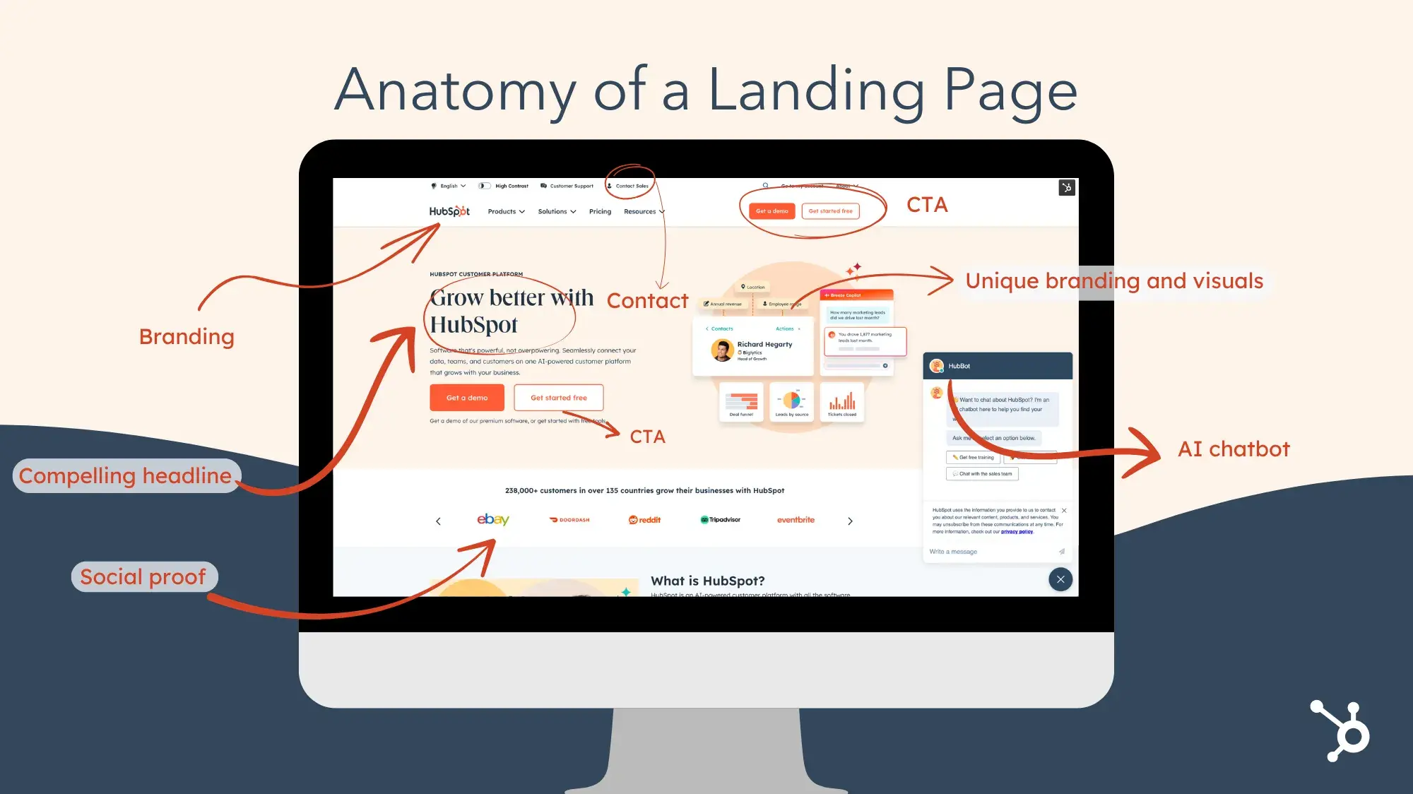
For example, a headline like “Grow Better with HubSpot” is not just a slogan; it is a promise. It suggests that using the software will lead to tangible business improvement. Your headline should do the same. It should answer the question: “What’s in it for me?”
5. Design for Beauty and Utility
A landing page must be both beautiful and helpful. Beauty attracts attention; utility retains it. Use consistent, on-brand colors and fonts to create a cohesive look. Incorporate high-quality visuals, such as images or videos, that support your message. But remember: less is more. A cluttered design can overwhelm visitors and distract them from your CTA.
Helpfulness comes from providing relevant content. Explain why your product or service is valuable. Show how it solves your audience’s problems. Make it easy for visitors to understand what they need to do next. Clear instructions and obvious CTAs are essential.
6. Publish, Test, and Iterate
Designing a landing page is not a one-time task. Once you publish your page, you should begin testing. A/B testing allows you to compare different versions of your page to see which performs better. You can test headlines, images, CTA colors, and even the placement of social proof.
Use the data from your tests to make informed decisions. If one version of your page generates more conversions, stick with it. But do not stop there. Continue to experiment and refine your design. The goal is to create a landing page that evolves with your audience and your business.
Best Practices for Optimization and User Experience
Beyond the basic steps of design, there are several best practices that can significantly enhance your landing page’s performance. These principles focus on user experience, clarity, and trust-building.
Keep It Simple and On-Brand
Simplicity is key. A clean, organized layout makes it easy for visitors to find the information they need. Avoid unnecessary navigation links that could lead them away from your conversion goal. Instead, keep the focus on the content and the CTA.
Your landing page should also be unmistakably on-brand. Use your logo, colors, and tone of voice consistently. This reinforces brand recognition and builds trust. Visitors should feel that they are interacting with your company, not a generic third-party site.
Optimize with Clear CTAs
Your call-to-action should be obvious, enticing, and placed above the fold (visible without scrolling). Use action-oriented language that tells visitors exactly what will happen when they click. For example, “Get Your Free Guide” is more effective than “Submit.”
If your offer is free, make that clear. The word “free” is powerful and can significantly increase click-through rates. Ensure your CTA button stands out visually from the rest of the page, using a contrasting color if necessary.
Include Contact Information and Support
Visitors may have questions before they are ready to convert. Provide easy access to your contact information, such as a phone number or email address. Additionally, consider adding a live chat or AI chatbot to your landing page. This allows visitors to get immediate answers, reducing friction and increasing the likelihood of conversion.
HubSpot’s landing page, for instance, features an AI chatbot that provides instant support. This small addition can make a big difference in user experience, especially for complex products or services.
Use A/B Testing to Refine Your Design
A/B testing is not just a best practice; it is a necessity. Even small changes can have a significant impact on conversions. Test different elements of your page, from headlines to images to CTA placement. Analyze the results and implement the changes that improve performance.
Remember, optimization is an ongoing process. What works today may not work tomorrow. Continuously test and refine your landing pages to ensure they remain effective.
Real-World Examples of Successful Landing Page Design
Looking at real-world examples can provide valuable inspiration and insight. Here are several landing pages that exemplify best practices in design, clarity, and conversion.
HubSpot: Minimalist and Direct
HubSpot’s landing pages often feature a minimalist design with a clear focus on the CTA. By removing the top navigation bar, they reduce visual clutter and keep the visitor’s attention on the main offer. The branding is consistent, and the headline is compelling, telling visitors exactly what they will get.
Shopify: Visual and Informative
Shopify’s landing page for website themes relies heavily on visuals. It showcases a variety of themes with filters for free/paid, catalog size, and industry. This approach allows visitors to explore options without leaving the page, meeting their intent to research before converting.
Netflix: Direct and Uncluttered
Netflix’s landing page is a masterclass in simplicity. It centers on a signup box with little else. The background provides a hint of the content available, but the focus is entirely on getting the user’s email address. There are no distractions, no hamburger menus, just a clear path to conversion.
Eufy: Bold and Benefit-Driven
Eufy’s landing page for its robot lawn mower uses a full-bleed photo to create a bold first impression. As you scroll, you get more information and tech specs, but the design remains spacious and uncluttered. The CTA, “Enjoy Now,” conveys both luxury and urgency, encouraging immediate action.
Trello: Vibrant and Simple
Trello’s landing page uses a vibrant gradient background to grab attention. The design is simple, with a descriptive headline and a few graphics. The video option is not embedded, keeping the page clean and focused on the CTA.
Adobe Illustrator: Interactive and Engaging
Adobe’s landing page for Illustrator features a product demo right on the page. Visitors can see the benefits of the product immediately, without having to click to another page. This interactive element increases engagement and provides a clear demonstration of value.
6Sense AI Email Agents: Color-Coded for Clarity
6Sense’s landing page uses a simple color scheme to guide the visitor’s eye. The bright orange CTA button and the turquoise annotated email stand out against a neutral background. This design choice ensures that the most important elements are immediately visible.
1871 Innovation Labs: Authentic and Engaging
1871’s landing page features an autoplay video with sound. This bold choice provides an authentic look at their events, making visitors feel like they are in the room with fellow entrepreneurs. It is not a slick commercial; it is real footage that builds trust and interest.
Dropbox: Product-Focused
Dropbox’s landing page dedicates two-thirds of the space to a product image. This keeps the design uncluttered while still providing a lot of information about what the product can do. The CTA buttons are bold and clear, and the headline is descriptive and grabby.
Canva: Transparent and User-Centric
Canva’s landing page for its free tier focuses on “easy and free.” It shows off the capabilities of the tool with half the page dedicated to visuals. By creating separate landing pages for each subscription tier, Canva meets the specific intent of users at each level, increasing transparency and trust.
Choosing the Right Tools for Your Landing Page
Selecting the right landing page design software is crucial for success. Here is a comparison of five popular options:
| Software | Key Features | Best For |
|---|---|---|
| HubSpot Free Landing Page Builder | Responsive templates, on-page editor, AI-powered copy assistance | Businesses looking for an all-in-one CRM and marketing platform |
| Instapage | Custom post-click pages, A/B testing, dynamic text replacement | Teams needing advanced personalization and testing capabilities |
| Unbounce | Over 100 templates, responsive design, customizable | Businesses of all types, from SaaS to ecommerce |
| Mailchimp | Drag-and-drop builder, easy integration with email campaigns | Users already using Mailchimp for email marketing |
| Leadpages | Drag-and-drop builder, A/B testing, customizable templates | Small businesses and startups looking for an affordable option |
Each of these tools offers unique features that can benefit your landing page design. Consider your specific needs and budget when making your choice.
Final Thoughts on Landing Page Design
Your landing page is often the first impression visitors have of your brand. It is your opportunity to showcase your value, build trust, and guide users toward a conversion. By following the steps and best practices outlined in this guide, you can create landing pages that not only look good but also perform well.
Remember, effective landing page design is an iterative process. Test, refine, and optimize continuously. Keep your audience’s needs at the forefront of every decision. And never underestimate the power of simplicity, clarity, and a strong call-to-action.
What elements of your current landing page could be improved to better serve your audience and achieve your business goals?





