The Persistent Debate: Plain Text Versus HTML Email Design
The conversation around email design often feels like a tug-of-war between aesthetics and authenticity. On one side, you have the allure of rich HTML templates—complete with branded headers, high-resolution images, and animated GIFs that promise to dazzle the recipient. On the other, there is the stark, unadorned simplicity of plain-text emails that mimic a personal note from a colleague. For years, marketers have oscillated between these two extremes, trying to determine which approach yields better results in terms of engagement and conversion.
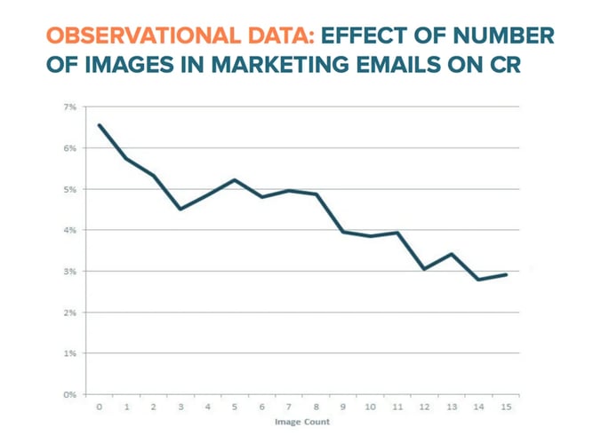
It is a common misconception that the debate is primarily about deliverability—that is, whether an email makes it to the inbox or the spam folder. While proper coding and the inclusion of a plain-text alternative are essential for maintaining a good sender reputation, the real issue lies in what happens after the email lands. Once a message is safely in a user’s inbox, does the presence of images and complex layouts help or hinder its performance? The data suggests that the answer might be counterintuitive to designers and creative teams who believe that more visual appeal equals more engagement.
We have observed this tension across numerous campaigns. The instinct is to make every touchpoint look as polished as possible. After all, visual storytelling is a cornerstone of modern marketing. Yet, email remains a unique channel. It is deeply personal, intimate, and often perceived as a direct line of communication between two entities. When you introduce heavy design elements into this space, you risk breaking that illusion of personal connection. The question then becomes: are you optimizing for the medium, or are you optimizing for the message?
.png?width=112&height=112&name=Image%20Hackathon%20%E2%80%93%20Horizontal%20(58).png)
Understanding the Deliverability Baseline
Before diving into performance metrics, it is crucial to establish a baseline regarding deliverability. Many marketers operate under the fear that HTML emails are inherently more likely to be flagged as spam. This fear is not entirely unfounded, but it is largely a result of poor execution rather than the format itself. An HTML email will not hurt your deliverability if it is coded correctly and if you provide a plain-text version alongside it.
Broken HTML tags or messy code can trigger spam filters, damaging your sender reputation not just for that specific send, but for all future communications from that domain. Furthermore, major email service providers like Gmail and Outlook expect legitimate businesses to include a plain-text alternative. If you omit this, your emails may be viewed with suspicion. However, if you follow these basic hygiene practices, your HTML and plain-text emails will have identical deliverability rates. They will land in the same place. The divergence in performance occurs not at the gate, but in the user’s eye.
The Illusion of Preference
Surveys have long indicated that consumers prefer HTML and image-based emails. In a widely cited study, nearly two-thirds of respondents stated they favored rich media over plain text. It makes sense on the surface. Visuals are engaging. They break up walls of text and provide immediate context. Based on this feedback, many brands doubled down on design, creating sleek templates with bold calls-to-action and vibrant imagery. The logic was straightforward: if people say they want visuals, give them visuals.
However, stated preference often diverges from actual behavior. Just because a consumer says they like a certain style in a survey does not mean they will interact with it in their daily inbox routine. The inbox is a noisy, cluttered environment. Users skim. They delete. They filter. In this high-speed environment, the cognitive load of processing a designed email can be a deterrent. The gap between what people say they want and what they actually click on is where the real insights lie. It is a reminder that marketing is not just about asking customers what they like; it is about observing how they behave when the lights are on and the distractions are real.
Why Plain-Text Emails Outperform HTML in Key Metrics
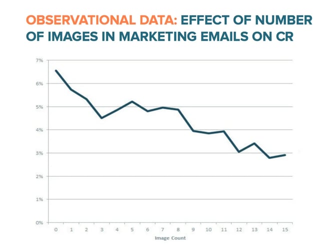
When we move from survey data to hard metrics, the story changes dramatically. Extensive A/B testing reveals a consistent pattern: simpler emails win. In fact, the more HTML-rich an email is, the lower its performance tends to be. This is not a marginal difference; it is a statistically significant trend that holds true across various industries and audience segments. Plain-text emails consistently achieve higher open rates and click-through rates compared to their HTML counterparts. The simplicity of the format acts as a signal of authenticity, which resonates with recipients in a way that designed templates often fail to do.
The Impact on Open Rates
One of the most surprising findings in email marketing is that HTML emails reduce open rates. This is not because the emails are being sent to the spam folder; they are landing in the primary inbox just as often as plain-text versions. The issue is visibility and perception. Email providers are increasingly aggressive in filtering commercial content. Gmail’s Promotions tab, for example, automatically sorts emails that appear to be marketing-driven into a separate section. These emails are often identified by their use of images, complex HTML structures, and promotional language.
When an email is diverted to the Promotions tab or a similar secondary folder, it becomes invisible to the casual user. Most people check their primary inbox and move on. They do not hunt for marketing emails in the tabs. Plain-text emails, by contrast, often bypass these filters because they resemble personal correspondence. They look like a note from a friend or a colleague. This perception allows them to remain in the primary view, where they are far more likely to be seen and opened. The less you look like an advertisement, the more likely you are to be read.
The Drop in Click-Through Rates
Open rates are only half the equation. Even if an HTML email manages to get opened, it often struggles with click-through rates. The assumption is that a well-designed email with clear buttons and images will guide the user to take action. Yet, the data shows the opposite. In tests comparing plain-text emails to those with images, the plain-text versions consistently generated more clicks. In one instance, an email with a GIF saw a 2.3% lower click-through rate and a significantly lower overall click volume compared to the plain-text version. Another test showed an HTML template with images resulting in a 21% lower click-through rate.
Why does this happen? It comes back to the nature of the medium. Email is perceived as a one-to-one interaction. When you send a beautifully designed template, you are reminding the recipient that this is a broadcast message from a company. It creates distance. Plain-text emails, however, feel personal. They require the reader to engage with the copy itself, to parse the message and find the link. This active engagement can lead to higher intent. Furthermore, the lack of visual distractions forces the writer to rely on strong, compelling copy. When the writing is good, and the offer is clear, the need for visual bells and whistles disappears.
The Role of User Expectations and Client Limitations
There are also technical and behavioral factors at play. Many email clients do not load images by default, especially from unknown senders. If your email relies on images to convey the core message or the call-to-action, you are losing a significant portion of your audience before they even engage. Plain-text emails do not have this vulnerability. They are fully readable regardless of image settings. Additionally, users often perceive plain-text emails as less of a time commitment. They are quick to scan and easy to digest. In a world where attention is scarce, the format that respects the user’s time often wins.
Strategic Implications for Modern Email Marketing
The evidence is clear: in most B2B and service-oriented contexts, plain-text emails outperform HTML designs. This does not mean that design is irrelevant, but it does suggest that the role of design in email is shifting. The goal is not to create a digital brochure, but to craft a message that feels personal, urgent, and relevant. For brands looking to maximize engagement, the shift toward simplicity is not a step backward, but a strategic refinement. It forces a focus on the fundamentals: subject line, copy, and value proposition.
Embracing the Constraints of Plain Text
Adopting a plain-text strategy can feel restrictive for creative teams. Without images, headers, and buttons, how do you differentiate your brand? The answer lies in the strength of your writing and the clarity of your offer. Plain-text emails force you to be concise and compelling. Every word must earn its place. This constraint can lead to better copy, which in turn leads to better results. You begin to rely on your voice, your tone, and your relationship with the audience. It is a return to the basics of communication, which can be more powerful than any graphic design.
Moreover, plain-text emails can enhance your brand’s authenticity. In an era of AI-generated content and hyper-polished marketing, a simple email can stand out as genuine. It signals that you value the recipient’s time and intelligence. It suggests that you have something worth saying, without needing to dress it up. This authenticity can build trust over time, which is the foundation of any successful customer relationship.
When HTML Might Still Be Appropriate
There are, of course, exceptions to the rule. E-commerce brands, for example, often rely on HTML emails to showcase products. When you are selling a physical item, the visual component is critical. A customer wants to see the product, the color, and the style. In this context, an HTML email with high-quality images is not just appropriate; it is necessary. The expectation is different. Users expect to receive visually rich updates from their favorite retailers.
Similarly, newsletters that are heavily editorial in nature may benefit from a hybrid approach. A clean, simple HTML layout with a few key images can provide structure and visual breaks without overwhelming the reader. The key is to avoid the “commercial” feel that triggers spam filters and user fatigue. Keep the design minimal. Focus on readability. Use images to support the text, not replace it. The goal is to strike a balance between aesthetics and authenticity.
Testing Your Own Audience
While the data strongly favors plain-text emails, every audience is different. The best way to determine the right approach for your brand is to test. Run A/B tests comparing plain-text versions of your campaigns against HTML templates. Measure not just open rates, but click-through rates and conversions. Look for patterns. Does your audience respond better to personal, text-heavy messages? Or do they prefer visual updates? The answers will guide your strategy.
At AEO/GEO, we believe in data-driven decisions. The shift toward AI-ready content and generative search optimization is about clarity, relevance, and value. The same principles apply to email. Whether you choose plain text or a minimalist HTML design, the focus should always be on the user’s experience. Are you providing value? Is your message clear? Does it feel personal? These are the questions that matter. The format is just a vehicle.
Final Thoughts on Email Strategy
The debate between plain text and HTML is not about choosing one side and abandoning the other. It is about understanding the psychology of the inbox. It is about recognizing that less can be more. In a landscape cluttered with advertisements and noise, simplicity is a competitive advantage. It cuts through the clutter. It builds trust. It drives engagement.
As marketers, we are often driven to be creative, to push boundaries, to make things look beautiful. But in email, the most beautiful thing you can offer is a message that feels like it was written just for the reader. It is a reminder that technology and design are tools, not ends in themselves. The end goal is connection. And sometimes, the most effective way to connect is to simply write a note. What does your email say about your brand? Is it shouting for attention, or is it having a conversation? The choice is yours, but the data suggests that the quietest voices are often the ones that are heard.
Consider how your current campaigns align with these insights. Are you relying too heavily on design to carry the message? Or is your copy strong enough to stand on its own? Experiment. Iterate. Learn. The inbox is a dynamic environment, and your strategy should evolve with it. The future of email may not be about more images, but about more meaning.





