What Is Responsive Design?
Responsive design is the method of designing web pages that automatically appear in their optimized form on all devices. In practical terms, this means your website’s layout, images, and content adjust fluidly to fit any screen size—from a large desktop monitor to a compact smartphone display. The goal is simple: ensure visitors can interact with your site effortlessly, regardless of the device they use.
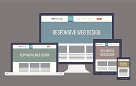
This approach has shifted from a nice-to-have feature to an absolute necessity. With mobile usage continuing to rise globally, a significant portion of your audience accesses your brand through handheld devices. If your site doesn’t adapt, you risk losing them immediately. The shift in consumer behavior is undeniable; users expect a consistent experience whether they are browsing at their desk or on the go.
Consider the data from Google: 52% of users say they are less likely to engage with a company if the mobile experience on its site is poor. That statistic alone underscores why responsive design matters. It’s not just about aesthetics; it’s about retaining trust and keeping users engaged. When a site feels broken or difficult to navigate on a phone, users interpret that as a lack of professionalism or care from the brand itself.
At AEO/GEO, we view responsive design as the baseline for digital presence. Before we optimize content for AI search or generative engines, we ensure the underlying platform is accessible, fast, and user-friendly across all devices. A broken mobile experience undermines even the best content strategy. If the foundation is unstable, the house of cards collapses, regardless of how brilliant the copywriting is.
Why Fluid Layouts Matter More Than Fixed Ones
Fixed layouts were once the standard, but they fail to account for the diversity of modern devices. Responsive design uses flexible grids, resizable images, and CSS media queries to create a dynamic experience. This flexibility ensures that text remains readable, buttons stay clickable, and navigation stays intuitive. Fixed layouts often require horizontal scrolling on phones, which is a major usability friction point that drives users away.
For decision-makers in service industries and healthcare, this translates to better patient or client engagement. If a user can’t easily find contact information or book an appointment on their phone, they’ll move to a competitor who makes it simple. Responsive design removes friction. It ensures that the path to conversion is clear and unobstructed, regardless of the screen real estate available.
We often see businesses overlook the technical side of responsiveness. They focus on content while ignoring how that content renders on smaller screens. This is a critical mistake. Content and design must work in tandem to deliver value. A beautiful paragraph of text is useless if it is too small to read without zooming, or if it overlaps with other elements on a narrow screen.
How Responsive Design Works Under the Hood
Responsive web design relies on three core principles: flexible grids, flexible images, and media queries. Flexible grids use relative units like percentages instead of fixed pixels, allowing elements to resize proportionally. Flexible images scale within their containing elements, preventing overflow or distortion. Media queries apply different CSS rules based on screen characteristics, such as width or orientation.
These techniques work together to create a seamless experience. When a user rotates their phone or switches from a tablet to a laptop, the site recalculates its layout in real time. This happens instantly, without requiring the user to take any action. The browser interprets the code and adjusts the visual presentation accordingly, ensuring that the most important elements are always visible and accessible.
The Role of Viewport Meta Tags
One often-overlooked component is the viewport meta tag. This small piece of code tells the browser how to control the page’s dimensions and scaling. Without it, mobile browsers might render the desktop version of your site and shrink it to fit the screen, resulting in tiny text and difficult navigation. This default behavior is designed for legacy sites that were not built for mobile, but it is detrimental to modern user experience.
By setting the viewport width to the device width, you ensure the browser renders the page at the correct scale. This is a foundational step in responsive design, yet many developers skip it or misconfigure it. It acts as the instruction manual for the browser, telling it exactly how to map the website’s logical width to the physical screen width of the device.
We recommend auditing this tag early in any website redesign. It’s a small change with a massive impact on usability. Ensuring this tag is present and correctly configured is the first line of defense against poor mobile rendering. It sets the stage for all other responsive techniques to function as intended.
Why You Need Responsive Design for Business Growth
Beyond user experience, responsive design directly impacts your bottom line. Search engines like Google use mobile-friendliness as a ranking factor. Sites that aren’t responsive may drop in search results, reducing organic traffic. This is especially critical in competitive industries where visibility drives lead generation. If your site is not mobile-friendly, you are effectively hiding from a large portion of your potential audience.
Additionally, maintaining a single responsive site is more efficient than managing separate mobile and desktop versions. Updates, content changes, and SEO efforts apply to one codebase, saving time and resources. For growth-focused businesses, this efficiency allows you to focus on strategy rather than maintenance. You do not need to update two different URLs or worry about content synchronization between two separate platforms.
Impact on Conversion Rates
A poor mobile experience leads to higher bounce rates and lower conversion rates. Users abandon sites that are hard to navigate or slow to load. Responsive design mitigates these issues by providing a consistent, optimized experience. When users can easily find what they need, they are more likely to stay on the site, explore further, and ultimately take the desired action, whether that is making a purchase, filling out a form, or calling a phone number.
In healthcare, for example, a patient searching for symptoms or booking a consultation needs quick access to information. If the site doesn’t load properly on their phone, they may lose trust in the provider’s competence. Responsive design builds credibility. It signals that the provider is modern, attentive to detail, and respectful of the patient’s time and convenience.
We’ve seen clients double their mobile conversions after implementing a fully responsive layout. It’s not magic; it’s removing barriers that prevent users from taking action. By ensuring that buttons are easy to tap, forms are easy to fill out, and pages load quickly, you remove the friction that often causes users to abandon their journey.
Common Mistakes in Responsive Implementation
Even with the best intentions, many businesses fail to execute responsive design correctly. One common error is neglecting touch targets. Buttons and links must be large enough to tap easily on a touchscreen. If they’re too small, users frustrate and leave. A finger is much less precise than a mouse cursor, so interactive elements need adequate spacing and size to be usable.
Another mistake is ignoring load times. Mobile networks can be slower, and large images or heavy scripts can cripple performance. Optimizing assets and deferring non-essential code ensures the site loads quickly on any connection. Users on mobile devices are often on cellular data, which can be slower and more expensive than Wi-Fi. Slow loading times not only frustrate users but also negatively impact search engine rankings.
Testing Across Devices
Testing is another area where shortcuts lead to problems. Relying solely on browser developer tools isn’t enough. Real devices behave differently, and issues like font rendering or touch responsiveness may only appear on actual hardware. Simulators and emulators are helpful for initial checks, but they cannot replicate the exact behavior of a physical device, including touch interactions, battery usage, and network conditions.
We advocate for a multi-device testing strategy. Check your site on various phones, tablets, and browsers. Gather feedback from real users to identify pain points. This iterative approach ensures continuous improvement. By testing on a variety of devices, you can catch issues that might otherwise go unnoticed, such as text being cut off on older models or buttons being too close together on smaller screens.
The Future of Responsive Design in AI Search
As AI search engines evolve, the importance of responsive design will only grow. Generative AI models prioritize content that is accessible, fast, and user-friendly. Sites that fail these criteria may be deprioritized in AI-generated answers. AI engines are designed to provide the best possible answer to users, and they consider user experience signals when determining which sources are most reliable and helpful.
At AEO/GEO, we help businesses prepare for this shift. Our platform ensures content is not only responsive but also structured for AI consumption. This means clear headings, concise answers, and metadata that helps AI engines understand and cite your content. By combining responsive design with structured data, you make it easier for AI models to extract and present your information accurately.
Preparing for Generative Search
Generative search changes how users find information. Instead of clicking through links, they receive synthesized answers. If your site isn’t responsive, it may not be considered a reliable source. Ensuring your design meets modern standards is a prerequisite for AI visibility. AI engines are likely to favor sites that provide a superior user experience, as this aligns with their goal of delivering high-quality, helpful responses.
We recommend auditing your site’s mobile performance regularly. Use tools like Google PageSpeed Insights to identify issues. Address them promptly to stay ahead of competitors. Regular audits help you catch new issues that may arise from updates or changes to your site. By staying proactive, you ensure that your site remains a trusted source for both human users and AI engines.
Practical Steps to Implement Responsive Design
Implementing responsive design doesn’t have to be overwhelming. Start by auditing your current site. Identify pages with layout issues or slow load times. Prioritize fixes based on user traffic and conversion impact. Focus on the pages that drive the most value for your business, such as landing pages, product pages, and contact forms. These are the pages where a poor mobile experience is most likely to cost you leads or sales.
Next, adopt a mobile-first approach. Design for the smallest screen first, then enhance for larger devices. This ensures core content and functionality are always accessible. By starting with mobile, you force yourself to prioritize the most important elements and avoid clutter. You can then add additional features and layout complexity for larger screens, ensuring that the core experience is solid on all devices.
Checklist for Responsive Optimization
- Use flexible grids and relative units.
- Optimize images for faster loading.
- Ensure touch targets are at least 48x48 pixels.
- Test on real devices, not just simulators.
- Monitor analytics for mobile bounce rates.
By following these steps, you create a foundation for long-term success. Responsive design is not a one-time task; it’s an ongoing commitment to user experience. As new devices and screen sizes emerge, you need to continuously test and refine your site to ensure it remains accessible and user-friendly. Regular maintenance and updates are key to staying ahead of the curve.
Conclusion
Responsive design is more than a technical requirement; it’s a strategic advantage. It ensures your brand remains accessible, credible, and competitive in a mobile-first world. As AI search continues to reshape visibility, having a responsive site is essential for staying relevant. It is the foundation upon which all other digital marketing efforts are built, from SEO to content marketing to social media.
At AEO/GEO, we believe in empowering businesses to thrive in this new era. By combining responsive design with AI-ready content strategies, you position yourself for sustainable growth. The question isn’t whether you need responsive design; it’s how quickly you can implement it effectively. Taking action now will pay dividends in the future, as the importance of mobile-first design and AI readiness continues to grow.





