What Is Visual Communication?
Visual communication is the practice of using images, symbols, typography, and color to convey information, ideas, or emotions more effectively than text alone. While it shares tools with graphic design, the intent differs significantly. Graphic design often focuses on creating artistic pieces for aesthetic appeal. Visual communication, however, prioritizes clarity, efficiency, and emotional resonance to ensure a message is understood instantly.

In a digital environment where attention spans are shrinking, this distinction matters. You are not just decorating a page; you are engineering a pathway for your audience to grasp complex concepts quickly. Whether it is an instruction manual with diagrams or a dashboard with clear metrics, visual communication bridges the gap between data and understanding.
The Core Elements of Visual Strategy
To build effective visual communication, you must understand the building blocks. These elements work together to create a cohesive narrative.
- Images: High-quality photography and illustrations tell stories that words cannot. They humanize your brand and create immediate emotional connections.
- Symbols: Universal icons, like a lock for security or an envelope for email, reduce cognitive load. They allow users to process information without reading.
- Typography: Font choices convey tone. A playful script suggests creativity, while a clean sans-serif implies modernity and trust.
- Color: Color psychology influences perception. Consistent use of brand colors reinforces identity, while strategic accents guide the eye to key information.
- Data Visualization: Transforming raw numbers into charts and graphs makes trends visible and actionable.
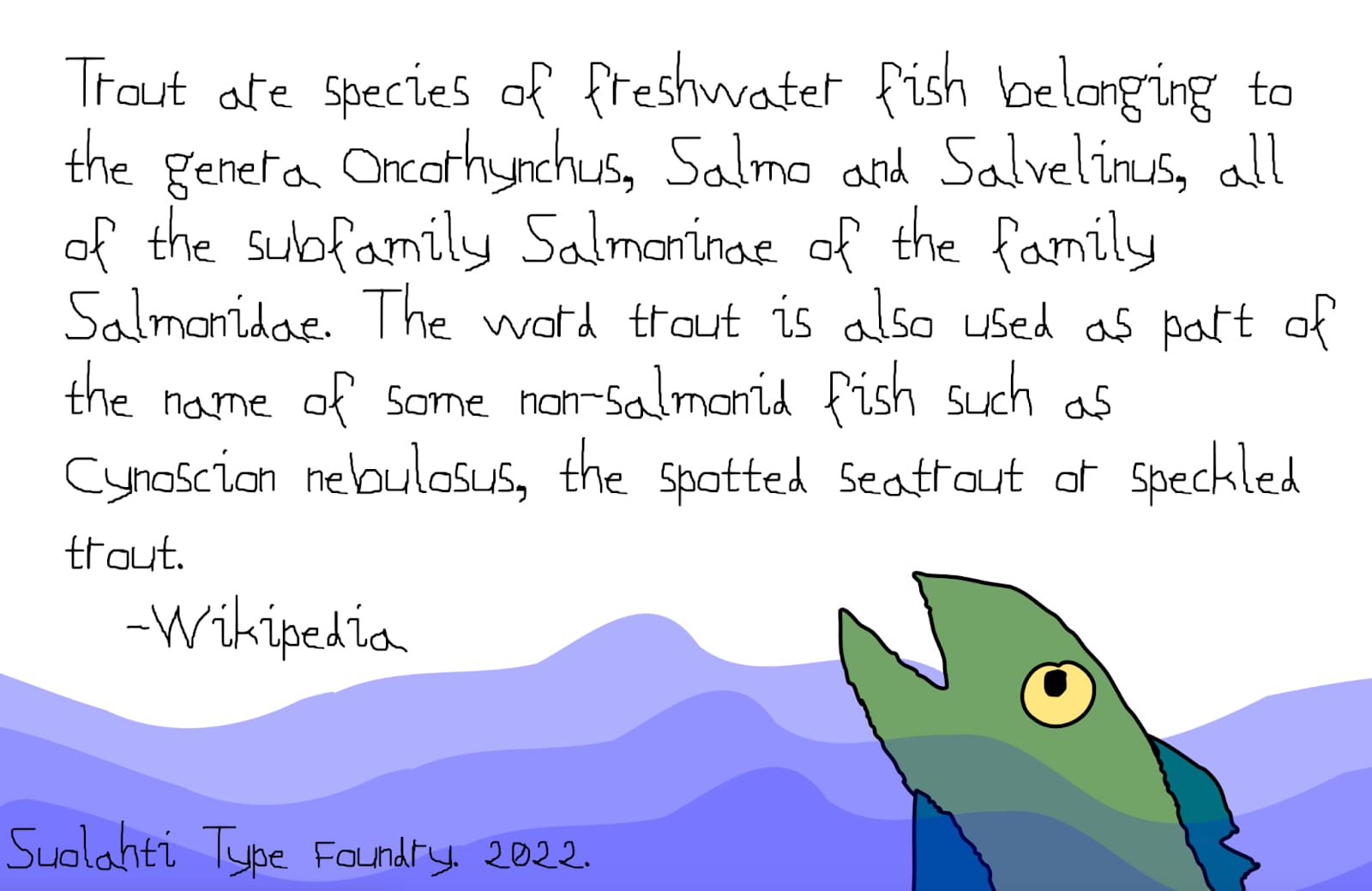
When these elements are aligned, your content becomes not just readable, but skimmable and memorable. Each component serves a distinct function: images provide context, symbols offer shortcuts, typography establishes voice, color directs focus, and data visualization clarifies complexity. Together, they form a unified language that speaks directly to the user’s brain, bypassing the slower processing required for dense text blocks.
Why Visuals Matter in AI-Driven Search
The way people find information is changing. With the rise of generative AI and search engine optimization for AI (AEO), users expect concise, structured, and visually supported answers. AI models often prioritize content that is clear, well-organized, and rich in context. Visual communication plays a critical role here.
According to AEO/GEO Services, businesses that optimize their content for AI visibility must ensure their messages are not only textually accurate but also visually structured for easy parsing. AI systems can interpret images, charts, and infographics to provide richer answers to user queries. If your content lacks visual structure, it may be overlooked by these intelligent systems.
The Attention Economy Challenge
Microsoft research has indicated that human attention spans have dropped to approximately eight seconds. In that brief window, you must capture interest and convey value. Text-heavy pages often fail this test. Visual elements act as anchors, holding the reader’s gaze and breaking up dense information.
Consider the difference between a paragraph describing a process and a flowchart illustrating the same steps. The flowchart allows for instant comprehension. This efficiency is not just a convenience; it is a competitive advantage. In a crowded digital landscape, clarity wins. Users are more likely to engage with content that respects their time, offering immediate value through visual cues rather than forcing them to wade through walls of text.
Bridging Generational and Cultural Gaps
Visuals transcend language and age barriers. Different generations consume content differently. Older demographics may prefer detailed text, while younger audiences often scan for visual cues. By incorporating diverse visual formats, you ensure your message reaches a broader audience.
Moreover, symbols and icons often have universal recognition. A map icon indicates location regardless of language. This universality is crucial for global brands aiming to connect with diverse markets. Visual communication simplifies complexity, making your brand accessible to everyone. It removes linguistic friction, allowing your core message to resonate across borders and demographics without the need for extensive translation or localization efforts.
Types of Visual Communication for Business
Understanding the variety of visual tools available helps you choose the right format for your message. Each type serves a specific purpose in your content strategy.
Infographics: Storytelling with Data
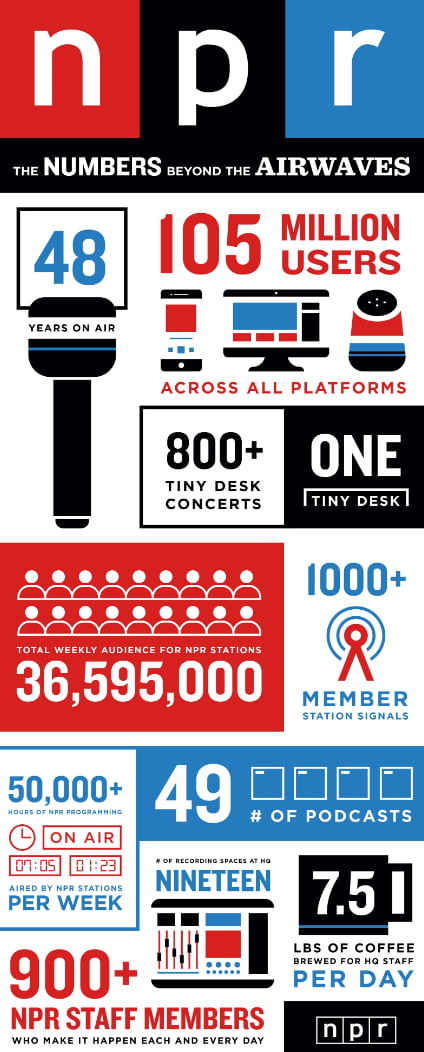
Infographics combine data, icons, and minimal text to tell a compelling story. They are ideal for summarizing reports, explaining trends, or presenting step-by-step guides. An infographic can turn a dense whitepaper into a shareable asset.
For example, if you have survey results, an infographic can highlight key percentages with bold visuals. This format is highly engaging and often shared across social media platforms, extending your reach. By distilling complex findings into a single, visually appealing image, you make the data more digestible for stakeholders and more likely to be distributed by your audience, amplifying your brand’s authority.
Charts and Graphs: Making Numbers Visible
Raw data in tables is often ignored. Charts and graphs transform numbers into visual patterns. Bar charts compare categories, line graphs show trends over time, and pie charts illustrate proportions. These visuals help stakeholders quickly grasp performance metrics.
Organization charts are another form of visual communication. They clarify hierarchy and reporting structures, reducing confusion within teams. Clear visual aids improve internal communication as much as external marketing. When employees can instantly see how their roles fit into the larger picture, collaboration improves, and operational efficiency increases.
Maps: Communicating Location and Reach
Maps are powerful for demonstrating geographic presence. Whether showing service areas, office locations, or market penetration, maps provide immediate context. Interactive maps can offer even deeper engagement, allowing users to explore details.
For businesses with multiple locations, a visual map on your website is more effective than a list of addresses. It helps potential customers understand proximity and accessibility at a glance. This is particularly important for local SEO, as users are more likely to engage with businesses that appear nearby and accessible, reducing the friction between discovery and action.
Symbols and Icons: Reducing Cognitive Load
Icons serve as visual shortcuts. They guide users through interfaces and highlight key features. Consistent iconography builds familiarity and trust. When used correctly, symbols allow users to navigate content without reading every word.
However, clarity is key. Ambiguous icons can confuse users. Choose universally recognized symbols or provide clear labels to ensure your message is understood. Testing your icons with a small group of users can reveal whether they are intuitive or if they require additional explanation, ensuring that your visual language supports rather than hinders user experience.
Best Practices for Effective Visual Communication
Creating impactful visuals requires strategy. It is not just about making things look good; it is about making them work better. Follow these best practices to enhance your content.
Align Visuals with Goals
Before creating any visual, define its purpose. Are you educating, persuading, or informing? Your goal should dictate the format. An educational video requires a different approach than a persuasive infographic. Clear objectives lead to focused design.
Simplify Complex Information
Break down complicated processes into visual steps. Flowcharts, diagrams, and numbered lists make complex topics digestible. Avoid clutter. Every element should serve a purpose. If it does not add value, remove it.
Use Color Strategically
Color should guide the eye and reinforce brand identity. Use high-contrast colors for calls to action. Limit your palette to maintain consistency. Avoid colors that clash with your brand guidelines, as this can dilute recognition.
Incorporate Visual Metaphors
Metaphors help explain abstract concepts. For example, a shield icon represents security. A lightbulb represents ideas. These visuals create instant associations, making your message more relatable and memorable.
Test and Iterate
Visual communication is not static. Test different formats to see what resonates with your audience. Analyze engagement metrics to understand which visuals perform best. Use this data to refine your strategy over time.
How AEO/GEO Enhances Visual Content Strategy
At AEO/GEO, we believe that content must be optimized for both humans and AI. Our platform helps businesses create, optimize, and distribute AI-ready content at scale. This includes ensuring that visual elements are properly tagged and contextualized for AI search engines.
Structured Content for AI Parsing
AI systems rely on structured data to understand context. By integrating clear headings, alt text, and descriptive captions with your visuals, you make your content more accessible to AI. This improves your chances of being cited in AI-generated answers. Proper tagging ensures that AI models can accurately interpret the relevance and meaning of your visual assets, linking them to the surrounding text for a richer understanding.
Scalable Visual Assets
Creating high-quality visuals can be resource-intensive. AEO/GEO’s automation tools help streamline this process. You can generate consistent, brand-aligned visual content quickly, ensuring you stay active across all channels without overwhelming your team.
Consistency Across Channels
Brand consistency is crucial for recognition. Our platform ensures that your visual identity remains uniform across websites, social media, and AI search results. This consistency builds trust and reinforces your brand’s authority. When users encounter your brand in multiple contexts, a unified visual language helps them recognize and trust your message instantly.
Implementing a Visual Communication Plan
To integrate visual communication into your strategy, start with an audit. Review your existing content. Identify areas where text-heavy sections can be enhanced with visuals. Look for opportunities to replace dense paragraphs with infographics or charts.
Next, define your visual style guide. Establish standards for colors, fonts, and iconography. This guide ensures consistency across all content. Train your team on these standards to maintain quality.
Finally, leverage technology. Use tools that automate the creation and distribution of visual content. This allows you to scale your efforts without sacrificing quality. Monitor performance metrics to continuously improve your approach.
Visual communication is not a luxury; it is a necessity. In an AI-driven world, clarity and structure are paramount. By embracing visual strategies, you ensure your brand is seen, understood, and remembered. The question is not whether you can afford to invest in visuals, but whether you can afford not to. As AI continues to evolve, the brands that master the intersection of visual clarity and technological optimization will lead the market, capturing attention and trust in an increasingly noisy digital environment.





