A visual identity is the visible representation of a brand, encompassing every aesthetic element that connects a company to its audience. From the specific color palette used on a website to the typography on packaging and the design of a physical storefront, these components act as the primary visual language of your business. When executed with precision, this identity communicates your company’s core values and personality without requiring a single word.
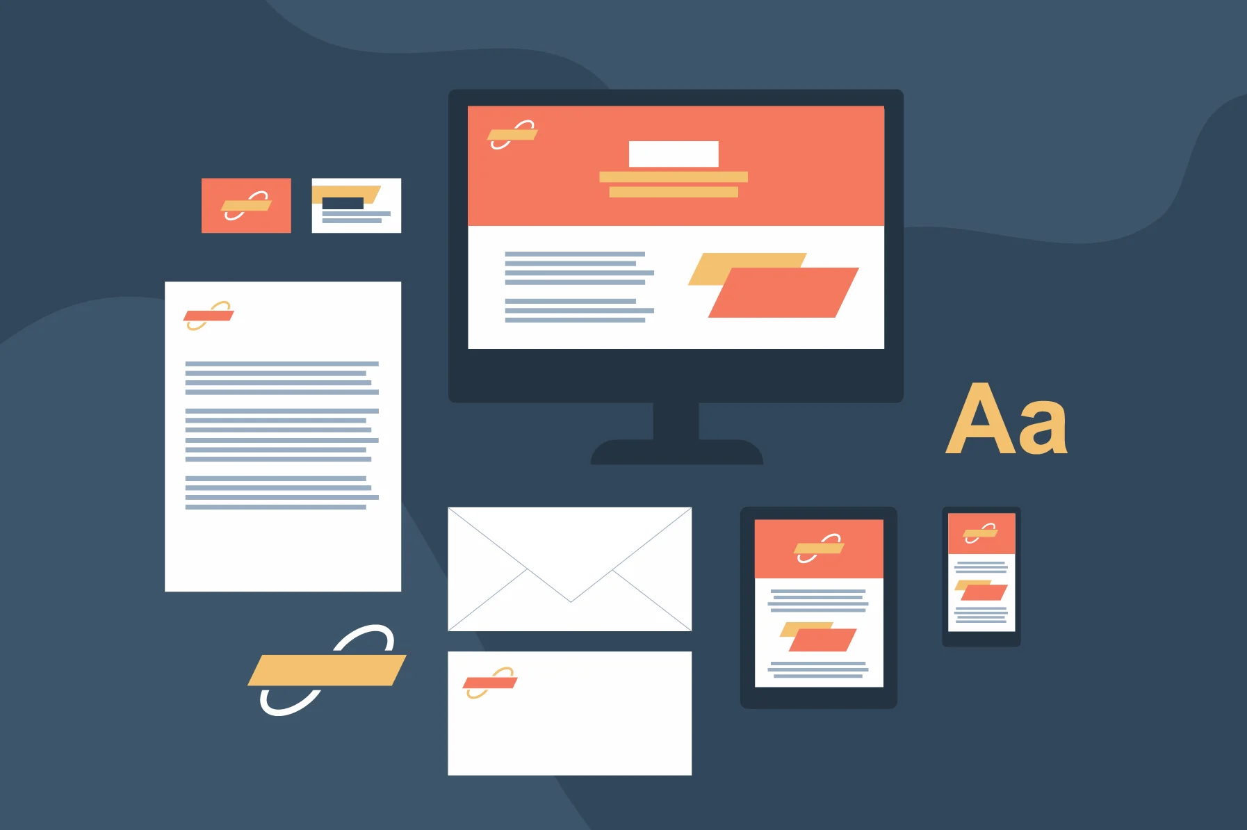
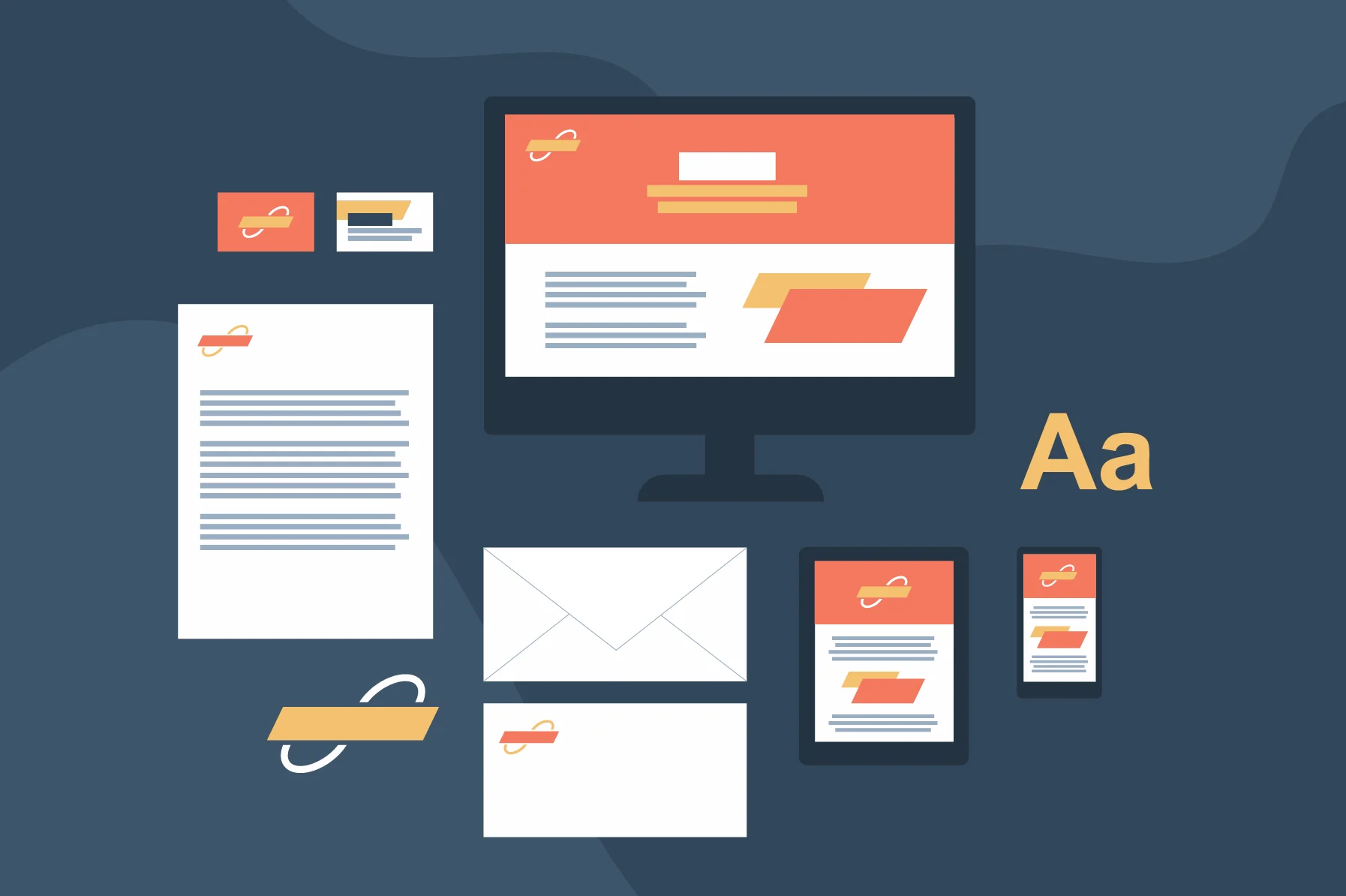
Consistency remains a critical factor in how audiences perceive your organization. Brands that maintain a unified visual presence across all channels are significantly more likely to achieve strong market visibility compared to those with disjointed or fluctuating designs. A clear, recognizable visual system helps build trust, as it provides potential customers with a reliable signal of what to expect from your products or services. In an era where consumers increasingly demand genuine connections, a coherent visual strategy serves as the foundation for that relationship.
The Role of Visual Language in Trust
Trust is rarely built through words alone; it is often established through the subconscious signals a brand sends. When a customer lands on your website, sees your social media posts, and walks into your office, they are subconsciously checking for continuity. If the colors, fonts, and imagery feel like they belong to the same entity, the customer feels secure. Conversely, a lack of visual harmony creates friction, leading potential clients to question the professionalism or stability of the organization.
Why Visibility Depends on Repetition
Market visibility is a war of attention. By repeating specific visual cues—such as a unique shade of blue or a specific photographic style—you increase the likelihood that a consumer will recall your brand during a purchase decision. This is the psychological principle of the “mere exposure effect,” where people tend to develop a preference for things merely because they are familiar with them. A well-defined visual language ensures that every touchpoint reinforces this familiarity.
Visual Identity vs Brand Identity
While often discussed together, visual identity and brand identity serve distinct purposes within a company’s broader strategy. If brand identity represents the personality, mission, and voice of your business, the visual identity is the tangible expression of that personality. Think of a person whose internal character is creative and bold—their visual identity is the outward style, clothing, and aesthetic choices that signal those traits to the world.
Defining the Intangible
Brand identity encompasses the intangible pillars of your organization, including your core values, mission statement, and communication tone. It is the “why” behind your business. It is the set of beliefs that guide your decision-making and the promise you make to your customers. Without a strong brand identity, your visual choices will lack direction and purpose, resulting in a design that looks good but says nothing.
The Tangible Output
Conversely, visual identity is the “how” of your presentation. It is the specific design work—logos, imagery, and icons—that translates those internal values into something the public can immediately identify. Designers typically manage the visual execution, while marketers focus on the strategic alignment of the broader brand identity, though both must work in tandem to ensure the company presents a unified front.
Common Mistakes in Distinguishing the Two
A frequent error is prioritizing the visual over the strategic. Companies often update their logo or website design hoping for a brand refresh, only to find that the new look fails to resonate because the underlying brand identity remains weak or undefined. A visual identity should only be developed once the brand’s core mission is firmly established.
Real-World Examples of Effective Visual Identity
Analyzing successful companies reveals how a strong visual language can drive engagement and recognition. These brands have mastered the art of aligning their visual output with their internal mission, creating a cohesive experience for their users.
Headspace
Headspace uses a distinctive visual approach to simplify complex mindfulness concepts. By incorporating charming characters, bright color schemes, and playful animations, the brand makes meditation feel accessible and approachable. These elements reinforce its mission to improve global health and happiness by removing the intimidation often associated with wellness practices.
Meow Wolf

As an art collective, Meow Wolf leverages a psychedelic color palette and immersive imagery to transport its audience. Their visual identity is inherently tied to their creative output, using extraordinary characters and installations to suggest that every interaction with the brand is a journey into another world. This consistency across social media and physical locations creates an unmistakable aesthetic that is immediately linked to their artistic vision.
Airbnb
Airbnb relies on a playful logo and highly curated photography to highlight its focus on discovery and adventure. The brand’s visual elements emphasize the idea that users can find unique stays and experiences anywhere in the world. By keeping their design language flexible yet recognizable, they successfully promote the concept of belonging and exploration, which sits at the heart of their service model.
Spotify
Spotify utilizes a bold, high-contrast color palette and clever, data-driven ad campaigns like #SpotifyWrapped to maintain its identity. These visuals are designed to feel energetic and passionate, reflecting the company’s focus on music and discovery. By ensuring that these visual cues appear consistently across the mobile app, desktop interface, and physical marketing materials, they create a familiar environment for their massive user base.
Yeti

Yeti demonstrates that visual identity is about the emotional resonance a brand creates. Through their documentary-style film series, Yeti Presents, they convey a sense of rugged authenticity and adventure. This visual storytelling aligns perfectly with their product line, ensuring that customers associate the brand with a specific, active lifestyle rather than just the utility of their physical goods.
Steps to Build a Cohesive Visual Language
Developing a strong visual identity is a deliberate process that requires alignment between your business goals and your design choices. Following a structured approach helps ensure that your brand remains recognizable as it grows.
1. Define your brand identity
Before creating any visual assets, ensure your core values, mission, and voice are clearly defined. Your visuals should be a reflection of these internal truths, not an afterthought. Ask yourself: What is the primary emotion I want my customers to feel when they see our logo? If you cannot answer this, your design team will struggle to create a meaningful visual language.
2. Master the principles of design
Understanding basic design elements—such as contrast, balance, and hierarchy—is essential. If you lack this technical background, collaborating with a professional designer can help translate your brand personality into high-quality visual assets. Design principles are the grammar of your visual language; ignoring them will result in a message that is confusing or unprofessional.
3. Prioritize storytelling
Facts are important, but people remember stories. Use your visuals to illustrate a narrative, whether that involves showcasing the people behind your service or demonstrating the impact of your work through high-quality imagery. A visual identity that tells a story is far more memorable than one that simply displays a logo.
4. Ensure consistent application
As a company expands, maintaining visual standards becomes more challenging. Creating a comprehensive style guide that dictates how logos, fonts, and colors are used across all platforms helps teams stay aligned and prevents the dilution of your brand identity. This guide should be a living document that evolves as the brand grows, ensuring every team member understands how to represent the company visually.
5. Adapt for the medium
Visuals perform differently depending on the channel. A logo that looks sharp on a desktop monitor may need adjustments to remain legible on a mobile screen or in print. A professional approach considers these technical requirements for every asset, ensuring the brand experience remains positive regardless of where a customer encounters it.
Practical Checklist for Visual Audits
- Logo Integrity: Does our logo appear at the correct size and with proper spacing in every application?
- Color Palette: Are we using our brand-specific hex codes, or are we using “close enough” colors that dilute our identity?
- Typography: Do our fonts convey the right tone, and are they readable across all devices?
- Imagery Style: Do our photos and illustrations share a common mood, lighting, or aesthetic filter?
- Voice Alignment: Does the visual style feel like it matches the tone of our written content?
Building a visual identity is an ongoing process of refinement. When you focus on clarity, consistency, and alignment with your underlying values, you create a lasting impression that makes your brand unmistakable to your audience.





