You’ve spent hours crafting a data-heavy report, only to watch your audience’s eyes glaze over durin
You’ve spent hours crafting a data-heavy report, only to watch your audience’s eyes glaze over during your presentation. It’s frustrating when your insights are solid, but the delivery is too dense to stick. Most people believe that creating high-impact visuals requires expensive software or a design background.
What if the secret to stunning graphics is already on your computer? Learning how to create an infographic in PowerPoint [free templates] is a highly efficient way to turn complex data into something your audience remembers. You don’t need to master complex interfaces or pay for monthly subscriptions. Instead, you can use the familiar tools you already have to transform your next presentation, blog post, or update into a visual powerhouse.
Why PowerPoint Is Your Secret Weapon for Infographics
Many people mistakenly believe that crafting professional-grade visuals requires subscriptions to design suites. In reality, you likely already have a powerhouse tool installed. PowerPoint infographic design is an accessible way to translate complex data into clear visuals without the steep learning curve.
The primary advantage of using a tool you already know is the dramatic reduction in execution time. You avoid fighting with new menus or complex layer management, so your focus stays on visual data communication. You can quickly drag and drop shapes, align text boxes, and adjust colors. This speed allows you to experiment with layouts until the story hits home, making it an easy infographic maker for busy professionals.
Furthermore, one well-designed infographic becomes an incredibly versatile asset. You can easily export your finished slide as a high-resolution image file to embed in a blog post, share on social media, or include in a presentation. This scalability ensures your design effort pays off across every channel.
Infographic Creation Methods Comparison
When considering your workflow, weigh the trade-offs between different creation methods.
| Method | Speed | Cost | Customization |
|---|---|---|---|
| PowerPoint | High | Low | High |
| Specialized Design Tools | Medium | Recurring | Medium |
| Outsourcing | Low | High | Very High |
Using PowerPoint allows you to maintain full control over your brand assets without recurring costs. By mastering these PowerPoint design tricks, you shift your focus from learning software to delivering high-impact value. With the right approach, your next great visual asset is already within reach.
Planning Your Visual Story for Maximum Impact
Before you touch a mouse, you need a blueprint. Jumping straight into software often leads to cluttered, incoherent designs. Effective visual data communication starts with a clear narrative—what is the one core message you want your audience to take away?
Start by sketching your flow on paper. Map out the beginning, middle, and end of your story. This foundational step is critical because it forces you to prioritize substance over style, ensuring your PowerPoint infographic design serves a specific purpose rather than acting as decoration.
The Power of Keeping It Simple
A common pitfall is cramming too much information into one space. We often feel the need to show every data point, but this leads to cognitive overload. Embrace simplicity: strip away any statistic, label, or decorative element that doesn’t directly support your main thesis.
If a data point doesn’t contribute to the core story, cut it. Your goal is to make complex information instantly digestible. An easy infographic maker is only as good as the content you feed it; a refined dataset will always outperform a chaotic, information-heavy design.
Selecting the Right Structure
The structure of your infographic should be dictated by the nature of your data. Using the wrong layout creates friction for the reader.
| Structure | Purpose |
|---|---|
| Timeline | Use for chronological stories or history. |
| Process | Choose for explaining steps or workflows. |
| Comparison | Use when contrasting products or metrics. |
By aligning your structure with your goal, you create a logical path for the eye to follow, which is a hallmark of professional marketing infographic tips.
Using Color and Hierarchy
Color and hierarchy are your best tools for controlling how a reader experiences your graphic. Don’t use color for aesthetics alone; use it intentionally to create a visual hierarchy. Bold colors should be reserved for your most important insights, while muted tones support background and secondary details.
Think of your layout in terms of must-see versus nice-to-know. By combining these PowerPoint design tricks with a consistent color palette, you ensure your infographic is highly effective.
Step-by-Step: Turning Data into a Visual Graphic
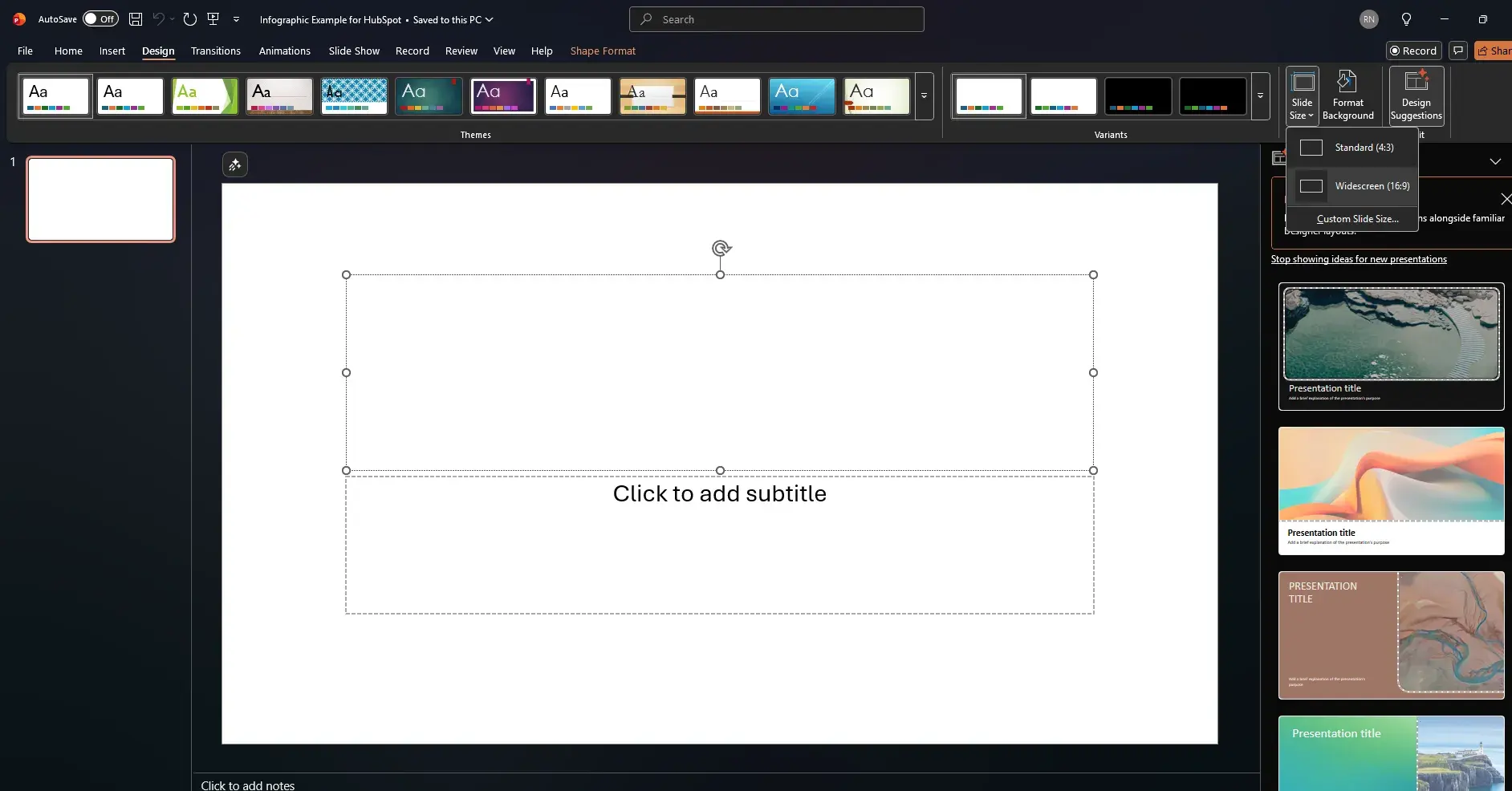
Building a high-quality visual starts with the right foundation. Open a blank presentation, navigate to the Design tab, select Slide Size, and choose Custom Slide Size. For a vertical infographic, set the width to 8 inches and the height to 12 or 16 inches. This adjustment changes the canvas into a portrait-oriented document perfect for scrolling or embedding.
Leveraging SmartArt
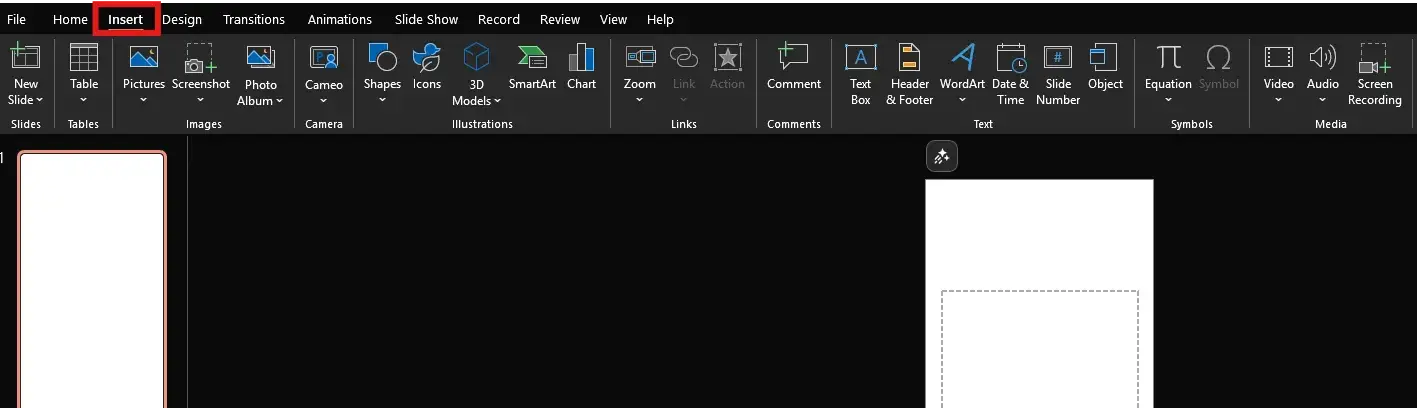
Manual drawing is a time-sink. Instead, use the PowerPoint infographic design features found in the Insert tab under SmartArt. This library provides ready-made, editable frameworks. For a process flow, navigate to the Process category; for hierarchical data, select Hierarchy. Once you insert a graphic, add or remove shapes to map out your data points without agonizing over alignment.
Inputting Data and Customizing
Type directly into the text pane or the shapes themselves to input data. If a shape looks too small, drag the sizing handles. To change the aesthetic, navigate to the SmartArt Design tab and explore the Change Colors menu. You can right-click any individual shape to apply custom gradients, outlines, or transparency levels to create depth.
Pro-Tip: Mastering the Eyedropper
If your brand guidelines specify colors, you don’t need to hunt for Hex codes. Select an object, go to Shape Fill, and choose Eyedropper. Hover over any image or logo to sample the exact hue. This ensures your visual data communication remains perfectly on-brand.
Finalizing Your Layout
After your data is placed, refine the composition. Use the Align and Distribute tools under the Shape Format tab to ensure perfect spacing. Once satisfied, select all elements, right-click, and group them. This locks your design together, making it simple to resize without losing structural integrity.
Best Practices for Professional Graphics
Even with solid data, the difference between an amateur graphic and a polished asset often comes down to small, deliberate design choices. To ensure your PowerPoint infographic design remains clean and trustworthy, focus on balancing your elements.
The Power of Whitespace
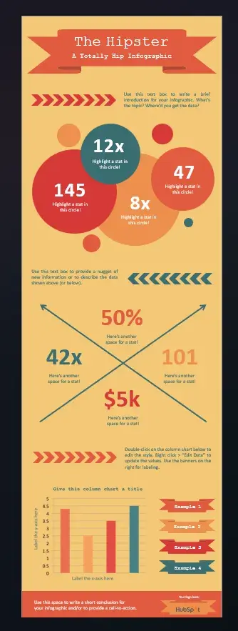
Many designers fall into the trap of filling every pixel. In reality, whitespace—the empty area around text—is crucial for your visual data communication. It acts as breathing room, preventing the reader from feeling overwhelmed and guiding their eye to the most important metrics. If your design feels busy, try increasing the space between elements.
Typography and Icon Integration
Keep font selection simple. Avoid decorative or cursive fonts that distract from your message. Stick to clean, sans-serif fonts like Arial, Calibri, or Roboto for high readability. Use icons as subtle signposts rather than decorative clutter. A well-placed icon reinforces a concept, whereas excessive imagery can distract from the actual data.
Final Polish: The Quality Checklist
Before you export, use this checklist to ensure your final asset is ready:
| Checklist Item | Purpose |
|---|---|
| Contrast | Ensures text stands out against backgrounds. |
| Alignment | Uses tools to snap elements into a grid. |
| Visual Hierarchy | Ensures headings are larger than details. |
| Clarity | Removes redundant text or unnecessary icons. |
By adhering to these standards, you transform your document into a powerful piece of visual data communication. Following these marketing infographic tips will elevate your design and ensure your audience retains the data you shared.
Stop thinking of PowerPoint as just a place for bulleted lists. When you adjust your perspective, it transforms into a flexible design canvas, capable of producing professional-grade visuals. You already possess the skills to master this tool; just shift your focus from slides to storytelling.
Whether you need to clarify a business process or visualize raw data, you have everything you need. By leveraging the techniques outlined in this guide, you can create high-impact visuals that resonate with your audience. Don’t let your data stay buried in spreadsheets. Open a new presentation and start building your first design today. Your audience is waiting for your next big idea—make sure they can see it clearly.
AEO/GEO
Want to learn more?
Contact us for direct consultation and support.