Designing a corporate website is rarely a straightforward task. You must balance the expectations of various stakeholders while overcoming obstacles that often stifle creativity. After spending nearly six years as a design manager for a large enterprise site, I noticed a recurring issue: we lost sight of what our target audiences truly needed. This phenomenon is often called tunnel vision. When you work on the same platform daily, it becomes essential to step back and rethink your approach. The following insights offer practical advice for creating effective website designs. You can apply these strategies to take your web design to the next level.
Establish Visual Hierarchy and Structure
Visual hierarchy determines how users perceive the importance of elements on a page. If your design process includes wireframing, you understand the value of starting with shades of gray. Transform your wireframe into a grayscale visual design before adding color. Insert your photography first, then introduce color to specific design elements one at a time. This method prevents an overdesigned appearance. It also ensures that prominence is placed only on items that require it. By controlling color saturation, you guide the user’s eye to the most critical information without distraction.
The Value of Grayscale Prototyping
Using grayscale forces you to focus on contrast and layout rather than aesthetic decoration. This approach reveals whether your hierarchy holds up without the crutch of vibrant hues. If a call-to-action button is not distinct in gray, adding color later will not fix the underlying structural issue. Start with high-contrast black and white to establish clear boundaries between sections. Then, introduce mid-tones to create depth. Finally, apply your brand colors sparingly to highlight interactive elements. This disciplined process results in a cleaner, more intuitive interface.
Rapid Prototyping with Presentation Software
You do not need complex graphic design software like Photoshop to create rapid prototypes. Many designers use presentation software such as Keynote or PowerPoint to build mockups of web pages, landing pages, and interface elements. There is a growing community of designers who use these tools for wireframing and prototyping. You can find numerous online repositories containing user interface templates for testing mobile and web applications. These tools allow for quick iteration and easy sharing with stakeholders who may not have design software installed. The simplicity of presentation software encourages faster decision-making and reduces the barrier to entry for collaborative design reviews.
Integrating Web Fonts into Brand Guidelines
Your corporate style guide must include specifications for web fonts. If your current guidelines do not address digital typography, you need to update them to ensure consistency across all digital touchpoints. Your website should adhere to the same governance standards as your print collateral and internal documents. Google Fonts offers a wide selection of suitable web fonts that are free to use. Select a font that aligns with your brand identity and define its usage in your style guide. Specify primary and secondary typefaces, along with recommended sizes and weights for headings, body text, and captions. Consistent typography enhances readability and reinforces brand recognition.
Optimize Content Placement and Navigation
Content placement significantly impacts user behavior. Placing social media icons in prominent locations, such as the header, can inadvertently encourage visitors to leave your site. You have worked hard to attract traffic to your website, so you want users to stay, learn about your services, and potentially inquire about solutions. Social media should drive traffic to your website, not vice versa. Consider moving social media icons to the footer. This placement keeps them accessible for users who seek them out while preventing them from distracting from your primary content and conversion goals. Focus on retaining user attention rather than facilitating an immediate exit.
The Problem with Image Carousels
Homepage slideshows and image carousels were once popular for displaying multiple messages on a single page. However, research shows that most users do not stay on the page long enough to view all the tiles or messages. Furthermore, the content displayed in carousels is often irrelevant to a first-time visitor’s immediate needs. Identify the single most important message you want a visitor to take away from their initial visit. Promote that one thing clearly and concisely. Usually, this involves explaining what your company does in plain language. Ditch the carousel and replace it with a static, compelling hero section that communicates your value proposition instantly. This approach reduces cognitive load and improves the likelihood of user engagement.
Simplifying Navigation Structures
Reducing the number of navigation options may seem counterintuitive, but it can guide users toward your most productive content. Overwhelming visitors with links to every possible page creates decision paralysis. Simplify your navigation by eliminating dropdown menus, especially multi-tiered options that are difficult to navigate on mobile devices. Reduce the number of links in your header or sidebar to only the most essential categories. A streamlined navigation menu helps users find what they need without getting lost in a labyrinth of subpages. Test your navigation with real users to identify which links are actually used and which are ignored. Remove or consolidate underused links to create a clearer path to conversion.
The Case for Removing Sidebars
Sidebars have been a common web design trend for over a decade, particularly on blogs. However, many organizations are finding that removing sidebars improves reader focus. When you eliminate the sidebar, you remove distractions such as related posts, ads, or secondary navigation links. This change encourages readers to pay attention to the main article and the call-to-action at the end. One company reported a significant increase in clicks on call-to-action graphics after removing sidebars from their blog. Consider adopting a single-column layout for your content pages. This design choice creates a cleaner, more immersive reading experience that mirrors the simplicity of print media. It also ensures that your primary message remains the focal point of the page.
Enhance Aesthetics and Readability
Color selection can be challenging, but nature offers a reliable source of inspiration. If you are struggling to find the perfect color combination for your website or a call-to-action graphic, look to natural landscapes. You can photograph natural wonders around you or find landscape photos online. Use a color picker tool to extract colors from these images. Nature’s color palettes are inherently harmonious and visually pleasing. Incorporating these colors into your design can create a sense of balance and tranquility. This approach ensures that your color scheme is both aesthetically pleasing and psychologically comfortable for users.
The Importance of Stepping Away
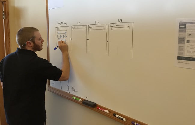
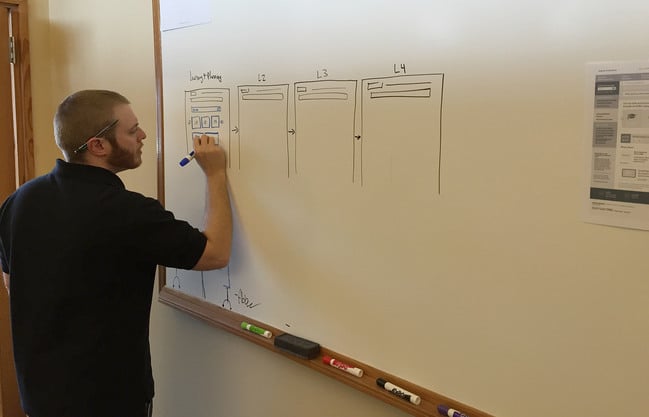
Good design begins with thorough planning. Getting your ideas down on paper or a whiteboard allows you to iterate through designs quickly. Drawing on a whiteboard makes the process collaborative, enabling team members to provide input in real-time. It is easy to erase pencil marks or whiteboard ink and make quick changes. Once you have a concrete concept, take a photo with your mobile phone and begin working on screen. This analog-to-digital workflow helps you focus on structure and flow before getting bogged down in pixel-perfect details. It also encourages creative thinking by removing the constraints of digital tools early in the process.
Creating Mood Boards with Pinterest
When designing a new website or redesigning an existing one, you need a central place to collect inspiration. Pinterest is an excellent tool for creating mood boards of favorite images, colors, layouts, patterns, and sample websites. Other designers share their mood boards, providing a wealth of curated resources. You can pin examples of typography, color schemes, and interface elements that resonate with your brand. This visual collection serves as a reference point throughout the design process, ensuring consistency and alignment with your creative vision. Sharing your mood board with stakeholders also helps align expectations early on.
Increasing Font Size for Clarity
Typography plays a crucial role in web design. Text is difficult to read on computer screens, so you must make important information stand out. One effective way to do this is by increasing font sizes, particularly for headings and key blocks of text. Consider increasing the size of your body text as well. Larger fonts improve readability and reduce eye strain. They also convey confidence and clarity. Avoid using small, cramped text that requires users to squint or zoom in. Prioritize legibility over saving space. A slightly larger font size can significantly enhance the user experience and make your content more accessible to a wider audience.
Utilizing White Space Effectively
White space, or negative space, is often underutilized in web design. Many websites cram every inch of the screen with content, especially above the fold. However, not every blank area needs to be filled. Giving your design room to breathe allows users to find information more easily. White space helps separate content sections, improves readability, and highlights important elements. It creates a sense of elegance and sophistication. Avoid cluttering your layout with excessive widgets, banners, or text blocks. Embrace simplicity and let your content speak for itself. A well-spaced design feels more modern and professional, enhancing the overall user experience.
Applying the Squint Test
The squint test is a quick way to assess the visual prominence of your website. Step back from your computer screen and squint your eyes until most details become blurry. Only the largest, most colorful, and prominent features will remain visible. This technique helps you understand what a first-time visitor notices when scanning your site. Ask yourself: is the most important information the most visible? If your call-to-action or key message is not prominent in the squint test, you may need to adjust its size, color, or placement. This simple exercise provides immediate feedback on your visual hierarchy and helps you refine your design for greater impact.
Final Thoughts on Design Iteration
Web design is an iterative process that requires constant evaluation and refinement. By applying these thirteen tactics, you can improve the clarity, usability, and aesthetic appeal of your website. Start with a strong visual hierarchy, simplify your navigation, and prioritize readability. Use nature-inspired colors and ample white space to create a balanced layout. Remember to step back and test your designs regularly. The goal is to create a website that not only looks good but also effectively communicates your brand’s value to your audience. As you implement these changes, observe how user behavior shifts. Use data to inform your next round of improvements. Design is never truly finished, but with a solid foundation, you can continuously evolve your site to meet changing user needs and business goals.





