The Evolution of SEO-Minded Design
In the early days of the web, design and search engine optimization (SEO) were often viewed as opposing forces. A website with strong SEO rankings frequently suffered from poor aesthetics and clunky navigation, while visually stunning sites often failed to rank because they ignored technical best practices. That era was characterized by keyword stuffing, confusing site structures, and outdated user experiences that prioritized bots over people.

Today, that dichotomy no longer exists. Modern digital strategy requires a unified approach where design and SEO work in tandem. When we design online experiences, we are not just creating visual layouts; we are building the infrastructure that search engines use to understand, index, and rank our content. The goal is to grow organic traffic at scale while maintaining an engaging, trustworthy user experience.
Designing with SEO in mind ultimately creates an excellent customer experience. By anticipating what users need and delivering it efficiently, we satisfy both human visitors and the algorithms that guide them to us. This alignment is critical for businesses looking to acquire leads and drive product sign-ups through organic channels. If a page is difficult to navigate or slow to load, users will leave quickly, signaling to search engines that the content lacks value.
Why Design Impacts Search Rankings
Design is an integral part of delivering key performance indicators (KPIs) like traffic and conversions. We directly influence what visitors and search crawlers see on a given page. If navigation is confusing, users exit rapidly, which indicates to search results pages (SERPs) that the content may be outdated or irrelevant to the query.
There are numerous design-related factors that influence SEO performance. Beyond just visual appeal, the structure, speed, and accessibility of a page determine its visibility. Understanding these connections allows teams to create content that ranks well and resonates with audiences. This is not about tricking search engines; it is about building a foundation that supports both technical requirements and human needs.
Prioritizing Mobile-First Experiences
Google has shifted to mobile-first indexing, meaning it uses the mobile version of a website for indexing and ranking. This change makes it imperative to ensure content quality is not compromised when designing for smaller screen sizes. The reality is that search engines may never see the desktop version of a site, so hiding content on mobile but showing it on desktop is akin to clipping a bird’s wings. Crawlers will not be able to explore the breadth of the website or gain enough context regarding the value the content provides.
In practice, this means site navigation must be fully available to mobile users. The link structure on mobile should not differ dramatically from the desktop version. Text content and images must remain accessible to ensure crawlers have sufficient context to understand the website’s purpose. Reducing content for mobile is a common pitfall, but it is essential to break this habit. Instead of trying to replicate the desktop experience, the focus should be on delivering the best possible experience for each specific platform.
Optimizing for Mobile Usability and Speed
To support mobile-first indexing, search engines heavily weigh the mobile friendliness of a website. Designers must pay close attention to several key factors when optimizing for mobile devices. First, the size of tappable areas must be adequate. Tap targets should be at least 48 pixels in size to ensure users can easily interact with links using their fingers. Second, font sizes must be legible. Text should scale appropriately to ensure readability on each device, as small fonts can result in penalties from search engines.
Image asset file sizes also play a critical role. When exporting images and other media, it is important to optimize file sizes for the web to prevent slow load times. User attention spans are short, and if pages take too long to load, potential visitors will abandon the site. By prioritizing speed and usability, businesses can improve both user satisfaction and search rankings.
Adapting Content for Different Platforms
Consider the example of a business template directory. Users might want to download templates for Microsoft Word, Excel, or PDF, which are typically used on desktops. On mobile, downloading these files may not be practical. Instead, the design can prioritize an option to email a link to the user, allowing them to download the template later on a desktop. This slight modification in the user experience creates an optimized flow for each platform, enabling users to achieve their goals regardless of the device they are using.
To ensure responsive design is considered at every stage, designers can adopt a workflow that includes creating mockups for both desktop and mobile simultaneously. By arranging content for both screen sizes concurrently, adjustments can be made based on the specific context of each platform. This approach ensures that no content is inadvertently hidden or degraded in the mobile version.

Building Meaningful Navigation Structures
The better navigation is at surfacing the structure of a website, the better crawlers can discover content and understand its organization. Clear navigation is not just for bots; it also helps visitors find relevant content easily. When a user lands on a page, they should be able to intuitively find related articles or resources. A well-organized website makes this process seamless, encouraging deeper engagement.
Modules such as “Related” feeds, “People also search for,” or “People also bought” are commonly used on e-commerce and directory websites. While they may seem simple, these features provide significant value to customers. They reinforce content categorization, helping visitors understand how the site is organized. They also promote the discovery of relevant content, allowing the website to deliver value beyond the initial query. This encourages customers to perceive the brand as a knowledgeable and helpful source of information.
Enhancing User Discovery and Decision Making
These navigation components help with decision-making by reducing the cognitive load required to find information. Customers feel reassured that they are not alone in their search, and the presence of related options can guide them toward the most relevant content. However, it is important to use this data wisely. Overloading users with too many options can be counterproductive. The goal is to be helpful, not overwhelming.
Breadcrumb navigation and tables of contents are other UI components that can be highly effective. While they may have a bad reputation in some design circles, they are useful for leveraging complex information architectures. Breadcrumbs show users where they are, where they have been, and where they can go next. This clarity prevents frustration and reduces the likelihood of users resorting to the browser’s back button because they are lost.

Structuring Content for Crawlers and Users
From a user perspective, clear navigation acts like road signs. It provides context and direction, making the browsing experience intuitive. For crawlers, a logical navigation structure helps them index the site more efficiently, understanding the hierarchy and importance of different pages. This dual benefit makes navigation a critical component of SEO-minded design. By organizing content clearly, businesses can improve both user satisfaction and search engine visibility.
Aligning Content with User Intent
Search engines aim to serve quality content that answers the queries they receive. Designing pages with relevant content is one of the most important parts of enabling strong SEO. When search engines do not deliver quality content, they lose users and revenue. Therefore, understanding what will be valuable to visitors is essential. This understanding comes from analyzing the intent behind a user’s query. Being familiar with user goals lays the foundation for creating content that delivers genuine value.
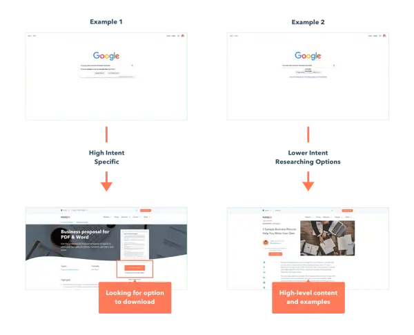
Keyword research is a primary tool for uncovering user intent. It examines the terms people type into search engines, the volume of those searches, and other metrics that help determine the value and difficulty of ranking for those terms. Examining the full queries allows designers to uncover more about the user’s knowledge level and intent. For example, a search for “business plan proposal template download” suggests a user who knows what they want and is ready to take action. In contrast, a search for “business plan proposal template examples” indicates a user who may need more context and guidance.
Conducting Empathy Exercises and User Research
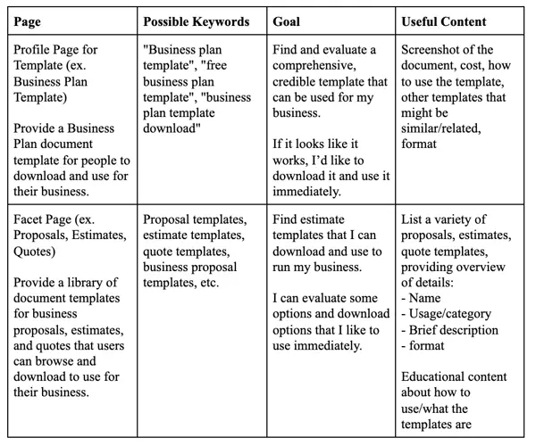
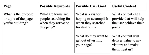
Once keywords are identified, an empathy exercise can help analyze the possible intent behind the query. For each page, designers can create a list of keywords, goals, and content that would be valuable to the user. This simple exercise helps consider the context in which people are visiting and maps out the modules that would create value. It sets a benchmark for the content that must be included, allowing designers to wireframe essential elements effectively.
User testing and research are also vital for evaluating assumptions. Tools like Validately and Respondent allow teams to recruit and screen users to test designs. By incorporating both moderated and unmoderated testing, businesses can gain direct insights into user behavior. When used together, keyword research, empathy exercises, and user testing provide a comprehensive understanding of user intent and goals.
Matching Content Specificity to User Expectations
Matching the specificity of content to user expectations is critical for ensuring value is delivered. If a user searches for a download, they expect a direct link to a file. If they search for examples, they expect an article with context and options. Keyword research serves as a litmus test for how well copy resonates with customers. Metrics like monthly search volume (MSV) can help understand how customers refer to relevant concepts in the real world. This information can guide decisions on whether to use commonly known terms or introduce new ones.
However, it is important to understand the limitations of keyword research. It shows what users are searching for, but not necessarily what they are looking for. Context plays a significant role in shaping intent. Using keyword research to form hypotheses about user intent is powerful, but it should not be taken as definitive proof of causality. Combining it with other research methods ensures a more accurate understanding of user needs.
Implementing Accessibility Best Practices
Making content accessible for all visitors is an important but often overlooked step in the design process. Common excuses for neglecting accessibility include the belief that it is visually uninteresting, time-consuming, or only impacts a small subset of customers. These assumptions are incorrect. Accessibility is not difficult to implement, and it is unacceptable to make excuses for ignoring it. Making content accessible impacts SEO because it creates a better user experience and helps search engines understand the content.
Adding descriptive alt text is one of the simplest ways to improve accessibility. Alt text helps people with visual impairments understand non-text content on a website. Screen readers use alt text to describe images, videos, and other media to users. Additionally, if images fail to load due to slow internet connections, alt text appears in place of the image, allowing users to still understand the content. Search engines also use alt text to understand what an image is about, which helps rank images in search results and provides context for the website’s overall value.
Creating Clear Content Hierarchies
Using headers to establish a consistent visual hierarchy makes content more digestible for both people and crawlers. Long bodies of text are difficult to read, so headers play a crucial role in allowing users to scan and find their way through content. Headers should be visually distinguished, clear, and descriptive, telling readers and crawlers exactly what lies ahead. This structure not only improves readability but also helps search engines understand the organization and importance of different sections of the page.
Writing descriptive anchor text is another key practice. Buttons and calls-to-action (CTAs) that simply say “Read More” or “Learn More” are not helpful for visitors or bots. They do not provide context about what the linked page contains. Effective CTAs and hyperlink copy should set expectations about the linked content, allowing users to evaluate whether it is valuable to them. Anchor text is also read by screen readers, so using descriptive links is essential for users with visual impairments who lack the visual context of the page layout.
Collaborating for Inclusive Design
Designers, developers, and marketers must work together to ensure that descriptive alt text, clear hierarchies, and descriptive anchor text are implemented on all content. Collaborating and holding each other accountable for these practices drives traffic to the site and creates an inclusive experience for all users. By prioritizing accessibility, businesses not only comply with ethical standards but also improve their SEO performance. Inclusive design is not just about helping a subset of users; it is about creating a better experience for everyone.
Designing with SEO in mind helps create a stronger, better customer experience. Ultimately, the best approach in any situation is to put the customer first. By using a collaborative, intentional approach to design and SEO, businesses can drive measurable impact and create more inclusive experiences for all. This alignment ensures that both human users and search engine bots find value in the content, leading to sustained organic growth and improved brand visibility.