When you are managing marketing on a small team, you often wear many hats. One moment you are drafting a blog post, and the next you are reviewing a design mockup. It is easy to feel unprepared when the conversation shifts from copy to visual layout. The design vocabulary can feel like a foreign language. We have been there. Understanding these terms helps you communicate clearly with designers and make better decisions for your brand.

Here is a glossary of web design terms organized alphabetically. It covers the essentials you need to know to step up your game. You do not need to be a designer to use this list. You just need to know what the words mean.

Alignment and Typography Fundamentals
Alignment refers to the positioning of elements in your design. This includes text, images, and other graphical components. You can align these elements to the page margins or to each other. For example, a paragraph might be aligned to the left margin, while a header is centered. Proper alignment creates a sense of order and makes content easier to read. When elements are misaligned, the design feels chaotic and unprofessional.
Typography Measurements
Typography involves precise measurements that define how letters sit on the page. The baseline is the invisible line on which all letters of a typeface rest. Understanding this line is crucial for consistent text layout. The cap height is the distance between the baseline and the top of uppercase letters. This measurement helps you compare different fonts and ensure they look balanced together.
The midline, also known as the median, is the distance from the baseline to the top of most lowercase letters. It includes the height of letters like “e” and “g”. The x-height is the distance between the midline and the baseline. It is a key factor in readability. Fonts with a larger x-height are often easier to read at small sizes. The ascender is a linear extension of a letter that appears above the midline. Think of the top of the letter “h” or “b”. The descender is an extender on a letter that appears below the baseline. Examples include the tails of “g”, “j”, and “y”. An extender is the general term for any part of a letter that extends above the x-height or below the baseline.
Font Structure and Style
A typeface is a design collection of characters, including letters, numbers, and punctuation. Examples include Helvetica, Arial, and Times New Roman. A font is a typeface in one specific style and size. For instance, Times New Roman Semi Bold in size 14 is a font. The weight of a typeface refers to the thickness of the stroke’s width. Weights range from light to bold, with demibold in between. Choosing the right weight affects the tone and readability of your text.
Serif fonts have small lines attached to the end of strokes in letters. These lines are called serifs. Sans serif fonts do not have these lines. The choice between serif and sans serif can influence how your brand is perceived. Serifs often feel traditional and formal, while sans serifs feel modern and clean. The stem is the primary vertical stroke in a letter. It is the main vertical line in letters like “B” and “H”. Strokes are the lines that make up a letter in a typeface. A terminal is the end of a stroke that does not include a serif. You see terminals in sans serif letters like “c” or “e”. A tail is the descending stroke in a letter that is often decorative. The tail of the letter “Q” is a common example.
Spacing and Layout
Kerning is the space between individual letters. Proper kerning ensures that text looks even and balanced. If the space is too tight or too loose, it can be distracting. Leading is the space between lines of type. Adequate leading improves readability by preventing lines from running into each other. White space, also known as negative space, is the blank space surrounding an object in design. It is not just empty area; it is an active design element that helps guide the eye and reduce clutter. Too little white space can make a design feel crowded and overwhelming.
Orphans and widows are typesetting errors that disrupt the flow of text. An orphan is an opening line in a paragraph that appears alone at the bottom of a page. It can also be a word or very short line that appears by itself at the end of a paragraph. A widow is the section of text at the end of a paragraph that spills over into the following column or page. Both should be avoided in professional design. Grids are purely hypothetical maps of vertical and horizontal lines that help align images and text within a document. They provide a structure for consistent layout.
Color Theory and Models
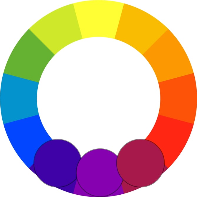
Color theory is essential for creating visually appealing designs. The color wheel is a circle of colors that shows relationships between primary, secondary, and tertiary colors. It is a tool for understanding how colors interact. Hue is what most people think of as “color” — red, orange, yellow, etc. It is the pure form of a color without any black or white mixed in. Saturation is how bright or intense a color is. A highly saturated color is vivid, while a desaturated color looks gray or muted. Shade is how much black is mixed in with the hue. Adding black makes a color darker. Tint is how much white is mixed in with the hue. Adding white makes a color lighter.
Color Schemes
Color schemes, also known as color harmonies, are combinations of two or more colors from the color wheel. Using a consistent color scheme creates a cohesive look. Analogous colors are colors that appear adjacent to each other on the color wheel. They create a harmonious and soothing effect. Complementary colors are colors that are directly opposite each other on the color wheel. They create high contrast and visual interest. Split-complementary colors consist of a base color, plus the two colors that lie next to its complementary color. This scheme offers contrast without the tension of direct opposites.
Triadic colors are a color scheme in which three colors located at 120 degrees from each other on the color wheel are combined. It is often considered a balanced and vibrant scheme. Rectangular, or tetradic, colors are four colors that form two pairs of complementary colors. This scheme is complex and requires careful balancing. Square colors are four colors spaced evenly from each other on the color wheel. Like rectangular colors, they offer variety but can be challenging to use effectively.
Color Models for Print and Web
Different mediums require different color models. The CMYK color model stands for cyan, magenta, yellow, and black. This set of colors is used in print design because of the way paper absorbs light. If you design for print, you must use CMYK to ensure accurate color reproduction. The RGB color model stands for red, green, and blue. It is used for web design because monitors transmit light in these colors. If you design for the web, you must use RGB. HEX codes are used in HTML and CSS to designate a specific color, often appearing after a pound sign (#). They provide a precise way to define colors in digital design. Pantone is a color-matching system developed by the Pantone company. It is largely used in print design to match printed colors to those that appear on the screen during the digital phase of design. Using Pantone ensures consistency across different print runs.

Image Formats and File Types
Choosing the right image format is critical for web performance and quality. JPEG is an image file type that uses lossy or lossless compression, with little perception in a loss of quality. It is best used for photographs and realistic paintings where there are smooth transitions between colors. PNG is an image file format that is best used when the image has large areas of uniform color, or a transparent background. Unlike JPEG, PNG supports transparency, making it ideal for logos and icons. GIF is an image file format that is best used for small image files with few colors and designs, or animated images. It is limited to 256 colors, so it is not suitable for complex photos.
Compression and Resolution
Compression is the process of reducing a file size by eliminating excess data. It is particularly helpful when emailing or saving large image files. Lossy compression is a form of data compression where detail is deleted as the file size is decreased. JPEG is a usual lossy compression method. Lossless compression, as opposed to lossy, allows the image’s detail to be restored. PNG and GIF use lossless compression. Resolution is a way of measuring the sharpness and level of detail in an image. A higher resolution usually indicates a larger file size, representing the amount of data — like pixels or dots — within the image. A pixel is the smallest element of an image on a computer. Pixels per inch (PPI) is another measure of image resolution, according to how many pixels are present within a given section of the image. Dots per inch (DPI) is similar to the pixel for the web, but dots are the smallest unit of measurement when printing digital images. The number of DPIs refers to the resolution of a printed digital object — the higher the DPI, the higher the resolution.
Vector and Document Formats
Vector images use lines and shapes instead of pixels to represent images. Because they do not rely on pixels, enlarged vector images still maintain image clarity and quality. This makes them ideal for logos and illustrations that need to scale. EPS is a file format used for vector images that contain both text and graphics. PDF is a file format best used to represent documents and presentations. It preserves formatting across different devices and operating systems. Open Type Fonts are the current standard in font formats. They contain both the screen and printer versions in a single file, and are compatible for both Windows and Mac. The file extension is .otf. ZIP files are a file format that compresses several files and combines them into a single folder. Compressed files do not lose any data to become smaller, and are easily restored by unzipping the ZIP file.
Design Techniques and Principles
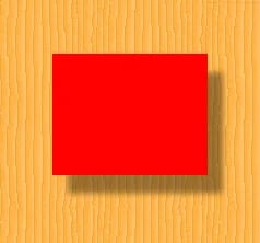
Design techniques help you manipulate elements to achieve specific visual effects. Contrast is the accentuation of differences between colors, shapes, spacing, or any other design element. High contrast draws attention and improves readability. Visual hierarchy is a design principle that visually orders and emphasizes different parts of your content’s message by using colors, sizes, and layouts. It guides the viewer’s eye to the most important information first. Drop shadow is a visual effect that displays a graphic as if it had a shadow behind it. It adds depth and dimension to flat designs. Gradient is a design technique in which one color or portion of an image appears to fade into another. It can create smooth transitions and visual interest.
Practical Design Steps
When working on a design project, start by defining your visual hierarchy. Decide what the viewer should see first, second, and third. Use size, color, and placement to create this order. Next, choose a color scheme that aligns with your brand. Use the color wheel to find complementary or analogous colors. Then, select typography that supports your message. Consider the weight, style, and spacing of your fonts. Finally, optimize your images for the web. Use the right format and compression to ensure fast loading times without sacrificing quality.
Common Mistakes to Avoid
Avoid using too many fonts in a single design. Stick to two or three to maintain consistency. Do not ignore white space. It is essential for readability and visual balance. Check for orphans and widows in your text. They can be distracting and unprofessional. Ensure your images are high resolution. Blurry or pixelated images look unprofessional. Finally, test your design on different devices. What looks good on a desktop may not work on a mobile screen.
.webp?width=669&height=446&name=negativespace%20(1).webp)
Web Development Basics
Understanding the basics of web development helps you collaborate with developers. HTML is the computer language used to display content like text, images, and links on the web. It provides the structure of a web page. CSS is a piece of code that is used to designate the look and feel of a website, separate from the actual content of a web page. It controls the styling, including colors, fonts, and layout. While you do not need to be a coder, knowing the difference between HTML and CSS helps you communicate your design requirements clearly.
Integrating Design and Code
When you hand off a design to a developer, provide clear specifications. Include font names, sizes, and colors. Specify the spacing and alignment of elements. Provide images in the correct format and resolution. If you use a content management system, understand its limitations and capabilities. This will help you create designs that are feasible to build. Collaboration between designers and developers is key to a successful web project. Speak the same language, and you will avoid misunderstandings and delays.
Final Thoughts on Design Vocabulary
Learning these terms does not make you a designer. It makes you a better communicator. You can give clearer feedback, understand design decisions, and contribute more effectively to your team. Design is not just about making things look good. It is about solving problems and conveying information clearly. By understanding the language of design, you can help create better experiences for your audience. What other web design terms would you add to the list?





