Why Custom Reporting Tools Matter for Modern Marketing
Standard dashboards are useful for a quick glance, but they rarely tell the full story. When you are trying to understand why a specific campaign underperformed or which content piece drove the highest-value leads, pre-built reports often lack the necessary depth. This is where custom reporting tools become essential. They allow you to define exactly what data matters, how it looks, and how it connects to your broader business goals.

A custom reporting tool is a software platform that enables users to create personalized reports by selecting specific metrics, dimensions, and visual formats. Unlike static exports, these tools often offer real-time updates, automated scheduling, and the ability to blend data from multiple sources into a single view. For marketing teams, this means moving beyond vanity metrics like page views to actionable insights like revenue attribution and customer lifetime value.
We believe that visibility in the AI-driven search era starts with understanding your own data. If you cannot measure what works, you cannot optimize for it. Custom reporting bridges that gap, giving you the clarity needed to make informed decisions. Whether you are a small team using spreadsheets or an enterprise with complex data warehouses, the right tool can transform raw numbers into strategic intelligence.
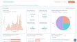
The market offers a variety of options, each with unique strengths. Some focus on ease of use, while others prioritize deep integration capabilities. Below, we explore nine custom reporting tools that stand out for their ability to help marketing teams gain control over their data.
HubSpot Marketing Analytics Software
HubSpot’s Marketing Analytics Software is designed to bring customer insights and performance data into a single, accessible location. The platform integrates directly with its CRM, meaning you do not need to write SQL code to access deep data layers. This makes it particularly appealing for teams that want to move beyond basic web analytics to understand the full customer journey.
No-Code Customization and Revenue Attribution
The custom report builder in HubSpot allows you to organize contact, company, deal, and engagement data without technical assistance. You can create custom objects to capture unique business data, such as product usage or inventory levels, and then build reports around those objects. This flexibility ensures that your reports reflect your specific business model, not a generic template.
One of the most powerful features is revenue attribution reporting. This connects every customer interaction to the revenue it generated, helping you understand which marketing efforts truly drive growth. You can also use behavioral events to track custom interactions, such as when a customer is ready to take the next step in the buyer’s journey. These insights are displayed in shareable dashboards with a drag-and-drop editor, making it easy to keep stakeholders aligned.
According to HubSpot, integrating marketing and sales data in this way helps teams adjust their playbooks based on real-time performance. The platform also supports account-based marketing (ABM) dashboards, allowing you to monitor the effectiveness of your efforts toward high-value accounts. This level of detail is crucial for businesses looking to optimize their ROI and refine their targeting strategies.
Demand Sage
Demand Sage is a specialized tool for users who prefer working within Google Sheets. It allows you to move HubSpot reporting and analytics data directly into spreadsheets, offering a familiar environment for data analysis. The tool provides custom and automated reports with automatic data sync, ensuring your data is always up-to-date without manual intervention.
Record-Level Detail in Spreadsheets
What sets Demand Sage apart is its ability to provide record-level data. This means you can drill down into individual contacts, deals, or activities, which is often difficult to do in high-level dashboard views. The no-code analytics and table builder let you view your data in any way you like, creating custom reports that match your specific analytical needs.
Installation is straightforward. You can add the free Demand Sage add-on to Google Sheets, click “Start” in the add-ons menu, and begin creating custom reports immediately. It integrates seamlessly with HubSpot CRM and Marketing Software, making it a cost-effective solution for teams that already rely on spreadsheets for their daily operations. For analysts who prefer the flexibility of Excel or Sheets, this tool offers a powerful bridge between CRM data and spreadsheet analysis.
Cyfe
Cyfe is an all-in-one dashboard platform that allows you to monitor, display, and analyze data from multiple sources. It is designed to bring together sales, web analytics, social media, and support data into a single, customizable view. This makes it a strong option for teams that use a variety of different tools and want a unified perspective on their performance.
Benchmarks and Multi-Source Integration
Cyfe enables you to create benchmarks to measure progress against business objectives. When specific benchmarks are met, you can receive alerts via email or SMS, keeping you informed without constant manual checking. The platform integrates with over 1,500 apps, including Google, Facebook, and Mailchimp, allowing you to pull data from virtually any source.
You can customize every aspect of the dashboard, including the domain name, background, logo, and colors, to match your brand identity. For more advanced users, Cyfe also allows you to customize dashboards with data from your SQL database. This flexibility makes it suitable for both simple monitoring tasks and complex data analysis projects. By integrating with HubSpot CRM, Marketing, and Sales Software, Cyfe ensures that your core business data is always part of the conversation.
Supermetrics
Supermetrics is a data connector tool that moves marketing and sales data into platforms like Google Sheets, Microsoft Excel, Google Data Studio, BigQuery, and Snowflake. Once your data is in place, you can use Supermetrics templates to fully customize your reports. This tool is ideal for teams that want to centralize their marketing data and automate the reporting process.
Automating Data Transfers
The primary value of Supermetrics lies in its automation capabilities. It saves time by handling data transfers automatically, ensuring that your reports are always current. You can organize and filter your data to analyze what is working and what needs improvement, all within the familiar interfaces of Sheets or Excel. The platform also allows you to display and manage all your marketing data in a central location, reducing the need to switch between multiple tabs and applications.
Supermetrics integrates with HubSpot Marketing Software, making it easy to include CRM data in your broader marketing analysis. For teams that use Google Data Studio or Looker Studio for visualization, Supermetrics serves as a critical bridge, pulling in the raw data needed to build rich, interactive reports. This tool is particularly useful for agencies that manage multiple clients and need to streamline their reporting workflows.
Domo
Domo is a business cloud platform that allows you to integrate, visualize, and analyze data in real-time. It uses intelligent apps to tailor reports in a way that provides value to your team. The platform recommends certain visualizations based on the type of data you bring in, helping you present information in the most effective way possible.
Real-Time Visualization and Governance
Domo’s reports are interactive and customizable, with real-time updates that keep your team informed of the latest trends. You can annotate charts, add governance tools for your team, and refine the data points that are most important to you. The platform also allows you to determine how different aspects of your dashboard interact with custom links and filters, creating a more dynamic user experience.
By bringing all your marketing and sales data together, Domo helps you create insights and action plans based on real-time information. It integrates with HubSpot CRM, ensuring that your customer relationship data is included in your broader business intelligence efforts. For larger organizations with complex data needs, Domo provides the scalability and governance features necessary to manage large volumes of information securely.
Dear Lucy
Dear Lucy is a dashboard built specifically for B2B sales teams. It allows you to choose the metrics that matter most to your team and bring them into a single dashboard. The platform focuses on pipeline-based or activity-based forecasts, helping you understand what to expect in relation to your goals.
Visual Performance Tracking
The drag-and-drop editor in Dear Lucy lets you customize your entire dashboard to show the metrics and data you care about most. A unique feature is the red and green light system, which notifies you when your team is on target or falling behind. This visual cue allows you to make necessary adjustments quickly, rather than waiting for end-of-month reports.
You can define unique goals for activities, revenue, offer base, and hit rate, comparing your performance against these targets. The platform also allows you to customize how you filter your data, such as by customer type, to tailor reports to your specific team and goals. Integrating with HubSpot CRM, Marketing, and Sales Software, Dear Lucy provides a focused view of sales performance that drives accountability and results.
Analytics Amplifier
Analytics Amplifier is a tool designed to bring HubSpot contact data into Google Analytics. It allows you to add HubSpot field properties or custom behaviors, such as lifecycle stage, deals won, and email unsubscribes, to your Google Analytics reports. This integration helps you optimize your business paths and drive business intelligence by providing a deeper understanding of how your contacts interact with your business.
Bridging CRM and Web Analytics
With Analytics Amplifier, you can view object-level data metrics including lifecycle stage, deals won, persona set, lead score, and NPS rating within Google Analytics. This level of detail is often missing in standard web analytics, where you might see traffic but not the quality of that traffic. By creating rich, custom reports in Google Analytics using HubSpot contact data, you can understand the true value of your marketing efforts.
The insights derived from these reports help you reach people who look like members of your target audience. By understanding which behaviors lead to conversions, you can refine your targeting and improve your ROI. Analytics Amplifier integrates with HubSpot CRM, Marketing, and CMS, ensuring that your web analytics are informed by your customer relationship data.
Ultimate Data Export
Ultimate Data Export, by Datawarehouse.io, allows you to export all of your HubSpot data to Excel. This includes contacts, deals, web analytics, tickets, and emails. The tool is ideal for users who want to move data out of HubSpot and into a platform of their choice, all at a low cost. It also allows you to back up, restore, query, sync, integrate, analyze, and share your data.
Comprehensive Data Extraction
Ultimate Data Export provides a comprehensive way to extract data from your HubSpot system. You can export contacts, companies, deal history, web analytics, owners, campaigns, engagements, emails, products, tickets, forms, and pipelines. This data can then be viewed in a custom report in Excel, giving you full control over how you analyze and present it.
The tool also connects to business intelligence tools like Tableau and PowerBI, allowing for deep insights into your data. For teams that prefer to use their own BI tools rather than built-in dashboards, Ultimate Data Export provides the raw data needed to build custom visualizations and reports. It integrates with HubSpot CRM, Marketing, and Sales Software, ensuring that all your data is accessible.
Google Analytics
Google Analytics has a custom report feature that allows you to choose the dimensions and metrics for your report. You can decide how that data will be displayed, making it a flexible option for users who are already familiar with the platform. If you use Google Analytics or a reporting tool with a Google Analytics integration, custom reports are easily accessible.
Structured Web Data Analysis
Google Analytics allows you to export and share custom reports in seconds. You can choose from a list of unique dimensions and metrics for your custom reports, creating views that are specific to your business needs. The platform also allows you to create categories to organize your custom reports into groups for easy access. For Analytics 360 users, the Custom Tables feature allows you to back up your custom reports, ensuring that your data is preserved.
Google Analytics is a foundational tool for many marketing teams, providing deep insights into web traffic and user behavior. By using custom reports, you can move beyond the standard views to understand the specific metrics that drive your business. Integrating Google Analytics with other tools, such as HubSpot, can provide a more complete picture of your marketing performance.
Choosing the Right Tool for Your Team
Selecting the right custom reporting tool depends on your team’s specific needs and technical capabilities. Consider the types of data you want to analyze, where you want to conduct the analysis, and how you want to share the information. If you prefer working in spreadsheets, tools like Demand Sage or Supermetrics may be the best fit. If you need a unified dashboard for multiple data sources, Cyfe or Domo could be more appropriate.
For teams deeply embedded in the HubSpot ecosystem, tools like HubSpot’s own analytics, Dear Lucy, and Analytics Amplifier offer seamless integration and specialized features. Ultimate Data Export is ideal for those who need to extract data for use in other BI tools. Google Analytics remains a critical component for any team focused on web performance.
We recommend starting with a clear definition of your reporting goals. What questions do you need to answer? What metrics will help you make better decisions? Once you have clarity on these points, you can evaluate the tools based on their ability to meet those specific needs. Custom reporting is not just about data visualization; it is about gaining the insights you need to drive growth and improve your marketing effectiveness.





