Understanding the Shift Toward Mobile-First Indexing
Search engine algorithms have always evolved, but the emphasis on mobile-friendliness represents a fundamental shift in how visibility is determined. Google announced that it would expand the use of mobile-friendliness as a ranking signal, affecting mobile searches in all languages worldwide. According to Google’s Webmaster Trends analyst, this change has a larger impact on search results than previous major updates like Panda and Penguin. The core message is clear: if your website, landing pages, or blog are not optimized for mobile devices, your ranking in mobile searches will likely suffer.

This update is not just about technical compliance; it is about solving for the searcher. Users expect a seamless experience regardless of the device they use. When a site is optimized for mobile, users find it easier to access relevant, high-quality information. For businesses, this means that mobile optimization is no longer optional—it is a critical component of maintaining and improving search visibility. The term “Mobilegeddon” was used to describe the initial shock of this update, but a more constructive view is that it rewards sites that prioritize user experience.

For organizations using platforms like HubSpot’s Content Management System (CMS), the transition is smoother. HubSpot’s platform uses responsive design, which automatically adapts to any mobile device and passes Google’s mobile-friendliness tests. However, for sites on other systems, the situation depends heavily on how the site was originally designed. Understanding your current readiness is the first step toward ensuring your brand remains visible in an increasingly mobile-first world.
Why Mobile Optimization Matters Now
The shift to mobile-first indexing reflects the reality of user behavior. A significant portion of web traffic now comes from mobile devices, and users expect fast, readable, and easy-to-navigate experiences. If a site is not optimized, users are likely to bounce quickly, signaling to search engines that the content is not valuable. This leads to lower rankings and reduced traffic. By prioritizing mobile optimization, brands can ensure they are meeting user expectations and maintaining their competitive edge.
Moreover, mobile optimization is closely tied to other ranking factors, such as page speed and user engagement. A site that loads slowly or is difficult to navigate on mobile will see higher bounce rates and lower time on page, both of which can negatively impact SEO. By addressing mobile-friendliness, you are also improving these other critical metrics, creating a positive feedback loop for your search visibility.
Testing Your Website’s Mobile Readiness
Google provides a free assessment tool to help website owners determine if their sites are ready for mobile-first indexing. This tool offers a quick evaluation of whether your mobile rankings will be affected by the algorithm update. If your site is fully optimized, you will receive a success message, along with a visual representation of how Googlebot views your website. This can be reassuring, especially if you are using a platform that prioritizes responsive design.
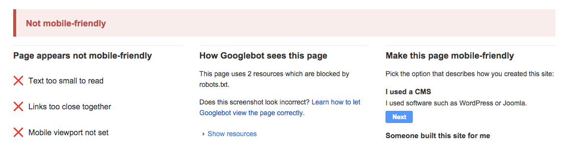
However, if your site is not mobile-friendly, the tool will provide specific feedback on what needs to be improved. Common issues include a missing mobile viewport, links that are too close together, and text that is too small to read. While these issues might seem daunting, they often can be resolved by moving to a mobile-optimized content management system or making targeted adjustments to your site’s design. The key is to act quickly, as every day your site is not optimized is a day you may lose potential traffic and conversions.
Interpreting the Test Results
When you run your site through Google’s mobile-friendly test, the results can provide valuable insights into your site’s current state. A positive result means your site is likely to maintain or improve its rankings in mobile searches. A negative result, however, requires attention. The specific issues highlighted by the test can guide your optimization efforts, helping you prioritize the most critical changes.
For example, if the test indicates that your text is too small, you may need to adjust your font sizes to ensure readability on smaller screens. If links are too close together, you might need to redesign your navigation to make it easier for users to tap on mobile devices. These adjustments not only improve your mobile-friendliness score but also enhance the overall user experience, leading to better engagement and higher conversion rates.
Choosing the Right Mobile Optimization Strategy
Google recognizes three main approaches to mobile optimization: responsive design, dynamic serving, and separate mobile websites. Each method has its own advantages and disadvantages, and the best choice depends on your specific needs and resources. Understanding these options can help you make an informed decision about how to optimize your site for mobile devices.
Responsive design is Google’s top recommendation. This approach uses a single URL and HTML code that adapts to different screen sizes. It provides a consistent experience across devices, making it easier for users to navigate and for search engines to crawl. Dynamic serving, on the other hand, uses the same URL but serves different HTML based on the user’s device. While this can be effective, it relies on user-agent detection, which can be error-prone. Finally, creating a separate mobile website involves maintaining two versions of your content, which can be resource-intensive and lead to inconsistencies.
Why Responsive Design Stands Out
Responsive design is widely regarded as the best approach for several reasons. First, it simplifies maintenance by requiring only one version of your content. This reduces the risk of errors and ensures that your information is always up-to-date across all devices. Second, it improves crawl efficiency for search engines, as Googlebot only needs to index one URL per piece of content. This can lead to better indexing and higher rankings.
From a user experience perspective, responsive design provides a seamless transition between devices. Users do not need to worry about being redirected to a different URL or encountering a different layout. This consistency builds trust and encourages longer engagement with your content. Additionally, responsive design tends to result in faster load times, as there is no need for redirects or additional server requests. Faster sites lead to better user experiences and higher conversion rates.
| Approach | Single URL? | Maintenance Complexity | Crawl Efficiency | User Experience |
|---|---|---|---|---|
| Responsive Design | Yes | Low | High | Consistent |
| Dynamic Serving | Yes | Medium | Medium | Good |
| Separate Mobile Site | No | High | Low | Fragmented |
Avoiding Common Mobile Optimization Mistakes
Even with the best intentions, it is easy to make mistakes when optimizing for mobile. Google has identified several common pitfalls that can negatively impact your rankings and user experience. One major issue is the use of Flash video and other content types that do not play on mobile devices. These elements can prevent users from accessing key content, leading to frustration and higher bounce rates.
Another common mistake is having a slow-loading mobile site. Page speed is a critical ranking factor, and users have little patience for delays. If your site takes too long to load on mobile, users are likely to leave before they even see your content. This not only hurts your rankings but also reduces the likelihood of conversions. To avoid this, ensure that your images are optimized, your code is minified, and your server response times are fast.
Best Practices for Mobile Optimization
To ensure your site is fully optimized for mobile, consider the following best practices. First, use a responsive design framework that adapts to all screen sizes. Second, optimize your images and videos for mobile to reduce load times. Third, ensure that your text is readable and your links are easy to tap. Fourth, simplify your navigation to make it easy for users to find what they need. Finally, test your site regularly using Google’s mobile-friendly test to identify and fix any issues.
By following these guidelines, you can create a mobile-friendly site that meets user expectations and performs well in search results. This not only improves your visibility but also enhances the overall user experience, leading to better engagement and higher conversion rates.
Frequently Asked Questions About Mobile Optimization
Many business owners have questions about the mobile-first update and how it affects their sites. Here are answers to some of the most common concerns.
Do I need to redesign my site immediately?
Not necessarily. While a full redesign might be ideal, you can often achieve mobile-friendliness by moving your existing content to a mobile-optimized platform. This can be a quicker and more cost-effective solution than a complete overhaul.
Will my site be permanently penalized?
No. You can rebuild your search credit after optimizing your site. However, every day your site is not mobile-friendly is a day you may lose traffic. Acting quickly is essential to minimize the impact on your rankings.
What other factors should I consider?
Beyond technical optimization, consider the user experience. Are your forms short and easy to fill out on mobile? Is your content strategy adapted for mobile users? These factors can significantly impact your conversion rates and overall success.
Long-Term Benefits of Mobile Optimization
Optimizing for mobile is not just about avoiding penalties; it is about embracing the future of search. As more users turn to mobile devices for information, brands that prioritize mobile-friendliness will be better positioned to capture their attention. This leads to increased traffic, higher engagement, and ultimately, more conversions.
Furthermore, mobile optimization is closely tied to other emerging trends, such as voice search and AI-driven search results. By ensuring your site is mobile-friendly, you are laying the groundwork for visibility in these new channels. This forward-thinking approach can help your brand stay ahead of the curve and maintain a competitive edge in a rapidly evolving digital landscape.
Final Thoughts on Mobile-First Search
The shift to mobile-first indexing is a significant change, but it is ultimately a positive one for users and businesses alike. By prioritizing mobile optimization, brands can improve their search visibility, enhance user experience, and drive better business outcomes. While the transition may require some effort, the long-term benefits far outweigh the initial investment.
As you consider your mobile optimization strategy, remember that this is not a one-time task. It is an ongoing process that requires regular attention and adjustment. By staying informed about best practices and continuously testing your site, you can ensure that your brand remains visible and relevant in an increasingly mobile-first world. The question is not whether you should optimize for mobile, but how quickly you can do so to capitalize on this opportunity.





