Mobile web design has shifted from being a nice-to-have feature to an absolute necessity. With more than half of all global search traffic originating from mobile devices, the way users interact with digital content has fundamentally changed. Yet, despite this massive shift in consumer behavior, nearly half of all marketers still haven’t fully optimized their websites for mobile viewing. This gap isn’t just a missed opportunity; it’s a direct threat to visibility, user trust, and conversion rates.
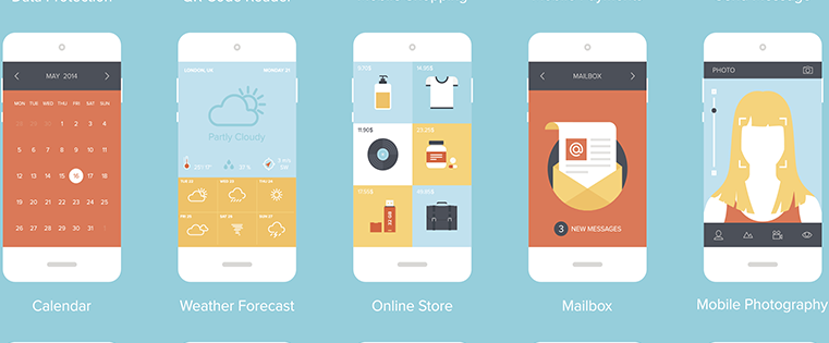
When we talk about mobile optimization, we aren’t just talking about making a site look good on a smaller screen. We are talking about creating an experience that respects the user’s time, intent, and context. Mobile users are often on the go, searching for specific information with a clear plan of action. They don’t have the patience for slow load times, confusing navigation, or intrusive pop-ups.
At AEO/GEO, we focus on ensuring brands remain visible and relevant in evolving search landscapes, including mobile-first indexing and AI-generated answers. A well-designed mobile site is the foundation of that visibility. If users bounce immediately because the experience is poor, even the best SEO strategy will fail. Here are nine core principles to guide your mobile web design efforts, ensuring you meet the needs of today’s discerning mobile audience.
1) Simplify Navigation for Small Screens
Navigation on a mobile device operates under different constraints than on a desktop. Screen real estate is limited, and users are often one-handed, navigating with thumbs rather than a precise mouse cursor. Expecting users to scroll through expansive menus or dig through multiple layers of sub-menus is a recipe for frustration. The goal is to provide a high-level overview that allows visitors to quickly narrow down their search.
Keep Menu Items Concise
The ideal mobile menu contains no more than five or six top-level items. This forces you to prioritize the most critical sections of your site, such as core products, services, or support. If sub-menus are necessary, limit them to two levels deep at most. The hamburger icon (three horizontal lines) has become a universal standard for mobile navigation, so you don’t need to label it explicitly. Users recognize it instantly.
Consider how major brands handle this. Restaurants like Carrabba’s place their menu and location finder directly in the header, keeping the main navigation dropdown clean and focused on other key actions. This approach reduces cognitive load and helps users find what they need without unnecessary clicks. When you strip away the non-essential, you make the essential elements shine.
2) Minimize Form Fields to Boost Conversions
Forms are often the biggest friction point in mobile user journeys. Typing on a small screen is tedious and error-prone. Users are far less likely to fill out a lengthy form on their phone compared to their desktop. If you require too much information upfront, you risk losing potential leads or sales before they even begin.
Ask Only for What You Need
For a newsletter signup, ask only for a name and email address. For a contact inquiry, stick to the bare minimum required to initiate a conversation. If you’re processing payments, understand that while more data is needed, you should still minimize fields by using smart formatting and autofill capabilities. MasterCard, for example, makes only first name, last name, email, topic, and comments required for support inquiries. Optional fields like phone number or card type are available but not mandatory, reducing pressure on the user.
To find the sweet spot for your own forms, run A/B tests. Remove one field at a time and measure the impact on completion rates. You might find that removing a phone number field increases conversions by 10%, while the quality of leads remains unchanged. Trust your users to provide more information if they choose to, but don’t force it.
3) Optimize Input Methods for Mobile
Beyond the number of fields, the type of input matters significantly. Asking a user to type out a city name, select a date from a complex calendar, or choose a category from a long list can be cumbersome. Mobile-friendly design leverages native device capabilities to make input easier.
Use Dropdowns, Checkboxes, and Predictive Text
Utilize dropdown menus for categorical data, checkboxes for multiple selections, and native date pickers for calendars. These elements are optimized for touch interfaces and reduce the need for manual typing. Expedia excels at this by offering predictive text when users type flight origins or destinations. As you type “New York,” the app suggests “JFK” or “LGA,” saving time and reducing errors.
Clarity is also key. Clearly mark required fields versus optional ones. For returning customers, enable autofill to speed up checkout. For new users, offer a guest checkout option to avoid creating unnecessary barriers. Every second saved in form completion is a second of goodwill earned with your user.
4) Design Clear and Visible Calls-to-Action
Calls-to-action (CTAs) guide users toward their next step, but on mobile, they need to be even more prominent. Mobile users have a specific intent; they want to find information, make a purchase, or contact support. Your CTAs should align with that intent and be impossible to miss.
Place CTAs Above the Fold
Position your primary CTA above the fold, using contrasting colors that stand out from the rest of the design. The text should be clear and action-oriented, avoiding vague language. Papa John’s uses its homepage to highlight a holiday promotion with bold, easy-to-read text. The offer is clear, the benefit is obvious, and the CTA tells the user exactly what will happen when they click. There’s no fine print or hidden steps—just a direct path to the user’s goal.
Ensure that the CTA button is large enough to tap easily and that it’s spaced away from other interactive elements to prevent accidental clicks. A clear CTA reduces uncertainty and increases the likelihood of conversion.
5) Enhance Site Search with Filters and Visuals
Site search is a lifeline for mobile users who know exactly what they’re looking for. They don’t want to browse; they want to find. Your search results page should deliver relevant items immediately, with options to refine the results further.
Provide Robust Filtering and Product Previews
Include filter options for price, size, relevance, and ratings. Under Armour’s mobile site allows users to narrow down hundreds of hoodie results by department, price range, or customer rating. This empowers users to control their search experience and find the right product quickly.
Additionally, display product images, prices, and short descriptions directly on the search results page. Avoid forcing users to click through to a product page just to see what it looks like or how much it costs. Let images expand within the current window for a better view. This reduces clicks and keeps users engaged with your content.
6) Make Contact Information Easily Accessible
Customers need to reach you, especially when they have urgent questions or issues. On mobile, the easiest way to contact a business is via a click-to-call button. This feature should be prominently displayed, ideally in the header or footer of every page.
Offer Multiple Contact Channels
While click-to-call is essential, also provide a simple contact form and a clear email address. Zappos places its customer service number above the fold, ensuring that users who need immediate assistance can call with a single tap. For less urgent inquiries, an FAQ page can help users self-serve, reducing the load on your support team.
If you have physical locations, embed a Google Map that allows users to get directions directly from your site. This small detail can make a significant difference for local businesses, turning online interest into foot traffic.
7) Design for Thumbs, Not Fingers
Mobile devices are operated with thumbs, and thumb movement is less precise than a mouse cursor. Buttons and links must be large enough to tap accurately, with sufficient spacing between them to prevent mis-clicks. The industry standard for minimum tap area is 44x44 pixels.
Ensure Readable Text and Clickable Elements
Never require users to pinch-to-zoom to read text or click a link. This is a sign of poor mobile design. Southwest Airlines’ mobile site uses full-width buttons that are easy to tap, even on smaller screens. The text is large and legible, and the layout is uncluttered, focusing on the primary actions: booking a flight or managing a reservation.
Test your design on various devices, including older models with smaller screens. If your buttons are too small or your text is too tiny, users will struggle to interact with your site, leading to frustration and abandonment.
8) Prioritize Fast Load Times
Patience is in short supply, especially on mobile. Users expect pages to load quickly, ideally in under four seconds. Slow load times are a primary reason for bounce rates, particularly on non-WiFi connections where data speeds can be inconsistent.
Optimize Media and Code
Keep your site’s total size under 1MB where possible. Compress images, use lazy loading for below-the-fold content, and minimize JavaScript and CSS files. The New York Times’ mobile site loads almost instantly, even on cellular data, by prioritizing text and optimizing images. This speed ensures that users can get the information they need without waiting.
Monitor your site’s performance regularly using tools like Google PageSpeed Insights. Identify bottlenecks and address them proactively. A fast site is not just a convenience; it’s a competitive advantage.
9) Avoid Intrusive Pop-Ups
Pop-ups are widely disliked, especially on mobile. They obstruct content, are difficult to close, and can lead to accidental clicks. Google’s mobile-friendly guidelines explicitly discourage intrusive interstitials, as they negatively impact user experience and search rankings.
Use Non-Intrusive Engagement Methods
Instead of pop-ups, use inline sign-up forms or subtle banners that don’t block the main content. BuzzFeed avoids pop-ups entirely, relying on sponsored content and clear CTAs within the page flow. This approach respects the user’s journey and allows them to engage with your brand on their terms.
If you must capture emails, consider a slide-in form that appears after a user has scrolled a certain distance or spent a specific amount of time on the page. This method is less intrusive and more likely to result in genuine interest.
Conclusion: Mobile-First is a Mindset
Mobile web design is not just about technical compliance; it’s about understanding user behavior and intent. By simplifying navigation, optimizing forms, and prioritizing speed, you create an experience that respects your users’ time and needs. As mobile usage continues to grow, these principles will only become more critical. Start with these nine guidelines, test iteratively, and always keep the user’s perspective at the forefront of your design decisions. After all, if your site isn’t working for mobile users, it’s not working at all.





