What Are Brand Colors and Why Do They Matter?
Brand colors are the specific hues and shades a company selects to represent its identity across every touchpoint, from the logo to the website and packaging. These colors do far more than decorate a design. They serve as a potent tool for conveying brand values and establishing immediate recognition. In fact, up to 80% of snap judgments about products are based solely on color. This statistic underscores the critical role visual identity plays in how consumers perceive a business before they even read a single word.

Consider the impact of McDonald’s yellow arches. The color is instantly recognizable and evokes feelings of warmth and energy. This consistency helps the brand stay top-of-mind long after a customer has finished their meal. Similarly, Coca-Cola has used its signature red and white palette since 1886. Red represents excitement and passion, while white suggests purity. Together, these colors have become synonymous with the brand, creating a visual shorthand that is understood globally.
The importance of brand colors extends beyond mere aesthetics. They help businesses stand out in a crowded market. When you use a consistent color palette, you create a cohesive look that resonates with your target audience. This consistency strengthens brand recognition and builds trust. Customers begin to associate your specific shades with your products and services, which can significantly enhance brand equity.

The Psychology Behind Color Choices
Color psychology explores how different hues impact human mood, behavior, and perception. Understanding this field allows brands to make informed decisions that align with their desired emotional impact. For instance, green often signifies growth, health, and nature, making it a popular choice for environmental or wellness brands. Conversely, red can symbolize passion, urgency, or even danger, depending on the context.
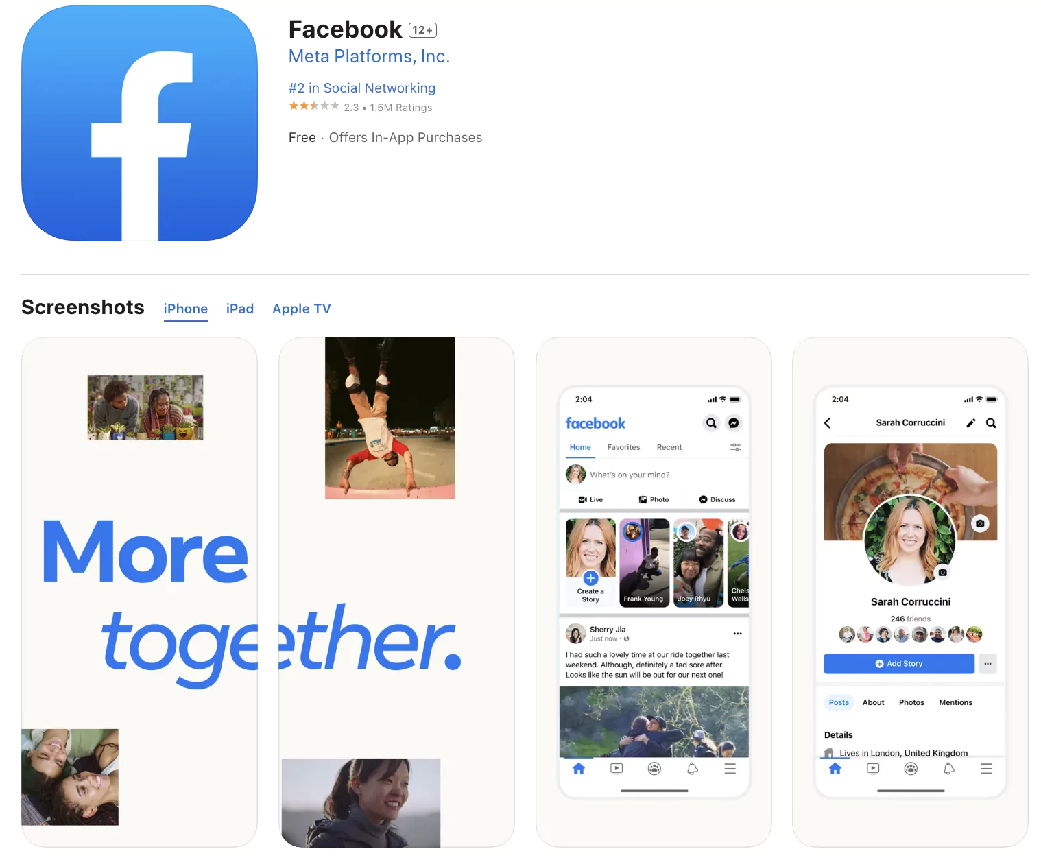
Facebook provides a clear example of strategic color use. The platform uses blue as its primary color because blue is associated with trust, security, and reliability. These qualities align with Facebook’s mission to create a safe online community. The color also has a calming effect, helping users feel more relaxed while navigating the site. This deliberate choice demonstrates how color can reinforce a brand’s core values.
Research suggests that people across 30 countries share similar associations between colors and feelings. A survey of over 4,500 participants found that most colors were linked to positive emotions, while brown, grey, and black were often associated with negative feelings. However, cultural context matters. In Western cultures, white symbolizes purity, whereas in some Asian cultures, it represents mourning and death. Ignoring these differences can lead to miscommunication or even backlash, as seen when Pepsi changed its logo color in Southeast Asia without considering local cultural connotations.
Building Your Brand Color Formula
A brand color formula is a set of predefined color codes that define a company’s visual identity. This formula ensures consistency across all marketing materials and helps maintain a professional appearance. The complexity of your palette can vary depending on your brand’s needs, ranging from a single color to a multi-hue scheme.
One-Color Brand Strategy
A one-color brand relies on a single dominant hue. This approach is simple yet powerful, as it creates a strong, memorable impression. Nike is a prime example, using black as its primary brand color. The stark contrast of the black swoosh against white backgrounds makes the logo instantly recognizable. This minimalist strategy works well for brands that want to project sophistication and clarity.
Two-Color Brand Strategy
A two-color brand uses a main color and an accent color. This combination allows for more visual interest while maintaining simplicity. T-Mobile uses magenta as its main color and white as an accent. The vibrant magenta stands out against the clean white, creating a dynamic and energetic look. This strategy is effective for brands that want to appear modern and approachable.
Three-Color Brand Strategy
A three-color brand includes a main color, a secondary color, and an accent color. This palette offers greater flexibility for design variations. FedEx uses purple and orange as its main colors, with white as an accent. The purple conveys professionalism and reliability, while the orange adds energy and movement. Together, these colors create a balanced and engaging visual identity.
Four-Color Brand Strategy
A four-color brand utilizes a primary color, a secondary color, and two accent colors. This approach allows for a rich and diverse visual experience. Microsoft uses blue and green as its primary and secondary colors, with yellow and red as accents. This multi-hue palette reflects the company’s wide range of products and services, creating a vibrant and inclusive brand image.

How to Choose the Right Brand Colors
Selecting the right brand colors requires a thoughtful process that considers your brand’s personality, values, and target audience. It is not just about picking colors you like. It is about choosing hues that communicate your brand’s message effectively.
Define Your Brand Personality
Before selecting colors, define your brand’s personality. Is it bold and daring or gentle and nurturing? Is it luxurious and exclusive or affordable and accessible? Your answers to these questions will guide your color choices. For example, a luxury brand might opt for black and gold to convey elegance, while a playful brand might choose bright yellows and oranges.
Research Color Psychology
Understanding color psychology is crucial for making informed decisions. Research how different colors evoke specific emotions and associations. For instance, blue is often associated with trust and security, making it a popular choice for financial institutions and tech companies. Red can create a sense of urgency, which is why it is often used in sales promotions.
Pick Your Primary Color
Your primary color should reflect your brand’s core values and personality. Choose a hue that resonates with your target audience and sets the tone for your brand. This color will be the most prominent in your visual identity, so it needs to make a strong impact.
Choose Secondary Colors
Secondary colors support your primary color and add depth to your palette. Select two to three colors that harmonize with your primary hue. These colors can be used for backgrounds, accents, and typography. They help create a balanced and visually appealing design.
Test Across Platforms
Once you have selected your colors, test them across various platforms. Ensure they look good on your website, social media channels, business cards, and packaging. Consistency is key to building brand recognition. You can also A/B test different color combinations to see which ones perform best in terms of engagement and conversions.

Best Practices for Using Brand Colors
To maximize the impact of your brand colors, follow these best practices. They will help you create a cohesive and effective visual identity.
Consider Cultural Differences
When targeting a global audience, consider cultural differences in color perception. What works in one culture may not work in another. For example, while white symbolizes purity in the West, it represents mourning in some Asian cultures. Research the cultural connotations of your chosen colors to avoid unintended messages.
Use Colors to Differentiate Products
If you offer multiple products or services, use colors to differentiate them. Google uses distinct color schemes for its various products, such as blue for Docs and green for Sheets. This strategy helps users easily identify and remember each product, enhancing the overall user experience.
Reinforce Brand Personality
Use colors to reinforce your brand’s personality and values. If your brand is energetic and innovative, choose vibrant and dynamic colors. If it is calm and trustworthy, opt for softer and more muted hues. Consistency in color usage helps build a strong and recognizable brand identity.
Ensure Visual Contrast
Visual contrast is essential for readability and accessibility. Use contrasting colors to highlight key elements and convey your message effectively. For example, black text on a white background is easy to read and visually appealing. Ensure that your color palette includes enough contrast to meet accessibility standards.
Be Open to Change
Brands evolve, and so should their visual identities. Do not hesitate to update your brand colors if they no longer align with your values or resonate with your audience. Airbnb, for example, shifted from a blue and white scheme to a more vibrant and diverse palette in 2014. This change reflected the company’s growth and expanded offerings.

Inspiration From Successful Brands
Studying successful brands can provide valuable insights into effective color usage. Here are a few examples of companies that have mastered their brand colors.
- Instagram: Uses purple, pink, orange, and white to convey creativity and vibrancy.
- LinkedIn: Employs blue and white to project professionalism and trust.
- Red Bull: Combines blue and red to evoke energy and excitement.
- Spotify: Uses green and black to create a modern and sleek look.
- Ferrari: Features red and yellow to symbolize speed and passion.
- Visa: Utilizes blue and gold to convey security and value.
- Samsung: Adopts blue and white to represent innovation and reliability.
- Twitter: Uses blue and white to suggest openness and communication.
- Dropbox: Relies on blue and white to project simplicity and trust.
- YouTube: Combines red and white to evoke energy and attention.
These brands demonstrate how strategic color choices can enhance brand recognition and emotional connection. By understanding the psychology of color and applying best practices, you can create a visual identity that resonates with your audience and sets you apart from competitors. Remember, there is no single “best” brand color. The key is to find the right combination that reflects your unique brand personality and values.





