How Website Design Has Changed Since the Early 2000s
Website design trends have shifted dramatically since the debut of the internet, and examining nostalgic websites offers a clear view of why modernizing your site is essential. By comparing past iterations of popular platforms to their current versions, we can see how user experience, visual hierarchy, and brand storytelling have evolved. Tools like the Wayback Machine allow us to peek into these digital time capsules, providing valuable lessons for anyone planning a website redesign or simply curious about the history of the web.

The core principles of effective web design have remained consistent, even as aesthetics have changed. Clarity, ease of navigation, and compelling visuals are as important today as they were two decades ago. However, the way brands execute these principles has become much more refined. Early websites often prioritized text over imagery, featured cluttered layouts, and lacked the whitespace that defines modern design. Today, brands like Google, Apple, and Microsoft focus on minimalism, personalized experiences, and high-quality visuals. This evolution reflects a deeper understanding of how users interact with digital content, moving from information-dense pages to streamlined, visually-driven experiences.
The Shift from Text-Heavy to Visual-First Designs
In the late 1990s and early 2000s, many websites were heavily text-based, with limited use of images due to slower internet speeds and technical constraints. Sites like Amazon, Yahoo, and Barnes & Noble relied on dense blocks of text and vertical menus to convey information. This approach often resulted in a dizzying user experience, with visitors struggling to find what they needed. As technology advanced, brands began to incorporate more imagery, leading to a more balanced and engaging design. Modern websites now use high-resolution images, videos, and interactive elements to tell their story and connect with users on a deeper level.
The Importance of Visual Hierarchy and Whitespace
Visual hierarchy plays a crucial role in guiding users through a website, helping them understand where to focus their attention. Early websites often lacked this structure, with elements competing for attention and creating a chaotic feel. Brands like Microsoft and AOL, for example, had cluttered pages with too many colors and little whitespace. Today, these brands have adopted cleaner designs with clear visual hierarchies, using whitespace to create breathing room and improve readability. This shift not only enhances the aesthetic appeal of a website but also improves usability, making it easier for visitors to find the information they need.
Tech Giants and Their Design Evolutions
Tech giants like Google, Apple, and Microsoft have undergone significant design transformations, reflecting broader trends in web design. These companies have consistently pushed the boundaries of what’s possible, setting new standards for clarity, simplicity, and user experience. By examining their journeys, we can gain insights into how to create websites that stand the test of time.
Google: From Simple Search to Personalized Experience
Google’s homepage has remained relatively simple over the years, but subtle changes have enhanced its functionality. In 1998, the site featured a basic search bar with minimal branding. Today, Google personalizes the homepage for users, bookmarking frequently visited sites and offering quick access to services. This evolution demonstrates how a brand can maintain its core identity while adapting to user needs and technological advancements.
.jpg)
Apple: Minimalism and Product-Centric Design
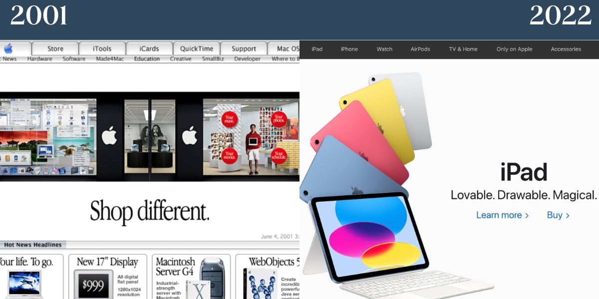
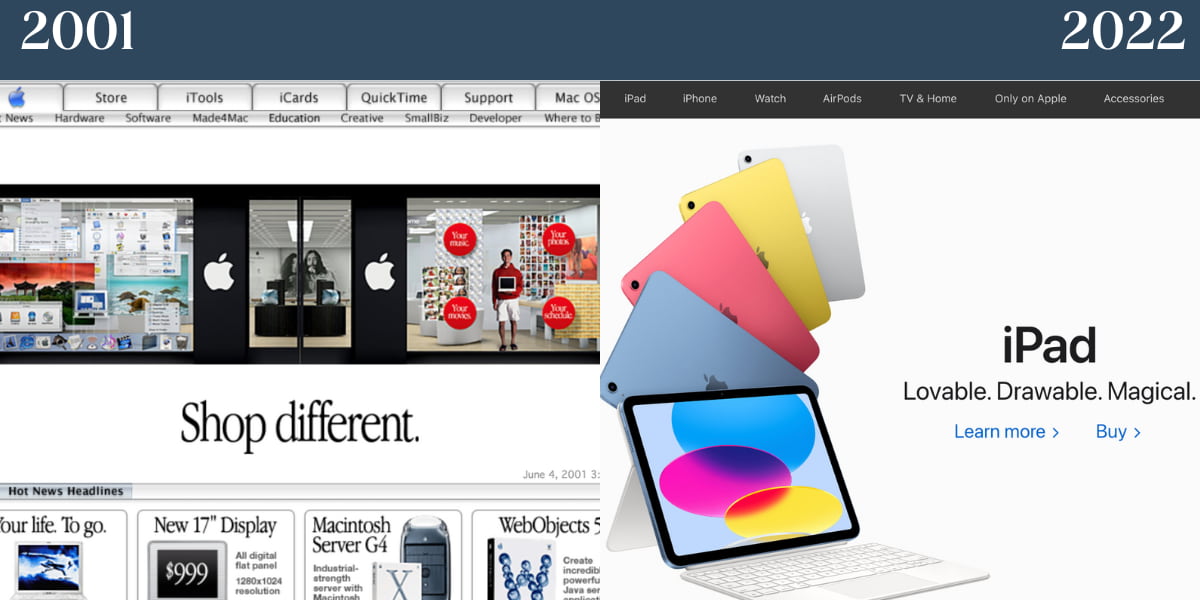
Apple has always taken a product-centric approach to its homepage, showcasing its latest innovations with minimal branding. In 2001, the site featured a grid of products, each with a brief description. Today, Apple focuses on a single product per page, using compelling copy and high-quality visuals to create a powerful impact. This minimalist approach highlights the brand’s confidence in its products and its ability to tell a story with just a few words.
Microsoft: From Clunky to Clean
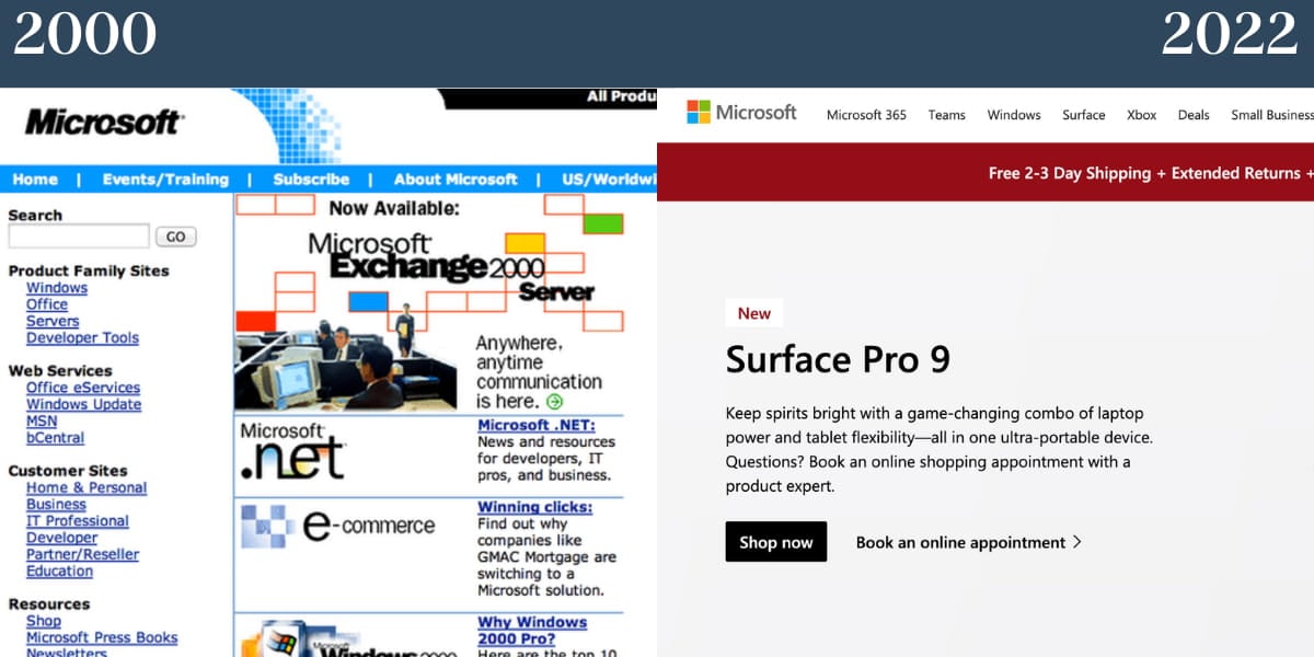
Microsoft’s website in 2000 was clunky and overwhelming, with too much text and little whitespace. Today, the site has embraced a cleaner, more digestible design, taking cues from Apple’s minimalist approach. The focus is on products and services, with clear navigation and compelling visuals. This transformation shows how a brand can reinvent itself by prioritizing user experience and clarity.
Retail and E-Commerce: Balancing Branding and Functionality
Retail and e-commerce websites face unique challenges, needing to balance branding with functionality to drive sales. Brands like Amazon, Walmart, and Target have evolved their designs to improve user experience and increase conversions. By examining their journeys, we can learn how to create e-commerce sites that are both visually appealing and highly functional.
Amazon: From Text-Heavy to Visual-Driven
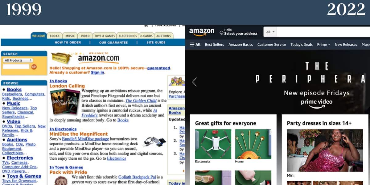
In 1999, Amazon’s website was text-heavy, with a cluttered vertical menu that made navigation difficult. Today, the site has a clean, visual design with a horizontal menu and high-quality product images. This shift has improved usability and helped Amazon become the e-commerce giant it is today. The brand’s focus on customer experience and continuous improvement is evident in its design evolution.
Walmart and Target: Color and Clarity
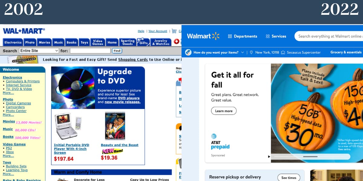
Walmart and Target have both used their signature color schemes to create cohesive brand identities online. In the early 2000s, their websites were functional but lacked visual appeal. Today, both brands have embraced cleaner designs with clear navigation and high-quality imagery. This approach not only enhances the user experience but also reinforces brand recognition.
Media and Entertainment: Storytelling Through Design
Media and entertainment brands use their websites to tell stories and engage audiences. Platforms like Netflix, TED, and BuzzFeed have evolved their designs to better serve their content and connect with users. By examining their journeys, we can learn how to create websites that are both informative and entertaining.
Netflix: From Image-Focused to Copy-Driven
In 2005, Netflix’s homepage was image-focused, showcasing its library of movies and TV shows. Today, the site is copy-driven, with a clear call-to-action and high-quality visuals. This shift reflects the brand’s focus on conversion and user engagement. The design is simple yet effective, making it easy for users to sign up and start streaming.

TED and BuzzFeed: Balancing Visuals and Text
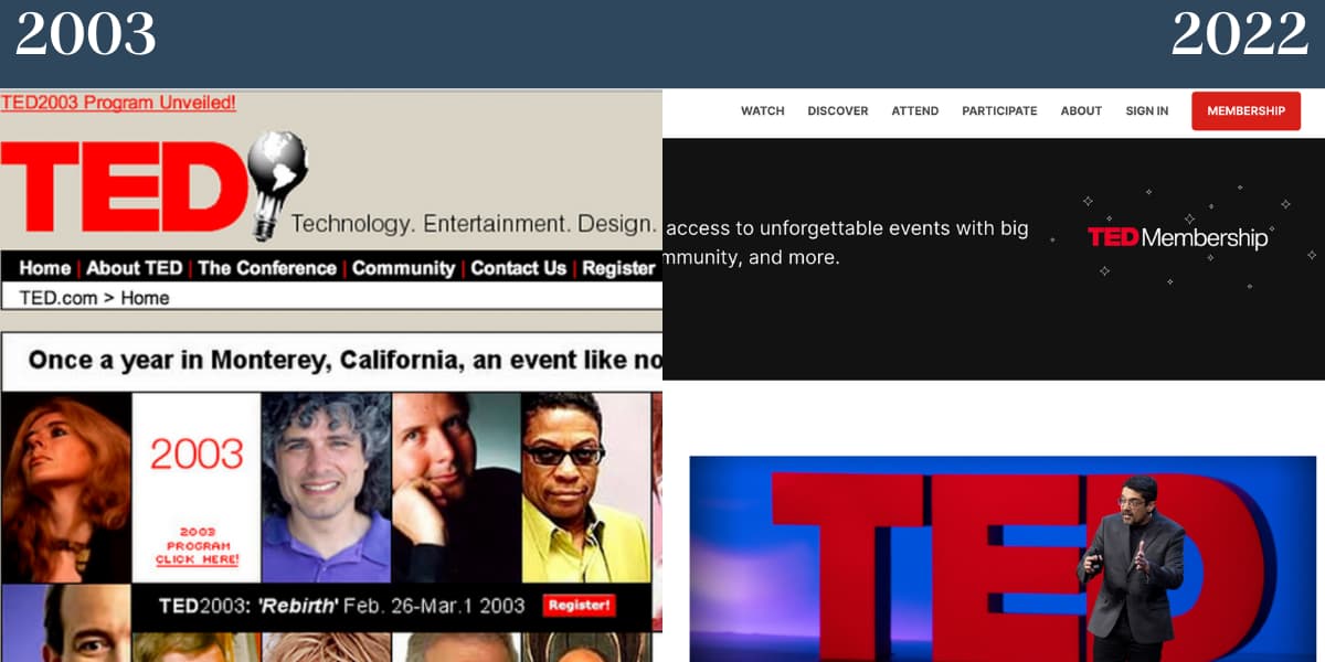
TED and BuzzFeed have both evolved their designs to balance visuals and text. TED’s site in 2003 was image-heavy but felt cramped. Today, the site uses a single main image above the fold, with clear copy and ample whitespace. BuzzFeed has shifted from a text-heavy design to a more visual and interactive approach, creating a more engaging user experience.
Brand Consistency and Adaptability
One of the most important lessons from these nostalgic websites is the importance of brand consistency and adaptability. Brands that have maintained a consistent identity while adapting to changing trends have thrived. Coca-Cola, for example, has kept its branding timeless, using visual content and simplicity to create a cohesive online presence. Similarly, Dunkin’ has stayed true to its signature color scheme, creating a recognizable and appealing website.
Coca-Cola: Timeless Branding
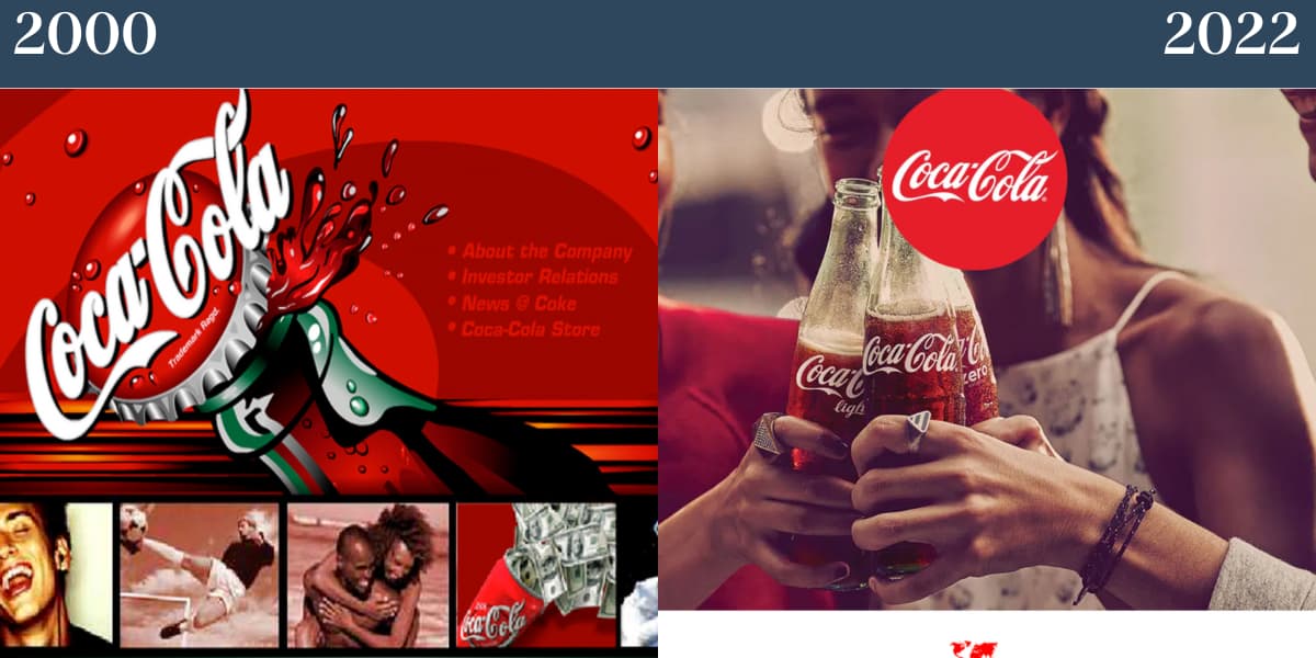
Coca-Cola’s website in 2000 was ahead of its time, using visual content and simplicity to create a cohesive brand experience. Today, the site continues to focus on imagery, with less red than in the past but still maintaining a strong brand identity. This consistency has helped Coca-Cola remain a dominant force in the beverage industry.
Dunkin’: Signature Colors and Minimalism
Dunkin’ has stayed true to its signature pink and orange color scheme, creating a recognizable and appealing website. In the early 2000s, the site was minimalistic, featuring a single image and clear copy. Today, the site has plenty of whitespace and cohesive branding, making it easy for users to navigate and find what they need.
.jpg)
Key Takeaways for Your Website Redesign
When planning a website redesign, it’s important to learn from the past while looking to the future. Here are some key takeaways from these nostalgic websites:
- Prioritize Visual Hierarchy: Use whitespace and clear navigation to guide users through your site. Avoid clutter and ensure that important elements stand out.
- Balance Text and Imagery: Use high-quality visuals to tell your story, but don’t overwhelm users with too much text. Find a balance that works for your brand.
- Maintain Brand Consistency: Keep your branding consistent across all touchpoints, from your logo to your color scheme. This helps build recognition and trust.
- Focus on User Experience: Design your site with the user in mind, ensuring that it’s easy to navigate and find information. Test your design with real users to identify areas for improvement.
- Embrace Minimalism: Less is often more. Use whitespace and simple designs to create a clean, modern look.
By applying these principles, you can create a website that not only looks great but also performs well. Remember, the goal of a website redesign is to improve user experience and drive business results. Take inspiration from these nostalgic websites, but don’t be afraid to innovate and push the boundaries of what’s possible.
Final Thoughts
The evolution of website design reflects broader changes in technology, user behavior, and brand strategy. By examining the past, we can gain valuable insights into how to create websites that are both visually appealing and highly functional. Whether you’re redesigning your own site or simply curious about the history of the web, these nostalgic websites offer a fascinating look at how far we’ve come. What lessons can you apply to your own brand’s digital presence?





